I recently got the P800. I ran the Epson inks to test it out. Perfect. I then installed My Piezography Special Edition inks with HD Matte Black and HD Photo Black. I used the Piezography P2 ink placement and curves. I am using matte paper. On the printer I switched from default Photo Black to Matte Black. I am using the chipless solution. After a number of great looking prints I checked the ink levels. The matte black was full but the photo black was half empty. On the printer, I switched from Matte Black back to the default Photo Black. Now it is using the Piezoflush (printing pink) in the second cartridge position instead of Matte Black.
If you have installed PK in the Yellow channel make sure you are using the correct P2 Curves. These are found (on Mac) in /Applications/Piezography/Curves-HD/P800-P2
Best regards,
Walker
Hi Walker, Thanks for your prompt reply. I believe I have everything set up properly
Yep. Because this is. UHD ultra hd matte black curve, you need to set your printer to Matte Black for this curve to work.
Best,
Walker
Yes. That was how I had it set. The prints looked good but when I checked the carts to see if needed to refill I found that the HD photo Black in the yellow, far right position was half empty and the UltraHD Matte Black in the Matte Black, far left position was completely full. So it appears to me that it is using the HD photo Black ink for Matte prints.
Not sure why it is the way it is but curve is fine.
All the best,
Walker
Is there a way to ascertain when using this curve where the ink is actually being drawn from?
Yes, the black is coming from the black channel. If you are set to PK on your printer it will print flush, MK it will print MK.
If this was a P2 gloss curve you would see Yellow all the way to the right.
best,
Walker
Thanks for your help and Patience
Best, Neal
Hi Neal and Walker
I 'm having problems getting the SpecEd color I see in PT softproof when on PTM (it just prints dead neutral no matter what PT combinations I use, and wondered if my problem is related to this posting, and if you’d got any further with it?
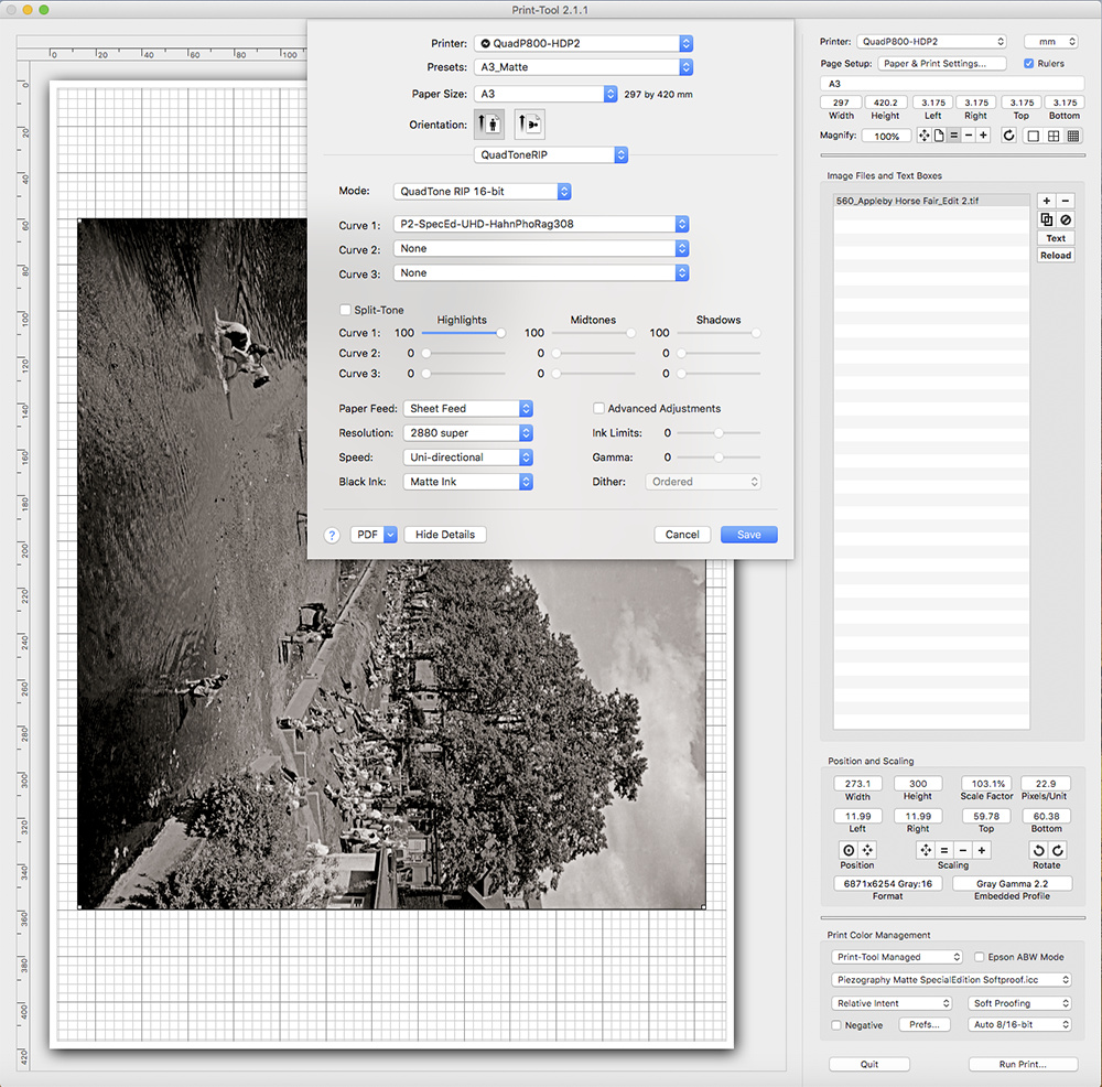
I’m printing on Innova FA SCNW315, and using the HPR308 P2curve. My settings are pretty much the same as Neils -
Screenshot_
Except I noticed he has Adobe RGB embedded, not GG 2.2. Why is this for NCM?
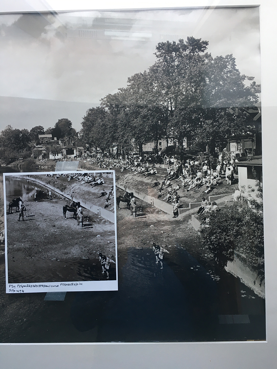
The only way I can get anything like SE color is switching the P800 to PK, and using an HPR pearl curve with a pearl or glossy paper - Ultimately what I’m trying to do is match an original selenium coated gelatin print -
 .
.
I have Sel inks ready to install, but want to get the SpecEd running right first.
Any guesses much appreciated.
Tony
So sorry for the slow reply. I hope Walker has helped you because I don’t think I can. He is the expert.
Settings in computer do not effect the color. The color is entirely effected by the ink/paper chemistry (polarization). These classic piezo inks are something we call “reactive color” meaning if there is titanium silica in the paper it will be one color, if there is OBAs in there it will be entirely another. So try different papers and test and see. SpecEd is the most “reactive” ink set we make in that it changes based on the polarization and bouncing of light off various inkjet paper chemistries. This is an entirely different approach to color than forcing a color onto a paper like ABW or (to a certain extent) PiezoPro.
best,
Walker
Hi Neil and Walker - Thanks for your replies. I take what you say Walker about chemistry.
So what matte paper would you recommend for best showing the SpecEd slightly brownish tones in the print? I’m out of HPR308 at the moment, and want to hold off buying if something else is likely to be better. My eventual plan is to run your SpecEd, Selenium and Carbon inksets.
I have to say a visual inspection of the cartridges appears to show more Y position (Photo ink) use for the mainly matte printing I’ve been doing, than MK position (UHD Matte ink) - but it’s difficult to tell from looking at the cartridges, my impression not as clear as Neil’s original comment. P800 definately changed from PK to MK, and set on Matte paper.
PK ink is entirely unused if your are selecting UHD ink curves.
The paper should be experimented with! But in general, browner tones show with glossy papers and/or non-titanium (aka not canson) paper.
best regards,
Walker
Yes I’ve found browner with gloss. And tried one or two other papers.
I’m wondering about QTR holding/reverting settings before applying them in printing. Roy H has mentioned similar behaviour previously. Presets seem to mysteriously change but only sometimes. I will query with him if it isn’t picked up here.
Always make sure to select “last used settings” before doing any settings, then ensure that you actually print. Then these settings will be “sticky” for the next print.
best,
Walker
Can I make a couple of observations as an ordinary user who has done a fair bit of printing using Spec Ed inks?
I’ve always had a problem with Spec Ed inks soft-proofing warmer than they print. I had a long discussion with Jon Cone about it 5½ years ago: https://community.inkjetmall.com/t/warmth-of-soft-proofing-icc-for-se-inks/2544
I never really resolved that issue. I’m not sure that the other user I mentioned in that thread was correct about my screen vs his, as he wasn’t printing with Spec Ed inks and we never managed to get our screens side-by-side to compare them.
My solution in part was to learn to live with it, and to learn to be able to predict what the print would look like from the screen. Also, you don’t say what kind of monitor you have, but if it’s an Eizo there is a technique that allows you to refine the white point of your monitor profile to match the paper. I’ve seen it demonstrated by local guru Les Walkling and he has an instructional video that I could try and locate if you’re interested. It reduced but didn’t entirely eliminate the problem IIRC.
In relation to printing with ICCs, in theory these shouldn’t affect the colour toning of the prints as this is not like colour printing. However … shades 1, 6 & 7 in Spec Ed are neutral, and the more tonality in your image that is printed by these particular shades, the more neutral it will appear. When printing on a matte paper with an ICC, the profile conversion tends to darken the shadows and use more of shade 1 and can reduce the warmth of the print. I had a bit of a revelation when I stopped printing with an ICC on matte papers and discovered how much warmer the print was with more open shadows. For this reason you’ll find the Spec Ed effect varies from image to image, depending on the tonality of the image and how much of the seven inks is used on each image.
Yes, printing with Spec Ed is a lot warmer on a PK style paper like Platine or IGFS. If that’s the look you want then that’s probably the answer. Personally I loved the subtle split-toning of Spec Ed on matte papers but found the very warm tone on PK papers to be too much. In recent years I’ve moved to Pro inks as a solution. I’ve created split-tone blends that give me a similar look on both MK & PK papers, It doesn’t exactly match Spec Ed, since that’s not possible with Pro, but it’s close enough for me. Also, the one-pass gloss coat is a real boon.
Hope this helps.
Brian - Thanks very much for chipping in. Your comments and the link are very useful references. I’ve got an Eizo ColorEdge 277, btw.
I’m getting in over my head I think, and need time to digest it all, so I’m going to work on the PT presets problem for now, and will be posting examples here soon as per Walker’s request - I’ve a (non-dimmable) GTI booth, so the color should be accurate (depending on what my iPhone does with it!).
Thanx again,
Tony
@Tony_Riley - I’m a bit hesitant to post this if you think you’re getting in over your head, but I may as well do so now so that it’s here and you can come back to it when you feel ready.
The local guru I mentioned is Dr Les Walkling. He has a page on his website with technical articles and videos. He is a major player in the Australian photo scene and taken very seriously by Epson, Canson, Eizo etc. I have only seen him present once, and it was essentially a longer version of the video below. Clearly he knows a lot, but I’m inclined to take some of his stuff with a large grain of salt (long story omitted). Nonetheless I think this video is useful, and if you follow his technique, I think it will get you closer.
This video, which is linked to on that page of articles, demonstrates an advanced technique to improve the monitor to paper match:
Dropbox - Advanced_Soft_Proofing_with_EIZO_CE_Monitors.mp4.zip - Simplify your life
Hi Walker - “Last Used Settings” seems to have sorted the erratic PT preset problem, thnx.
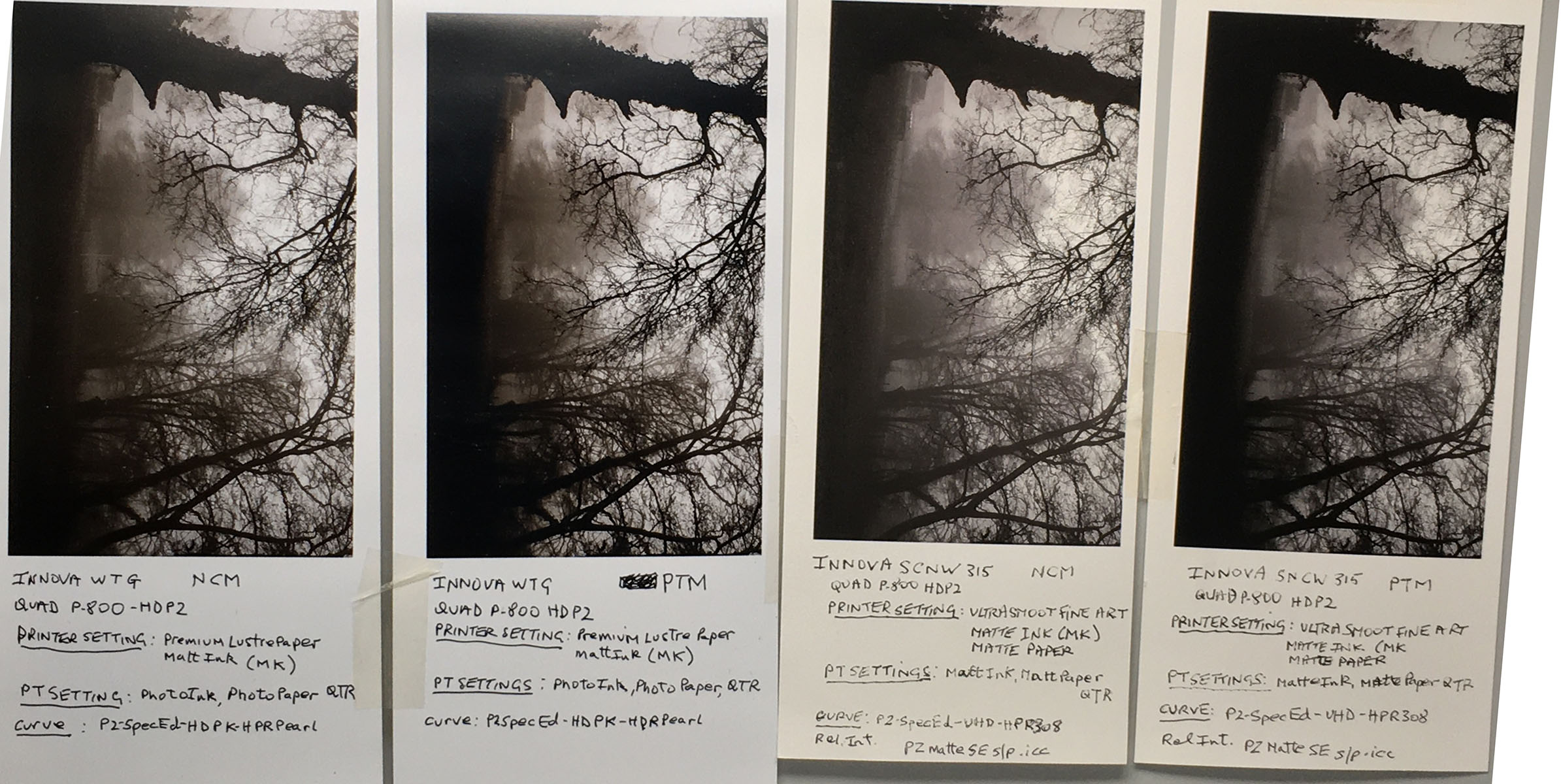
Re. SpecEd tone on matte papers, I may have misled you by describing the color drop from glossy paper rendition as dead neutral. I suspect now this is maybe just my perception, and attach a view booth shot that compares print 4 versions as you requested, bit dark sorry, and would welcome your comment.

I also checked the cart inks/positions, that I believe are correct.
Brian - All the info you sent is interesting for me, so thanks. I printed out one of Jon Cone’s articles for soft-proofing, but can’t now find a link.
Perhaps Walker can post it? It is called -
Piezography Linear or Match to Screen or Hardware Calibrate? Jon Cone (27 March 2019).