Solved: Dark prints and posterization

Hi Phil~

Thanks for the update. Yes, you can flush the yellow channel the same way (using the yellow flush image thru QTR Calibration Mode) to help get the yellow staining out. You will need to transfer the chip from your yellow ink cartridge to use the LM flush cart in the Y channel. Just remove the whole chip on the plastic base, and switch the whole chip with base, making sure it’s fully attached and straight on the cart before installing into your printer. Instructions (and photos) for removing and attaching chips on R3000 carts can be found here: http://www.inkjetmall.com/tech/content.php?150-How-to-replace-chip-on-refillable-R3000-cartridge. After flushing the yellow channel, so you can see pink, and no longer yellow/orange tint, I recommend letting the printer sit for a few hours or overnight, then print another yellow purge sheet to see if yellow/orange returns (it very well may return and need to be flushed a few times until it doesn’t return).

Also, has the printer sat unused for the past +/- month? If so, you may want to shake all ink carts and print a few sheets of the 8-ink flush image to ensure all channels are printing at full/correct density.

Please keep me posted!
Warmly~ Dana :slight_smile:

HI Dana,

LM and Yellow successfully flushed and recharged with inks. In the case of the LM ink I used a new cartridge filled with the new batch of Selenium Shade 5. I then printed the 8-ink flush image to be sure all heads were OK. That appeared to be fine.

I think printed two images on Epson Exhibition Fibre and it’s looking positive. I then went back to the waterfall image and tried that since it’s an image we’ve used before and experienced poor results. It’s definitely an improvement but, for some reason, that image on that paper just looks a horrible chocolate brown. The phone captured images don’t really represent the print well but you can see som elevel of brown. It’s much worse in person.

Here are all the images I printed. The top left waterfall is the gloss version and bottom left is matt. Matt is much better!


Matt print


You can really see the brown tones in the other prints too. Is this normal for the Special Edition on EEF?

Anyway, a definite improvement. I’m just not sure that it’s ‘right’ yet? What are your thoughts?

Regards,

Phil.

Hi Phil~

Thanks for the update. I’m glad to hear your output is looking better after flushing and recharging your LM and Y channels.

I have printed a LOT of different images over the years with a LOT of different papers, and Special Edition is my personal favorite ink tone for nearly everything.
A while back, I made a paper evaluation 3-ring binder, which includes papers from leading manufacturers such as Hahnemuhle, Canson, Epson, Inkpress, Awagami and of course our own Jon Cone Studio papers. With each different paper, I have both a Piezography and ConeColor print, as well as manufacturer information. All the Piezography prints were made with Special Edition ink, so one can compare different papers and see how much the paper effects the ink tone. Some papers have a lot of warmth, and really bring out the carbon tone, where as other papers can have more subtle warmth in the shadows. I have found most gloss papers bring out more warmth than matte or rag papers, and have attached a few quick photos showing different papers.

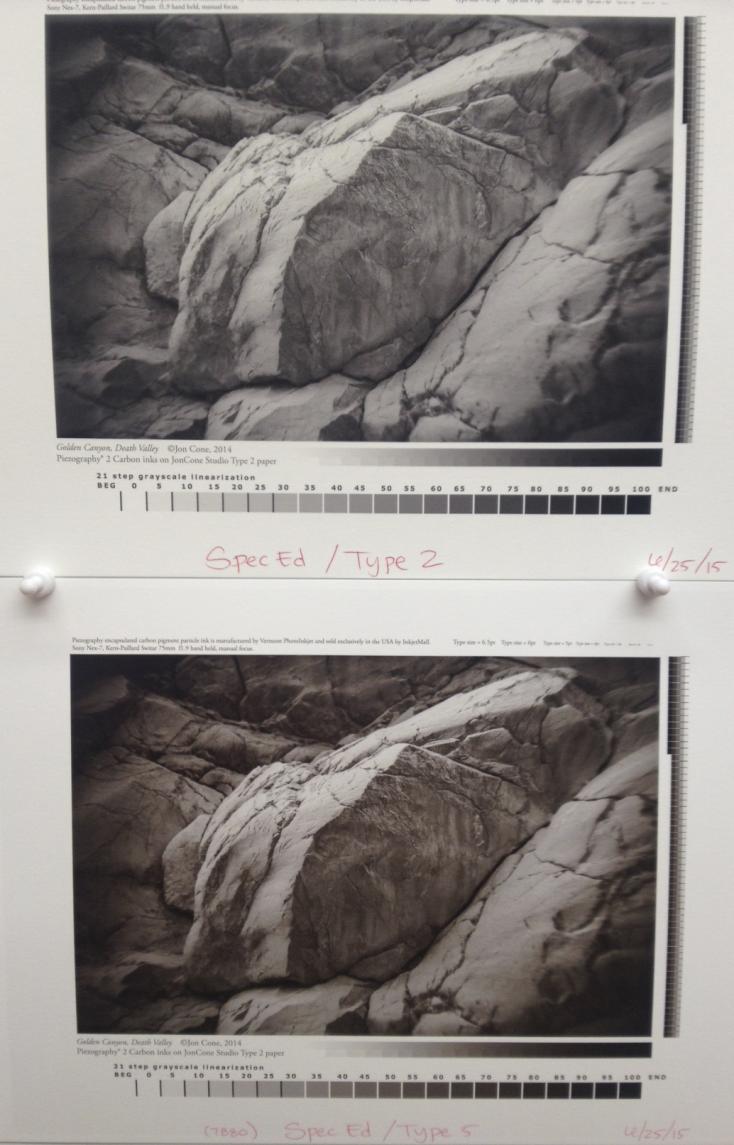
The photo below shows the same image printed with Special Edition inks, Type 2 paper on top and Type 5 paper on bottom:

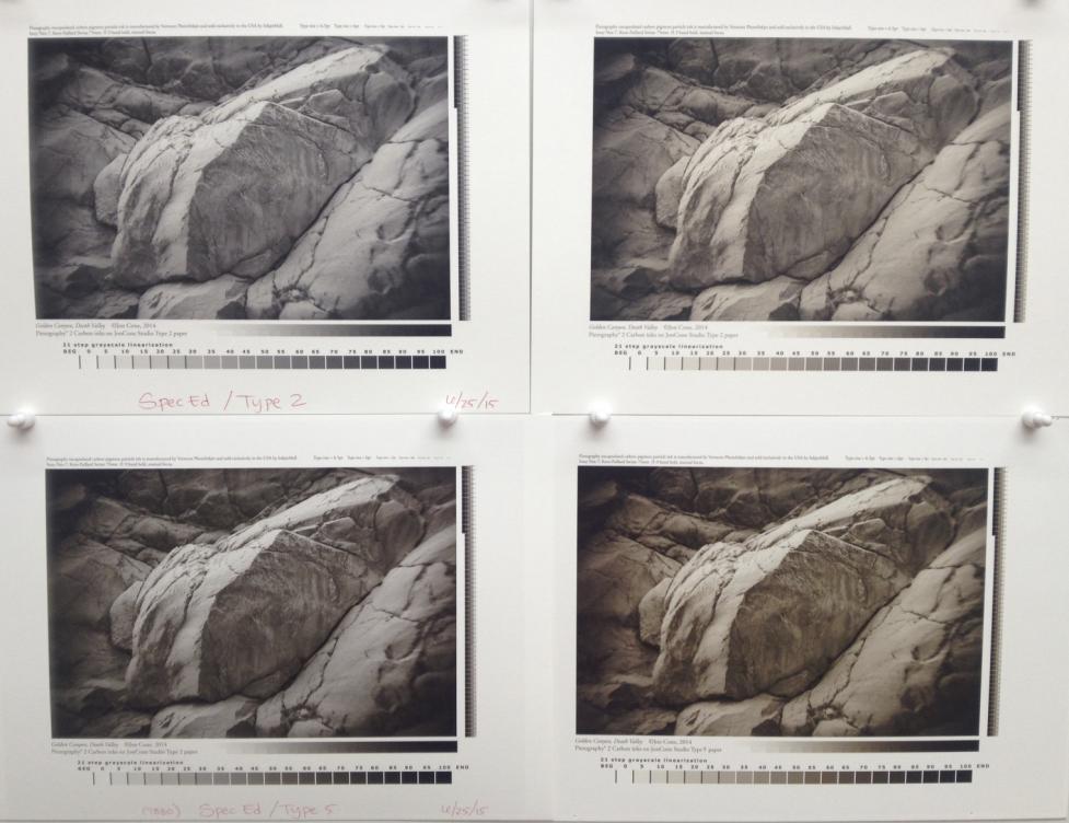
and the photo below is comparing Special Edition on the left with pure Carbon on the right (Type 2 on top, Type 5 on bottom). Notice how on both ink tones, Type 5 is much warmer than Type 2. Although Epson Exhibition is much cooler/brighter than Type 5, they both produce similar results regarding the warmth and split-tone “color” of Special Edition ink, which I have found to be true with generally all gloss papers.

the photos above also demonstrate how glossy prints are darker than matte/rag prints. Both gloss and rag/matte prints are linear from white to black, but the dMax on gloss paper is much higher, therefore the shadow ranger is longer.

I love SE on matte papers, but I find it too warm on gloss papers like IGFS. The subtlety is lost. My personal view is that a different SE mix is required for gloss. I’ve considered mixing one, but so far I’ve balked. I honestly think that it’s something that IJM should consider. What would be best is to have a recommended mix of SE & Neutral. (Jon & I discussed this a while back, but I’ve done no more at this stage. I was also worried a little about the warmth of CRP, but I decided that what I was seeing was the paper colour, rather than an exaggerated SE effect, and so the urge diminished.)

I also think that the gloss and matte comparisons above show the limitations of the grey gamma 2.2 workflow. If I was looking to create both matte & gloss versions of that image, then I’d edit them differently for the two papers.

I’m not sure if I fully understand what you mean by the matte and gloss comparison I posted above “show the limitations of gray gamma 2.2 workflow”… it is simply showing the results of rag vs. gloss paper.
Different papers produce different results, including dMax, tonal range, and “color” of inks- which is effected by both the paper base color as well as the clear inkjet receiver coating. We think it’s really cool to get such a wide range of results with one ink set by printing on different papers, and our customers love the results on both matte/rag or gloss/semi-gloss media.
Gloss and semi-gloss papers can get a higher dMax than matte and rag papers, which is true not only with Piezography, but any printing platform, including the standard Epson driver, inks and papers.
Both are wonderful in different ways: with Piezography, the subtle tones, open shadows and beauty of a rag print (with around 1.6 dMax); or the accentuated ink tone, open shadows with greater dMax (around 2.1) and more “crisp” effect on gloss papers.

We won’t change the current Special Edition formulation for matte or gloss printing, because it is widely used and loved by many as it is. If Special Edition is too warm for you on gloss papers, then I recommend creating your own custom ink set, possibly replacing Carbon for Warm-Neutral.

If gloss papers can achieve a higher dMax, would you prefer limiting glossy curves to “match” matte/rag output, or would you edit your files to limit the results on gloss paper to match matte/rag? No, I don’t think so.
Our curves are designed to optimize results for a specific paper, and we are even making a new batch of curves that are also specific to the ink tone, for K3 printer models. We always create curves to have the highest dMax for the specific printer/ink/paper combination, and linear output from black to white (though, obviously different printers and how a system is maintained can effect the the results).

Best regards~ Dana

[QUOTE=Dana-IJM;8118]Gloss and semi-gloss papers can get a higher dMax than matte and rag papers, which is true not only with Piezography, but any printing platform, including the standard Epson driver, inks and papers.

If gloss papers can achieve a higher dMax, would you prefer limiting glossy curves to “match” matte/rag output, or would you edit your files to limit the results on gloss paper to match matte/rag? No, I don’t think so.
[/QUOTE]

First, I am traveling at present with only an android tablet, and so I admit that I can’t view the posted images with as much accuracy as I’d like, but I know what I’d see on my main screen.

This is what I meant by that comment. It is sometimes the case that I’m not sure which surface I want to print an image on - matte or gloss - so I do both. Now the gloss is always going to have a higher dmax, and so it appears darker. That’s why the image might look better on gloss. But what I want are two prints that look as similar as possible, allowing for the gloss / matte dmax difference. I often won’t get that just by printing the image as-is. The differences that you’re saying are a good thing are what I’m trying to minimise, while still getting a higher dmax.

If I do the same thing in colour, I can get similar but different prints by converting to an ICC profile. But we’re not supposed to do this in the piezo workflow, because it compresses shadows. So when I stick to the GG2.2 workflow I generally edit the image differently for gloss and matte. I hope this makes sense and explains what I meant. It’s quite a different philosophy to wanting to generate as many different appearances of the one image.

Re Phil’s prob problem, in the SE inkset, shade 2 is the warmest shade, and so prints that use a lot of shade 2 will look particularly warm on gloss. That waterfall image, as best as I can make out, is a classic for the overly warm on gloss SE look. I honestly think that’s what he’s seeing, and while some will like it, he and I find it too warm. YMMV. It also varies a lot with the image. The effect is much less for lighter images, although most of the gloss papers that I use are fairly warm in any case.

[QUOTE=Dana-IJM;8107]Hi Phil~

Thanks for the update. I’m glad to hear your output is looking better after flushing and recharging your LM and Y channels.

I have printed a LOT of different images over the years with a LOT of different papers, and Special Edition is my personal favorite ink tone for nearly everything.
A while back, I made a paper evaluation 3-ring binder, which includes papers from leading manufacturers such as Hahnemuhle, Canson, Epson, Inkpress, Awagami and of course our own Jon Cone Studio papers. With each different paper, I have both a Piezography and ConeColor print, as well as manufacturer information. All the Piezography prints were made with Special Edition ink, so one can compare different papers and see how much the paper effects the ink tone. Some papers have a lot of warmth, and really bring out the carbon tone, where as other papers can have more subtle warmth in the shadows. I have found most gloss papers bring out more warmth than matte or rag papers, and have attached a few quick photos showing different papers.

The photo below shows the same image printed with Special Edition inks, Type 2 paper on top and Type 5 paper on bottom:

and the photo below is comparing Special Edition on the left with pure Carbon on the right (Type 2 on top, Type 5 on bottom). Notice how on both ink tones, Type 5 is much warmer than Type 2. Although Epson Exhibition is much cooler/brighter than Type 5, they both produce similar results regarding the warmth and split-tone “color” of Special Edition ink, which I have found to be true with generally all gloss papers.

[/QUOTE]

Thanks for sharing the photos - it was helpful to see such wide differences. As you might imagine by now, the top left image (printed on Type 2) is the look I prefer. And the top image of the pure Carbon images.

I have a few more questions at this point:

  1. Do you think, based on the photos, that I’m back on track or would you like me to print the ink separation chart again and measure the 60% values?
  2. Do you have curves for either Canson Baryta Photographique or Canson Arches Aquarelle Rag? I have trial pack and I’m curious to see how they perform, particularly the former in comparison to EEF.
  3. I have other papers I’d like to try. Do you have instructions on creating my own curves?
  4. I’m not going to grow to love that EEF look and, given that my leaning is more towards a neutral look, which ink would you recommend swapping out to achieve that (for matt and gloss prints)?

Many thanks Dana. I’m sure I’ll stop pestering you soon! :slight_smile:

Regards,

Phil.

Hi Phil~

You’re not “pestering” me, I’m here to help, and we want all customers printing well :slight_smile:

  1. Yes, based on your photos, I think you’re on track now (I also printed your waterfall image, and it looks very similar to the recent ones you posted).
    You can check your output linearization anytime you want, by measuring a printed 21 step strip and entering measurements into our linearization checker.
  2. Yes, we have some pre-made curves for Canson Baryta Photographique paper, which you can download from our glossy curve resource, here: http://www.inkjetmall.com/tech/content.php?158-Piezography-K7-GLOSSY-Curve-Resource (check in the K3 printers, then the 3800/3880 folder). I have attached a curve for Arches Aquarelle Rag paper below for you to try.
  3. Roy Harrington just released a workflow to linearize curves on your own.
  4. If you want a more “neutral” look, then I suggest using our Neutral tone inks. If you want slightly warm tinted neutral, then use Warm-Neutral ink set, or use a few shades of WN along with Neutral or Selenium for a subtle split-tone without as much warmth as Carbon in the Special Edition ink set. The possibilities are endless, and it’s all about developing the custom blend for your personal preference.

Best regards and happy printing~ Dana :slight_smile:

I have used Roy’s new droplet on HPR and CRP so far. It works as advertised. My curves weren’t bad but the droplet brings them a lot closer to linearity. It strikes me as a really simple way to get a bit more from the supplied curves.

Yes, Roy’s new droplet application seems like a great way to “fine tune” existing curves for your system, or for similar papers.

Happy printing~ Dana :slight_smile:

Brian~

Yes, the tone of Special Edition ink is very dependent on the image. Darker images will use more of the Carbon shades, creating a warmer image. Images that are primarily light will print the Neutral and Selenium tones. Images with the full range from highlight to shadow will see the split of Neutral to Selenium highlights, transitioning to Selenium and Carbon mid-tones and shadows. Obviously, the paper will also have an effect on the ink tone.

Different images can look better on different papers, some working better with matte or rag papers, and some are best printed on a glossy paper surface. It depends on the image, and the effect you want to produce.
We believe using different papers to get a wide range of print output and effects is one of many amazing tools to printing and print making. If it’s your preference to have images match as close as possible on all different papers, then yes- you will need to edit images for specific papers. You can use Piezography soft proof profiles to simulate a specific ink/paper combination, which is helpful when editing images, and determine which paper(s) or ink(s) to print with. If you make a custom ink blend, you can make your own soft proof profiles by measuring a 21 step strip, and dragging/dropping the measurements onto the QTR-create-ICC-RGB application.

Best regards and happy printing~ Dana :slight_smile:

@Phil: there is some discussion of mixing and blending SE inks in this thread, which may or may not interest you:

http://www.inkjetmall.com/tech/showthread.php?76-Cooling-the-tone-of-K7-glossy

What Dana didn’t say is that to switch to Neutral you only need to swap shades 2-5. Although shade 2 is where most of the warmth is coming from imho, I’m not sure that swapping only it would give good results.

@Dana: thanks for that. I have a lot of practice at doing precisely what you describe, plus some other things that don’t quite comply with the orthodox piezography theology, in order to achieve paper matching. What you see as a strength I still see as a limitation.

Brian,

By example to what Dana is suggesting for you - the late David Chow did exactly this with Piezography. He used Piezography to proof his Platinum / Palladium prints that he made with Piezography Digital Negatives. Pt/Pd has a very low dMax and a particularly long mid-tone range. So Chow simulated this using a Curve in Photoshop (with adjustments to the output points) and converted the image to print onto a very high dMax paper as the image would if printed using the low dMax Pt/Pd process. He was very successful with this and used it as a proofing method for his Pt/Pd customers.

regards,

Jon

Jon, I’m reluctant to take this too much further, at least in this thread, because what started as a passing comment is now hijacking the thread.

I understand what David Chow is doing, or at least I think I do, because it’s a more extreme version of one of the things that I do. I like EEM / EAM as an inexpensive proofing paper, and then use soft-proofing to match the look on something else. Which is pretty much the same workflow as “matching” matte and gloss, except that I’m not aiming for an exact match, only “similar”. In both cases there will be dmax differences that cant be adjusted for. Indeed, those differences are usually the point of changing papers.

[QUOTE=Dana-IJM;8134]Hi Phil~

You’re not “pestering” me, I’m here to help, and we want all customers printing well :slight_smile:

  1. Yes, based on your photos, I think you’re on track now (I also printed your waterfall image, and it looks very similar to the recent ones you posted).
    You can check your output linearization anytime you want, by measuring a printed 21 step strip and entering measurements into our linearization checker.
  2. Yes, we have some pre-made curves for Canson Baryta Photographique paper, which you can download from our glossy curve resource, here: http://www.inkjetmall.com/tech/content.php?158-Piezography-K7-GLOSSY-Curve-Resource (check in the K3 printers, then the 3800/3880 folder). I have attached a curve for Arches Aquarelle Rag paper below for you to try.
  3. Roy Harrington just released a workflow to linearize curves on your own.
  4. If you want a more “neutral” look, then I suggest using our Neutral tone inks. If you want slightly warm tinted neutral, then use Warm-Neutral ink set, or use a few shades of WN along with Neutral or Selenium for a subtle split-tone without as much warmth as Carbon in the Special Edition ink set. The possibilities are endless, and it’s all about developing the custom blend for your personal preference.

Best regards and happy printing~ Dana :)[/QUOTE]

Thanks Dana for all your help, and Jon too. I’ll do the linearization check and let you know if there are problems but I’m hopeful now.

I think you might have forgotten to attach the Arches Aquarelle Rag curve, I couldn’t see a link at least. :slight_smile:

I have some practice recently creating profiles to apply linearization adjustments to images before printing in ABW mode (this is for my non-Piezography Epson 3880) so I imagine the process for creating curves is similar. I look forward to try that out.

I’ll experiment with what I have for now to get some experience printing images on different papers but I’ll probably switch some of the inks for something more neutral when I come to order refills.

Thanks again for all your help - you’ve been amazing and very patient! :slight_smile:

Regards,

Phil.

[QUOTE=Brian_S;8148]@Phil: there is some discussion of mixing and blending SE inks in this thread, which may or may not interest you:

http://www.inkjetmall.com/tech/showthread.php?76-Cooling-the-tone-of-K7-glossy

What Dana didn’t say is that to switch to Neutral you only need to swap shades 2-5. Although shade 2 is where most of the warmth is coming from imho, I’m not sure that swapping only it would give good results.[/QUOTE]

Thanks Brian. I’ll check that out in the coming days. Swapping 4 inks…ouch that’s gonna hurt!

Hi Phil~

Woops, sorry about not attaching the curve, here it is!

7880-CANarchesAquarelle.quad.zip (2.82 KB)

Thanks Dana :slight_smile:

Hi Dana,

I’ve finally had a chance to started producing some matte prints after you helped me sort out my ink problems. I have to say I’m thrilled at the quality I’m getting. The detail I’m seeing is amazing!
I’ve attached a shot of a print I’ve just made. It’s printed on Breathing Color’s Pura Smooth using the EpEnhancedMatte curve. Even with the wrong curve I’m getting a great result.
The iPhone shot can’t do it justice but it is so worth the effort of getting here.


Just thought you’d like to know how much I appreciate you helping me reach this point. :slight_smile: