I have recently converted our 9900 to run a set of K7 neutral inks, both matte and gloss. The black channel in the printer is permanently clogged so I have loaded the new Ultra HD Matte black in the orange slot and the new High Density Photo Black into green, I have Piezoflush in the MK and PK cartridges. I am using ErgoSoft V15 to run the printer and create our own setups for each paper.
Basically my issue is that prints are too yellow in the lighter tones, slightly blue in the darker tones but then a nice neutral black. This is happening on different papers, Hahnemuhle Photo Rag, Hahnemuhle German Etching, Canson Rag Photographique, Ilford Textured Cotton Rag and Ilford Cotton Artist Textured are what I have tried.
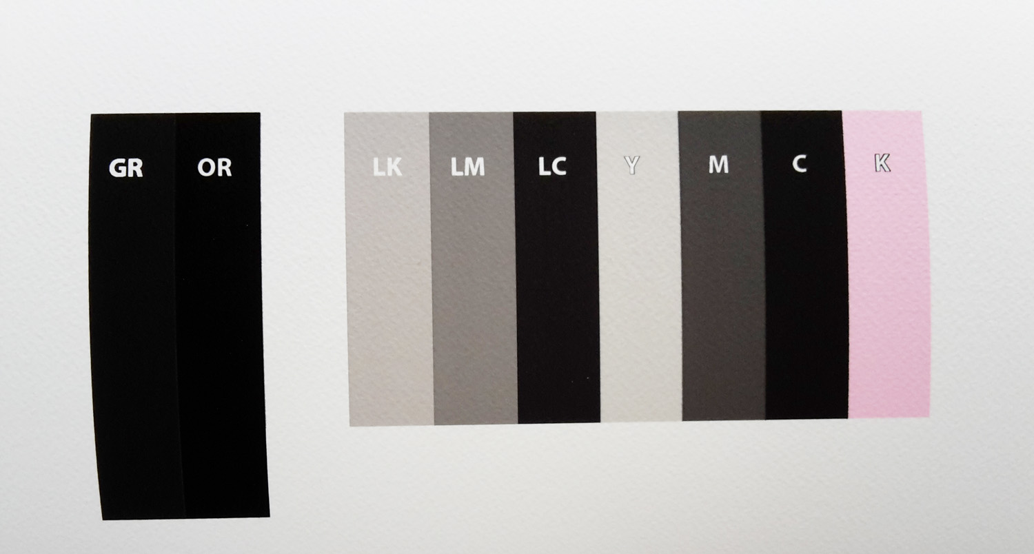
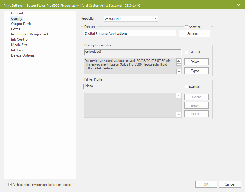
I have printed the 10 ink purge image from QTR in calibration mode with ink calibration on 100, 2880 dpi and unidirectional, I cropped it to save paper. I have attached a photo of it, it’s just a snap from my phone sorry. I printed it on Ilford Cotton Artist Textured, a warm paper with no OBAs. I scanned each patch in i1Profiler to check I’m not going crazy, these are the results. I get the same sort of results on all matte papers that I have tried. I haven’t made it to gloss properly yet.
When I set up the printer I did an initial fill with Piezoflush and let it sit for 48 hours, and then filled with the K7 inks and did an initial fill. I have since done another two initial fills with the inks after agitating the cartridges just to make sure there’s no settling. I have also cleaned the capping station.
Also, I think you should test QuadtoneRIP (most recent UltraHD-MK “UHD” master curve) against StudioPrint. It’s a different curve architecture and print/underprint system. It will most likely maximize your dMax down to L* 12.xx
Thanks for your feedback, sorry I couldn’t get back to you sooner.
First thing, I have already used up a bottle of each of shades 6 and 7 so I don’t know what their lot numbers are, however I have recently refilled them and the new lot numbers are #131223, on both shades.
I have done many nozzle checks and the K has not budged.
I did start out trying QTR, however because I have had to remap channels I could not get it to co-operate. No matter what I tried in changing the channels in the text files, it simply would not work. Because I could not get any further I can’t comment anymore about QTR.
StudioPrint allows us to easily remap channels and create new setups from scratch for any paper we choose, so for us in a lab environment it’s perfect as we can be completely independent. I can’t comment on the quality of QTR prints but we are getting deep blacks and excellent shadow rendition.
The instructions for remapping are there in >Applications>Piezography>Documentation>(the manual) as well as on this forum (in various threads).
You don’t move the # “Curve” headers. You move the 256 rows of numbers bellow the headers. Each header has to have 256 rows so if you want to X out a channel you put 256 0’s under the header.
I tried many times to remap the curves by shifting the numbers, not renaming the headers. I tried Wordpad and Notepad on PC and TextEdit on Mac, all to no avail. I also tried saving various ways in case I was introducing a formatting error. It was pretty painful and unsuccessful.
I’m really happy with the StudioPrint workflow and image quality, it’s just the warmth in the prints that I’m trying to fix.
Hi Brian, thanks for posting the link to your remapping spreadsheet. I did actually read through that thread a while ago while researching.
I am actually very happy using StudioPrint, it gives us the ability to set up any paper at all and do all our own linearizations completely independently. At this stage I have no intention of using QTR unless for some reason it is absolutely necessary.
Hi Walker, I’m interested to hear what you find with your testing. The use of selenium shades sounds interesting, I haven’t really looked into them to be honest.
The issue with that is I literally just topped up all our cartridges yesterday with neutral shades, so I have a 9900 chock full of neutral inks!
It’s a tricky situation, the prints are beautiful, just slightly different to what we had in mind, more a slight split tone. We are a lab and we are starting to show prints to our customers, we can’t really start swapping inks around.
It’s true that “neutral” is really what I like to refer to as a “European Neutral” the paper base of FORTE. This color is more stable perceptually in a “classic silver sense” than leaning towards the magenta/blue end. Epson and Canon “neutral” is just incredibly blue and magenta. I’ve actually introduced that kind of neutral (a much more subtle version) into the Pro inkset (of course you can then also choose which neutral you want with that set) because I’ve always personally leaned towards the more polar white end of the neutral spectrum instead of the classic silver yellow/green base-tone end.
I transitioned from a dual quad split (selenium and warm neutral) in my lab in Chicago to neutral K7. Right off the bat I noticed some optical “green/yellow” and the ink has been consistent ever since (12 years and counting now) and also our top seller. There’s a few reasons for this but the main reason is that this ink was built with Hahnemuhle Photo Rag v1 formulation (aka, HPR changed significantly over the years and this effected how the paper base white and ink interacts). There is never a way to make a perfectly neutral ink due to paper chemistry and viewing conditions. However, I suggest you mix your neutral 2:1 with selenium ink. This will get you much closer to where you need to go IMO.
In my own personal experience (as an IJM customer before working here) at first glance I didn’t like it (k7 neutral) when I was printing for customers. Then they started requesting it over the other ink-sets . . .
Thanks for all that info Walker, it makes sense to me. I too prefer the warmer side of neutral and understand that perfect neutrality is not realistic.
I have started setting up some gloss papers and the yellow tone is showing through much stronger on these, I’m getting b values up to 5. This looks too yellow really to use. Could it be a printer issue with some sort of remnant yellow ink contamination happening somewhere along the ink pipeline? Or do you think the selenium/neutral mix is the answer?
I won’t be able to reply for a few days, thanks again for your help.
I’m using a new in V15 Dithering called “Digital Printing Applications”, also known as Stochastic 3sf. I have tried Smooth Diffusion before and I prefer the new method.
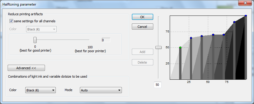
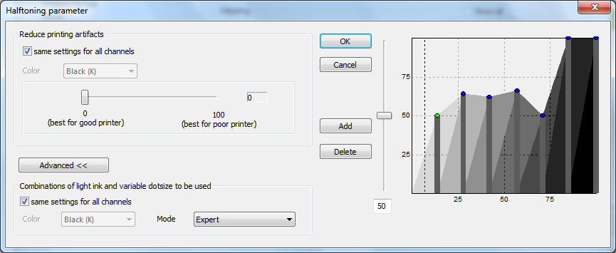
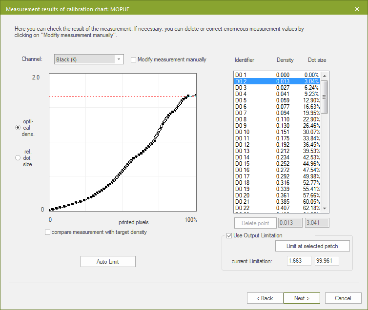
For both matte and gloss I am printing at 2880x1440 fixed small dot, unidirectional. See screenshot below.
I have done some testing and have set different halftoning parameters for gloss and matte that seem to be working well and giving me good linearizations.
This is my gloss setting.
Matte
These were set by printing the Ink Assignment Chart which prints 100% of each ink at the set resolution and dot size. I then measured the density of each with an i1Pro 2 and set the limits accordingly, also a bit of trial and error as well.
Below is a sample matte linearization. This paper doesn’t have the greatest Dmax, but you get the picture.
When printed on matte paper shades 2 and 3 have very similar L values but quite different ab values. I’m not sure if this is normal?
Example on Hahnemuhle Photo Rag
Shade 3: L 22.03 a 1.74 b -.72
Shade 2: L 21.21 a 0.99 b 0.9
Thanks for the screenshots. First off the bat, I assume the environment you have set is an unlocked monochrome only environment as by default 9900s are locked on SP . . . The ABs are supposed to be slightly different on neutral ink between the shades as the ink was developed for the underpainting of QTR (two inks overlapping together) + the surface chemistry of Hahnemuhle Photo Rag. This ink is actually meant to change color based on the surface chemistry of one paper vs another. On BFK Rives you will see a split tone from cool in the shadows to light in the highlights. On old Canson Baryta Photographique it will be a totally different color than Hahnemuhle Photo Rag Pearl, etc.
ErgoSoft V15 is actually an all new version of the program that combines the various versions, there is no longer StudioPrint, PosterPrint and TexPrint, just ErgoSoft RIP. In V15 many (all?) Epsons are now unlocked for individual ink channel control, dithering etc. So I am using a proper 9900 monochrome setup in ErgoSoft. We were already using it for several other machines so just needed to buy an additional licence.
You said QTR uses a different underlying curve architecture than ErgoSoft, can you recommend percentages to set for each shade in the ErgoSoft halftoning parameters to mimic QTR? Or is that too simplistic?
I understand what you are saying about the different paper types, I’ll do some more testing. So much to learn!
Sadly, ergosoft does not give full curve overlap control unlike QTR so it can’t really do the exact same thing. Instead Ergosoft does some more nifty 3-level dot control per channel and then does a lot LESS overlap than QTR does. There are benefits to Ergosoft’s approach but it makes any transitions from one ink to another very apparent.
Yesterday I tried again to do some prints through QTR to compare to ErgoSoft. Unfortunately I simply could not successfully remap the ink channels no matter what I tried.
I think we will just keep going with our current setup. The prints are quite spectacular, just not quite what we were originally expecting. Matte prints look great, it’s the yellowness in the gloss prints that has me worried. I’ll just keep testing I guess.
I have been thinking about mixing the light neutral inks with selenium like you suggested Walker, are you able to break down the selenium shades and whether they are warm or cool please? Ie, shade 7 is cool, 6 is warm, etc, or whatever it may be.
Also is there some sort of guide for mixing inks? I mean the actual practical hands on part. I don’t recall seeing anything apart from making sure you mix the same shades together. Sorry if that’s a stupid question!