Epson 3880 Nozzle Check with very light ink

I have an Epson 3880 with the K7 ink set. I was getting lighter than usual prints. I did a nozzle check and although there are no broken lines some of the lines you can hardly see. I have tried several different methods to clean the nozzles and head. The exit chambers on all carts are at least half full. Not sure which inks actually belong to each letter, could someone tell me which letter goes with a specific ink location. If ‘C’ is the GO than that being blank makes sense, but the others not sure why they are so light. Since there are no broken lines what might be the issue, bad carts. Any help is greatly appreciated.

NOZZEL check 3880

I printed this B&W test print and from what I see all is good. would you agree? Is there another test image that is better to use then this one.
IMG_20201110_095747378_HDR-3

Hi John,

This looks just fine. The light shades are indeed hardly visible as expected. Using your alphabetical channel labels, B is shade 6, C is GO (which is invisible), and H is shade 7. One little trick to help see the light shades better is to illuminate it with UV light. (I learned this several years ago for inspecting yellow ink which is always hard to see in the test pattern under normal light. It also helps with the lightest shades of Piezo inks.)

The full channel layout of the nozzle test pattern is as follows: (You can also find this in the Ink Position chart is the online Piezography manual.)

(Your letter designation = Epson OEM ink channel = Piezo K7 shade)

A = K = 1 (MK or PK)
B = LK = 6
C = LLK = GO
D = C = 2
E = M = 4
F = LC = 3
G = LM = 5
H = Y = 7

Prints coming out too light (or too dark) is most likely due to an error in the QTR setup, possibly printing at 1440 rather than 2880dpi, using the wrong quad curve, printing on the wrong side of the paper, using PK on matte paper, &c.

More complete details on exactly what you are doing including screenshots of all setup windows would be helpful for diagnosing the problem.

Cheers,
Keith

You could try this one: https://shop.inkjetmall.com/blog/ink-on-paper-blog-2/post/the-proof-of-piezography-1471

To my eyes this looks slightly light but also generally “linear” which is not the same as your monitor. If you want a quick (hint not labor intensive) screen to print match, print with an ICC profile “Piezography Matte Print” on matte paper on the Mac with Print-Tool (RelCol w/BPC rendering intent). Otherwise, Gray Gamma 2.2 color space in the file, no color management, and soft-roof with said profile in Photoshop with Preserve RGB #s ticked on to simulate the linear print method on your monitor which is what the above image looks like.

best,
Walker

Walker,

I have looked over the below information on linear and ICC printing, but have a few questions. I’m running a Windows 10 setup. Since my prints on screen did not match output I have the following work flow.

HW/SW used

  • Capture One 20 for my editing and might do final in Affinity Photo.
  • BenQ GW 2765, software calibration using Display Cal3.8 with a SpyderX Pro set at 6500K,90lux and 60 lux viewing
  • Epson 3880

Capture One 20

  • I set soft proof to Piezography Matte Softproff ICC
  • I use a custom curve I apply to the image as a first step based on target printed
  • I edit as needed then process the image with out the custom curve and with Phase One G2.2 ICC. This gives a darker image but once printed looks right or close.

QTR gui

  • I set the curve to the paper ICC I’m using Either HahnBamboo or CanRagPho310
  • I will print a 1/2 size hard proof for editing

Does this workflow look to one that should work?
Is not using a HW calibration monitor why i need to use a curve to get the right looking print?

Also thinking about getting a monitor with HW calibration like a BenQ SW271. Want to ensure I have a good work flow. Any help is greatly appreciated.

Thanks John

QTR on the PC only prints linear. There is no ICC option. So soft proof with preserve RGB numbers turned on always.

This should all be ok.

best
Walker

Ummmm … you can manually convert to an ICC in Photoshop or Affinity, save that as a duplicate file and print that.

One of the problems that @johnlist1962 is having is that he is using Affinity Photo rather than Photoshop. I bought a copy based on all the rave reviews to see if I might be able to stop paying the Adobe tax. The short answer is close but no cigar.

The longer answer is that it has a quirky way of soft-proofing which takes a bit of getting used to (in effect you have to add a soft-proofing layer) and there is NO “preserve numbers” option. So John won’t be able to follow your suggestion. This omission makes using the linear workflow in Affinity problematic, because you can’t soft-proof the linear workflow. Nor can you in Capture One, but then no RAW converter that I know of gives you that option, LR included.

But you can use the non-linear workflow in Affinity Photo. John should be able to export a duplicate of his image which has been converted to the ICC in question and print that via QTRGui. He should also be able to do that from Capture One (I just did this myself recently). I am happy to provide tips on either, although I don’t profess to be an Affinity Photo expert.

On the linear vs non-linear workflow, see this recent Piezography blog post:

(As a personal aside, this blog post IMHO represets a major shift by IJM. Some time ago, before Walker’s arrival at IJM, there was a lot of hostility to the non-linear workflow. Part of the reason for the shift was no doubt the development of alternative ICCs that do less damage to the deep shadows. I need to rewrite my own blog post on this topic to reflect and acknowledge this shift.)

If you want to use the linear workflow, then it’s hard to do so without Photoshop.

For the sake of completeness, the other problem with Affinity Photo I found was file format compatibility. It isn’t all that good in reading in layered TIFFs, which apparently are an Adobe Proprietary format. Surprisingly, it does somewhat better with PSDs. It has it’s own proprietary file format - .afphoto - for saving layered edits, which few if any other programs can read. So anyone with a back catalogue of layered TIFFs will find it very hard to ditch Photoshop.

@Brian_S , I use Capture one for my B&W because of the powerful color tools that it has along with masking by color or level. So only way to have a full linear workflow is to incorporate Photoshop. Have any tips for using Capture one as my output software. email johnlist1962@gmail.com
Thanks John

@johnlist1962 - I’ll reply here rather than by email as I think it’s on-topic to the linear vs non-linear issue, and it gives others the opportunity to correct anything I get wrong. (We are straying a long way from the title of this thread, and @IJM_TechSupport may wish to break this discussion off into another thread.)

My comments relate to Output tool tab in C1 V20, and specifically the ICC Profile field In the Process Recipe tool. The Output tool tab is unchanged in the soon-to-be-released V21 (currently in beta) but there are slight UI changes since the last version (V12).

For the linear workflow you set the ICC profile field to either Grey Gamma 2.2 (Phase One Gray 2.2) or AdobeRGB. For black and white, AdobeRGB is essentially an RGB version of Grey Gamma 2.2. This workflow may require you to re-edit the image in Photoshop once you see it under a preserve numbers soft-proof, as the image will probably appear less dark and contrasty than it did in C1, especially in the shadows. Not completely re-edit, and perhaps not a lot, but to some extent. Why use this workflow? Because it encourages you to preserve shadow detail. And once re-edited, if that proves necessary, you can simply print the image in QTRGui.

For the non-linear workflow, in the C1 ICC Profile field you specify the ICC you wish to proof and print with, and the exported image will be converted to this ICC. Then you can just print it via QTRGui. You can still soft-proof it in Photoshop or Affinity if you like. In Photoshop the preserve numbers soft-proofing option won’t make much difference on or off, the only real difference you’ll see is from the simulate black ink and paper colour soft-proofing options, which I don’t think Affinity has, IIRC.

Soft-proofing in C1 can be confusing. I’m not going to attempt to fully describe it here. The simplest approach is to soft-proof in C1 by selecting the output recipe with the ICC. If you create a recipe with your QTR profile specified then you should see a full soft-proof if you select that recipe. Depending on other settings, you may also need to have Enable Recipe Proofing enabled under the View menu. However there aren’t any other soft-proofing options that you can choose from. From what I can tell, Simulate Black Ink and Paper Colour are always enabled - you can’t turn them off (unlike in LR). But at least you can edit the image while soft-proofing the non-linear workflow, and then export an image with an embedded ICC which you can then print in QTRGui.

This is longer than I intended. Hope it’s clear.

@Brian_S Thank you for your detailed input. Here is my work flow I came up with, not sure how valid it is.

I imported the Piezography 51 step target for Spyder into C1
I soft proof using the Piezography Matte profile
I then make a curve so that each of the 51 blocks is the value it should be, ie 0, 5, 10 etc
I then change to the gamma 2.2 profile when I process for output as a 8bit TIFF (output with Piezo Matte ICC looked better, deeper blacks)
I than open QTR gui choose the paper profile and Image then print

Not sure if this is anywhere near right, but the print does look very close to the screen. I have screen shots if needed.

Thanks John

@johnlist1962 - I don’t know, I really don’t. Probably because I don’t understand. Never seen this workflow before.

At one level, if it works and you get a good screen to print match then well and good. But if it were me I’d want to understand why it worked and be confident that it was repeatable.

In that Piezography post by Jon Cone linked to above, there’s a plot of the impact of applying various sorts of ICCs. For monochrome, using either a QTR-generated ICC or one from IJM’s Piezography Pro Edition (PPE) software is equivalent to applying a curve for printing. It has the same effect. So using a curve is an alternative. In fact, it opens up a range of options. Rather than the all-or-nothing of using an ICC or not, you can use 50% of it, and can even design your own curve. But this only really makes sense in Photoshop with a preserve numbers soft proof, because only then can you see the impact of printing with the curve and no ICC conversion.

I have a hunch that what you’re doing is working because you are in effect doing something like this. I have no idea how the 51 step is helping you specify the curve. Photoshop preserve numbers soft-proofing is a much better way to do this.

@Brian_S Let me see if I can explain how the 51 step wedge step is helping me build a curve. In theory each step will increment by an RBG value of 5. So the darkest wedge should be 0 then next to that 5, then 10 and so on till you get to 255. When you view the 51 step wedge with the AdobeRGB profile all the wedges have the correct RGB numbers. But when soft proof with the Piezography matte ICC profile the numbers change. Now to get the RGB numbers back to there respective real values I apply a custom curve that will make each wedge the RGB value it should be as it was before soft proofing. Then when I process in C1 I leave the custom curve and use the Piezography matte ICC as i did with soft proofing. When the 51 step wedge prints out it looks like the screen with the custom curve. In theory this sounds right, but not sure.

Thanks John

@johnlist1962 - I tried to follow this workflow. Wasn’t easy, because C1 doesn’t seem to like the Piezography step charts.

That’s what’s supposed to happen. That was the precise point of that Jon Cone blog post. Using an ICC is equivalent to using a curve that darkens the image, particularly in the shadows. The C1 histogram shows you the impact of the ICC on the histogram when soft-proofing via a process recipe, something that Adobe s/w doesn’t do in its soft-proofing.

Why don’t you post a screen grab of that curve? Not the entire screen, just the curves tool tab. Because what I assume that curve is doing is completely offsetting the effect of the ICC.

So by using the curve and completely offsetting it, the net effect is that you’re not using it at all. Effectively you’re using the linear workflow.

And your prints match the monitor because you’re soft-proofing with the ICC and printing with that ICC.

I guess it’s one way of working. Certainly novel.

@Brian_S After looking deeper, thinking about my work flow and reading more I have come to realize that my work flow off. I was proofing with the Piezography Matte Selenium ICC than on process export from C1 I was changing the ICC profile to Phase one Gray G2.2, and some times applying a curve. As you can guess the curve changed and the print changed from what I saw on screen when editing. Now I have the Rendering Intent set to Perceptual, the proofing and output set to Piezography Matte Selenium ICC. I’m using Perceptual Rendering Intent so that the blacks are not blocked up. If I have an image that needs more deep blacks than I change the Rendering Intent to Relative Colorimetric. Thanks for all the help

Thanks
John

@Brian_S I saw your reply to this https://community.inkjetmall.com/t/resampling-vs-scaling/1552/8

I know you use Capture One also. I out put my files from C1 at 360 dpi and print using QTR gui. Do you think this is best or out put from C1 at 360 DPI then use QIMAGE to resample to 720dpi and print using QTR qui.

Thanks
John

@johnlist1962 John , the question you’ve asked is one of the more vexed digital phototography questions. I’ll PM you a blog article I’ve written on this topic.

The short answer is that, despite what others may have said, Roy Harrington has said that QTR expects 720 pixels per inch, and if it doesn’t get it then the image gets resized to 720ppi. On Win it’s QTR that does the resizing, and I think that Roy has said bicubic is used. On Mac the resizing is done eslewhere.

So if your image is not at 720ppi, you have two choices - you can up or downscale it yourself, or let QTR do it for you. Does it make a difference? Opinion varies. Maybe a little. Hard to see. IMHO this level of detail enhancement does not make much of a difference to whether or not you have a good print of a good image, unless perhaps it’s a mega print of a highly detailed scene, but quasi-religious wars have been fought over it nonetheless.

As to C1, the answer depends on whether you’re going straight to print or via a pixel editor like Photoshop or Affinity, or perhaps via printing software like Qimage. If you’re going via other software, then it probably doesn’t matter. You’d set the C1 output scale to fixed 100% and the resolution setting is just setting an information field for other software to interpret, it doesn’t do anything to the number of pixels in the exported image. You’d set print size and resolution (ppi) for printing in the other software.

If you’re going to print direct from C1, i.e. export a TIFF that you then print via QTRGui, then you’re back at the previous para, do you get C1 to up or downscale your image to your chosen print size at 720ppi, or do you just set the print size in C1 and let QTR scale to an input resolution of 720ppi? Your choice. Perhaps try both and see if you can detect a difference, and let us know.

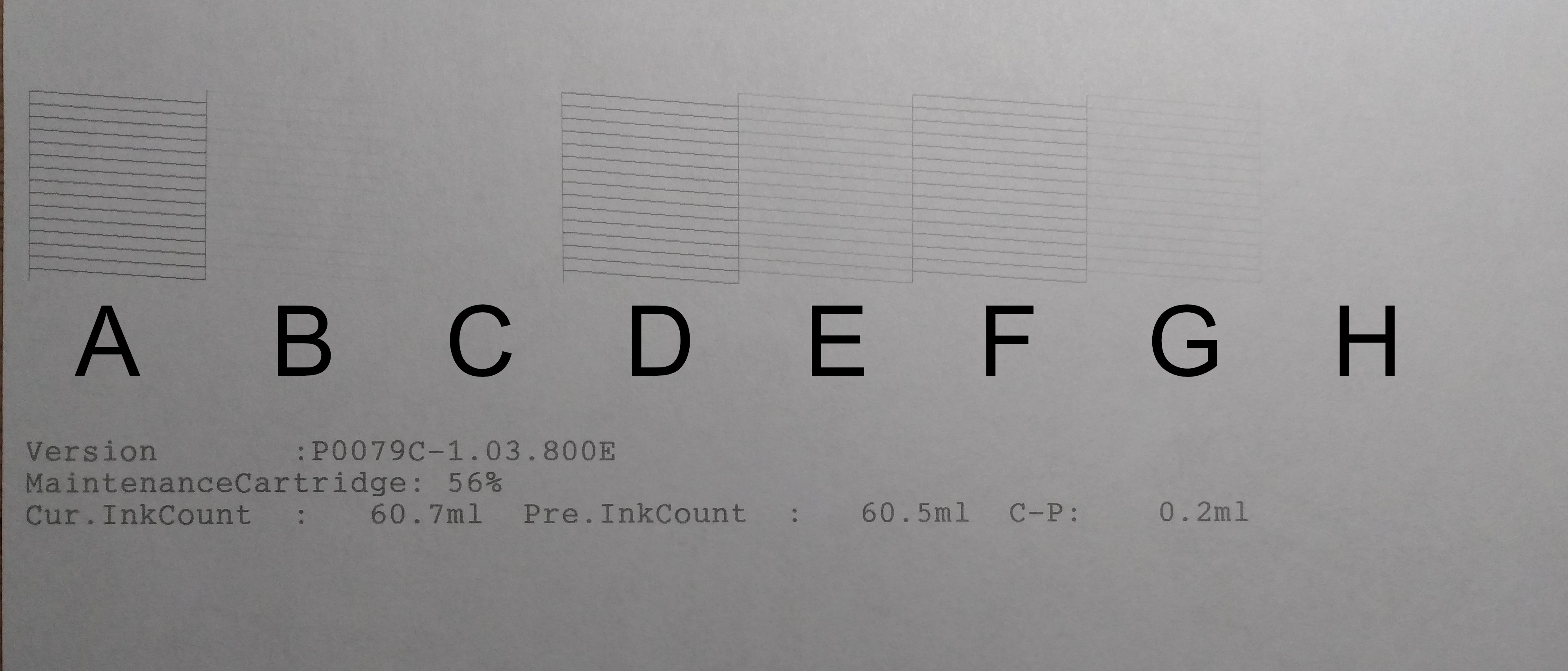
Note: while people often use dpi when talking about digital image files, it’s not strictly correct, which is why I’ve carefully stuck to ppi. Digital files have pixels, hence ppi. Printers lay down dots at resolutions like 720 1440, 2880 hence dpi. QTRGui’s output resolutions are 720dpi, 1440dpi, 2880dpi, but it expects an input resolution of 720ppi.

@Brian_S I have conducted a little experiment of my own. I took an image from my Fuji Xpro2 that is 10.5 square at 360 DPI and processed and printed 5 different ways. I used an Epson 3880 with the Piezography Selenium K7 ink set on Canson Infinity Rag Photographique 310, 17x22 in paper. Programs used were Capture One 20 Pro,Qimage Ultimate and QTR gui as I’m on a Windows 10 PC.

My goal was to upscale a 10.5 x10.5 @360 to 16x16 in print. This I felt was taking the abilities of the software and printing to the max. The photo I used was a picture of a snowy day with a park bench smooth snow in front of the bench with some light shadows and lots of trees with branches behind the bench.

I observed the prints sitting on a table with 3 large windows, prints stacked one on top the other with 6 in showing from each. Over all the prints looked the same from 3 feet, but one thing that you could see was the difference in gradations of the snow shadows. Also the sharpness of Qimage could be seen at 3 ft. When looked at with a loupe I could see the increased contract when Qimage was used because of the sharpening. This allowed more depth into the deep shadows. I could not defect any added noise or artifacts. Below in order from best to worst are the pictures and process used. From this I will output from C1 @360 DPI close to or the exact size print I want and use Qimage to Print sharpen and upres to 720 DPI as I do see a difference.

Here are my results from best to worst.

  1. C1 16x16 @ 360DPI/Qimage 720 DPI, Interpol-Fusion, Sharpen 5
  2. C1 12x12 @ 360DPI/Qimage 16 x16 @720 DPI, Interpol-Fusion, Sharpen 5
  3. C1 16x16 @ 360DPI
  4. C1 16x16 @ 238DPI
  5. C1 10.5x10.5 @ 360DPI/Qimage 16 x16 @720 DPI, Interpol-Fusion, Sharpen 5

Also when I took a C1 10.5x10.5 @ 360DPI/Qimage 12 x12 @720 DPI, Interpol-Fusion, Sharpen 5. The image was better in all ways from a straight C1 image, better sharpness, more depth in deep shadows.

Thanks
John

@johnlist1962 - It’s been a while since I tried to assess the benefits of Qimage’s much-vaunted upscaling algorithms, but my recollection is that it was difficult to get an apples-with-apples comparison because of the confounding effect of Qimage’s much-vaunted print sharpening algorithms. As always, the best approach is to find a workflow that consistently produces pleasing results and stick with it. Just be careful of over-sharpening. There’s a risk of printing images that initially appeal, but later when you come back you find them harsh because they’re over-sharpened.

I’ve had the same WF-3640 problem — it was blocked by a lack of use. I hope that this works with your printer, turn off the printer, check the nozzle, go to the spool folder of your printing machine - a file with the command sent to the printer for nozzle testing should be sent. Copy the file to a separate location. Send a job to the printer with ‘nozzle check order.’ Plan the task every couple of days.

It’ll cost you a little page, turn it around, turn it over, who cares about it, if you write about the pattern of the punching…

The cleaning process can use less tint.

I actually had two 3640’s. The first one died and wouldn’t print any ink - took it back to Costco and got another one. 14 months later the second one died with an Error 0x97. Back it went. I’m currently looking for another printer. As much as I really likes the Epson, I won’t get another one.