I have just printed my first print using the Piezography system. I can tell that this is going to be fun.
I have a print that was printed for me at Cone Editions Studio that I’m trying to replicate on my
7900. The print had listed the ink blends that were used, so I copied these. I used LRoom to process
the image, but that is where the image came from that I sent to CES. I set mine to TIFF with the
embedded profile of AdobeRGB (1998)–I understand that this profile is 16 bit with a gamma of 2.2
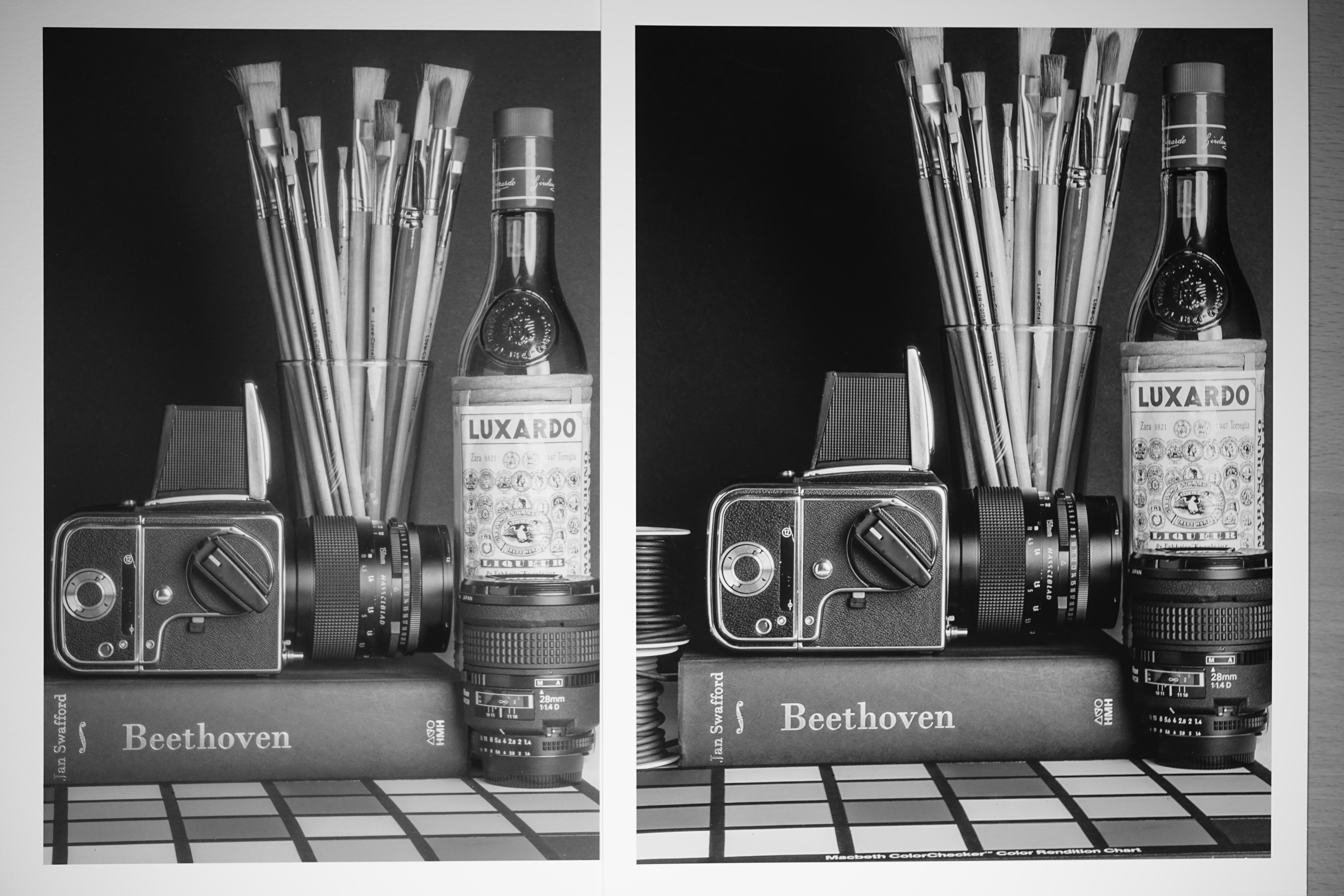
Below is a shot of the two prints side by side. The CES print pops off of the page and has a real depth to it.
Mine is flat and muddy, and that is being optimistic. I was unable to use all of the channels on my 7900, so
I lost two tints of the Pro ink set–the lightest shades.
This looks nothing like it does on my monitor, and it is calibrated (ColorMunki, iMac 27"). I get great
results with my color 7900 from monitor to print, but not using this system.
I would like to know what steps to take so that I can get the same results that are achieved at CES.
Do I need a dedicated monitor? Do I need a better colorimeter? Do I need the Pro edition tools?
So I need to start using Photoshop?
I should be able to get the same results as CES using the same equipment and inks? Correct?
Thank you, Daniel
We used an ICC to print the Cone Editions print. The one on the left is a linear print.
Linear printing gives way more control over shadow and highlights detail but it requires one to soft-proof with any of the matte piezo softproof ICCs (installed on your computer already most likely) using “preserve RGB numbers” in Photoshop to see this linear effect on your monitor. It then requires an extra step (an adjustment curve) to bring the image back into good contrast. This extra soft-proof and adjustment step gives you much more control over shadows and highlights but is also more work especially if you initially imaged the photo without softproofing.
This is documented in the manual + there are many posts on this forum as well as at https://inkjetmall.com/blog and elsewhere about linear printing vs icc printing. In general we have always gone the harder route (left print) due to it’s better shadow control but I don’t always recommend this option if you simply need to match a print to your screen without soft-proofing.
Print with these profiles in Relative Colorimetric (with Black Point Compensation) mode to get the effect on the right.
Piezography-Matte.icc.zip (1.9 MB)
Piezography-Gloss.icc.zip (1.9 MB)
I’ll read about the two different methods. Can I achieve the print on the right using the linear method?
And can I do linear printing in LR? or Capture One? These profiles, are they printer profiles? or paper
profiles?
Daniel
You can achieve the result on the right using linear method but you will need to use an adjustment curve and soft-proof in Photoshop. Photoshop is the only program that allows you to preview in “Preserve RGB Numbers” mode (aka, Linear mode).
Yes, LR and CaptureOne should allow you to set AdobeRBG 1998 as your output profile. This will result in a Linear output with QuadtoneRIP. Simply setting “printer manages color” does not create a linear output.
The profiles above are “universal printing profiles” and will work for any matte or gloss paper (respectively) that has been linearized. That said, your pro ink curves are already linear so these ICCs will work.
best
Walker
This worked so that I could get the same result as Cone Editions produced. I’m happy. I will look more into
the linear method later, once I get used to the other.
Thank you, Daniel
1 Like
Restart print-tool. Then at the bottom right select Print-Tool Managed and then select your ICC and then select Relative Intent w/BPC
best,
Walker
I’ve put these in Library/ColorSync/Profiles
At which step of the process do I choose the ICC profile? I don’t recall seeing this option in PrintTool.
Daniel