Viewing light brightness

I’m setting up my P800 / PiezoPro system and am down to the last variable, a viewing light for the print.

I do not have a viewing booth, but a dimmable LED light with a CRI of 96 and variable color temp. This is a small unit for cinema production and it is very color accurate.
I have built a small booth covered in neutral gray paper that is similar in tone to a Kodak gray card.

Now I need to determine just how bright my viewing light should be, i.e. how many lux should fall on the print? I have a calibrated Sekonic lightmeter that can measure lux, EV, foot-candles etc.

Can you please point me to some documentation that explains how I determine how bright my viewing light should be?

If my monitor is set to 85 cd/m2, how many lux should fall on my paper?

Below you can see all information pertinent to my setup.

Thanks

Room

White walls
Dim with windows covered by neutral colored blinds

Printer / Paper

Epson P800 / Piezo Pro Glossy
Hahnemühle Photo Glossy Baryta 320

Display
NEC MultiSync PA271Q 27" with SpectraView II Color Calibration

Colorspace: AdobeRGB
Gamma 2.20
Brightness 85 cd/m2
Whitepoint temperature 5000k
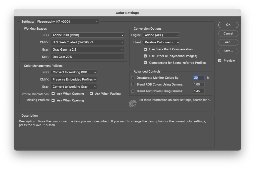
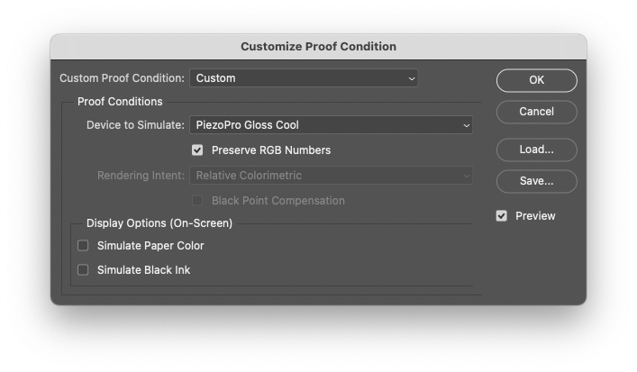
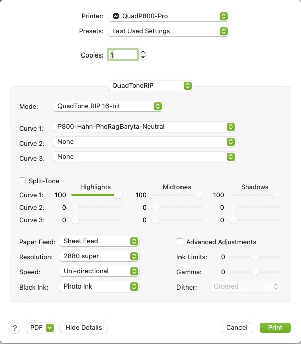
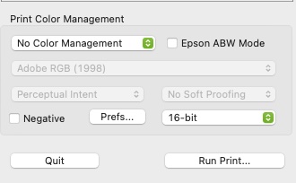
Software Settings

Adobe_colorSettings

Proof

PrintTool

PrintTool02

you need to change it to Piezography Gloss Print for your linear soft-proof ICC.

otherwise all is pretty good although you probably need to adjust the brightness of either/or your monitor and booth to visually match the image and print.

-Walker

Ok, that helped. Now the proof looks neutral in color, instead of magenta. brightness looks the same.

Now here is a question.

I got my light setup and dialed in.

I have 500 lux falling on my print in my booth (as measured by my Sekonic incident meter)
That visually matches my calibrated NEC MultiSync PA271Q set to AdobeRGB @ 85 cd/m2 / 5000k very closely. (with soft proof turned on in PS)

Now here is an interesting observation.

It turns out that a reading of 500 lux (incident) falling on my print is the equivalent of shooting Tri-X @ 400 and 1/60 f2.8. That is the same exposure setting I have noticed in many museums around he world, like the Getty Center etc. It also happens to be the average illumination level I have encountered in pretty much every commercial office building, store or mall I have ever been in.

This brings up an interesting point.

So, now I have the monitor and review light (booth) matching.

But how does that light level of 500 lux compare to common light levels in the real world?

If we use a museum etc as a baseline and they mostly operate under the 500 lux rule, then my print would look as expected, when viewed under those lighting conditions.

I wonder if galleries strive for a similar level of illumination? Is 500 lux (incident) an architectural standard for your average interior lighting level?

There may be something to that because over the years I have noticed that exposing at 400asa and 1/60th @ 2.8 is a very common light level in many commercial buildings. That is the equivalent of 500 lux.

The print and monitor matching is one thing. But It almost sounds like judging your print under what is the architectural standard for average light level is of paramount importance. Is that figure 500 lux? From what I know a GTI viewing booth is,… 500 lux. Is 500 lux the baseline illumination level that the entire print industry judges prints under?

Am I making any sense here?