I just want to double check that I am using the correct Piezography curve.
My 3800 is configured with SPED (position/ink): MK/MK-NU1, PK/WN1, LK/NU6, LLK/GO, C/C2, M/SPED4, LC/SPED3, LM/SED5, Y/NU7
I am printing on HFA Photo Rag.
I have made test prints with the following Piezography curves:
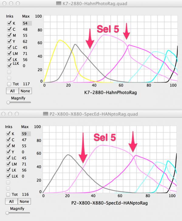
K7-2880-HahnPhotoRag (Note that this does not indicate which ink set. In fact none of my installed K7 piezography curves indicate the ink set.)
P2-X800-X880-SpecEd-HANptoRag (While this does indicate ink set it also is for a P2 configuration and I believe I have my 3800 setup as a K7 system.)
I do notice a difference in the test prints. The K7 print is slightly warmer (with more carbon). The P2 print is cooler (more silvery / selenium like).
The P2 curve only uses shades 1-6 and it redistributes the use of these shades more broadly than does the K7 curve. We did not design P2 curves to be used with K7 installations but there is no reason why they can not be used because they share the same ink positions from 1-6 when using matte curves.
Having said that, P2 glossy media curves will NOT work in a K7 installation because the K7 is using lightest shade 7 in the yellow position while P2 is using Photo Black in the yellow position.
The Selenium shade 5 with the P2 curve is being used more in the mid-tones than it is in the K7 curve…
see attached
Thanks for the quick reply. I should have remembered to use the QTR Curve View to look at the curves. But…, can you refresh my memory on how to read them (or point me to one of your excellent “white papers” on the subject)? In particular what does the “max” value represent and how to interpret the blending of the various shades? I went back and looked at various K7 HFA Photo Rag curves I have in my QTR folder. While there are duplicates there are also unique curves (the difference being the printer model listed — although I did read your article on which printer families are compatible curve wise). So I suspect that these were made for customers and overtime migrated their way into the open library of curves? And I suspect that the difference could be the printer / paper / ink lot variations?
Version galore… We make a lot of curves… we release some! I think I gave you a stick of curves at the workshop in Santa Fe and they are probably not release - could be different than release. Maybe you have downloaded the release since and you have multiple copies. Also we did not differentiate so much in the available documentation of the curves as we first began releasing them to Roy Harrington. And there just are different version sets…that I travel with - and who knows what I brought to Santa Fe!
So here is curve diagramed out…
“Max” is total percentage of ink of a particular shade (or color). Although I would never do it (because the ink will pool and run off the paper) if this is set to a value such as 65536, that would in theory allow that print channel to express as much ink out as it is possible for that ink channel to express - the 100% amount of ink.
The crossover points are where the curves intersect. They slope from off (left) to the right when looked at in QTR Curve preview on Mac OS. The ink begins in each curve at the furthest-most curve point to the left and as more density is required it moves up and to the right. When the ink begins to trail off the curve moves lower and continues to the right until it is 0% (off). In a Piezography curve, there is much blending because the curves have long tails. At 80% grayscale density you can see that 80% gray would be printed by:
.05% shade 6
40% shade 5
44% shade 4
40% shade 3
1.25% shade 2
80% is a particularly beautiful Piezography tone of gray, and one accumulated from 5 inks. So split-toning by ink channel takes a lot into consideration and is why we did some custom blending at the Santa Fe workshops.
So when you made the original (existing) K7 curves there was no thinking (or perhaps they did not exist yet) of the different ink sets only paper? For example the K7-2880-HahnPhotoRag curve in our example above what ink set was used? Have you ever tested (I am sure you or Dana have ) the four ink sets on the same paper with the same K7 curve? How are they different visually? Have you ever made K7 curves for different inks (e.g. Carbon and SPED )?
7 are more universal than 6. 7 inks blend so much that they work well the slight variations in L from one ink set to the other. With 6 it is less forgiving so we make individual libraries.
The ideal would be to custom profile the ink set and your print head. But K7 is very forgiving. Yes there will be variations from ink set to ink set - but only if you are running both at a time would you notice… (we think). With P2 (K6) we made the decision to offer five different curves sets for the five different ink sets…
 We make a lot of curves… we release some! I think I gave you a stick of curves at the workshop in Santa Fe and they are probably not release - could be different than release. Maybe you have downloaded the release since and you have multiple copies. Also we did not differentiate so much in the available documentation of the curves as we first began releasing them to Roy Harrington. And there just are different version sets…that I travel with - and who knows what I brought to Santa Fe!