Walker,
I wanted to respond here because I could see there were some nerves being struck and I didn’t want to aggravate them further.
Walker’s response:
“ABW curves are not linear. This is actually on purpose because epson is doing their best to match poorly constructed displays unable to match gamma 2.2 and the low contrast ratio required.”
If the ABW curve was designed purely to match poorly constructed displays, it’s doing a really bad job of even that. I took two pictures with my new Coolpix A in macro mode so I could see how QTR was handling the image differently from ABW.
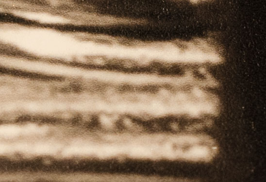
Here is the ABW print:
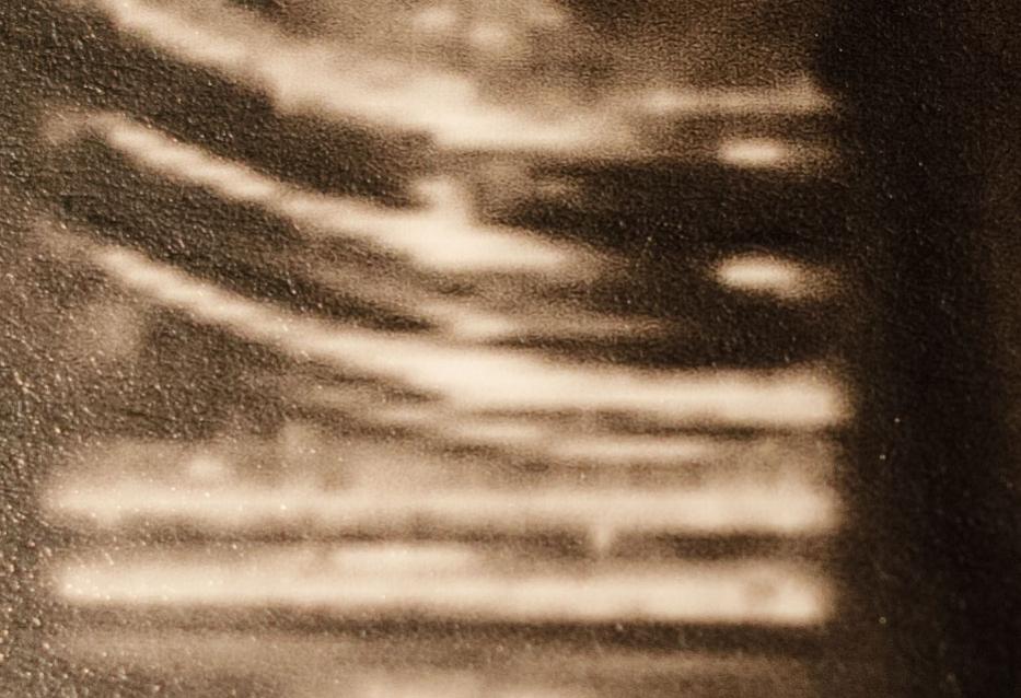
Here is the QTR print of the exact same file (The top one was cropped a little more. The equivalent crop on the one below would be from the lower right corner. Yes, these came from the same file.)
The QTR prints the image as is. The only problem is soft proofing to get the brightness correct. There is no canned rgb soft proofing icc that will do this accurately, hence why I started the other thread. Other than that, the general graduations of shading on my screen (and I have one of those “cheap LED” screens) shows up in my print. What appears “soft” on screen, appears as soft on the QTR print.
The ABW print converted all the deep-mid shades to either dark deep shades or light shades. The effect of this was to create sharper edges, which had the effect of “focussing” the edges. If the non linearity of the ABW print was to match my “poorly constructed display” (I’m not denying that, BTW), the print certainly did NOT match my display. My display image was softer than the ABW print. ABW is taking my image editing control waaaaay out of my hands.
From a normal viewing distance, the ABW print doesn’t look all that bad. But, if I’m intending something to have soft transitions, it’s going to look really bad.
(Can you tell I’m a convert to QTR now?.. If Epson offers a smokin’ deal on an R2880, I don’t think I’ll be able to resist the urge to jump into piezo!) So Walker, if you have any push or shove with Epson Canada to get them to offer me a deal I can’t pass up…
Brian has generously taken my images and processed them to make equivalently toned ABW and piezography prints for me to compare. Apparently he’s done a couple of “tricks” to produce a more linear print using ABW, I think. I’ll have to reread his e-mail, but I think it involves saving the file with a profile that offsets the non-linearity of the ABW print. Depending on how the images compare with my QTR prints, I may pull the trigger sooner or later. Given the detail that even QTR reveals (I’m sure that piezo reveals even more), I’ll have to refine my shooting and processing abilities even more.
I too was intrigued by Walker’s suggestion that the non-linearity that ABW exhibits was intended to compensate for poor quality screens. I’ve posted a linearity checker plot for ABW on EEM here on IJM before and there’s a significant contrast boost compared to linear that looks to be intentional, so that fits. However the same plot for a semi-gloss paper shows ABW to be much lighter across the range, which I don’t think fits, as most screens are set too bright for print. I don’t understand the rationale at all.
To be clear, I’ve taken the image that Larry is using as a test image, and printed it using Piezography (P2/K6), QTR-K3-OEM and ABW. I’ve done this on a matte paper and a semi-gloss. The P2 & QTR-K3-OEM prints are tonality-matched by virtue of the fact that the QTR curves are linear. The ABW prints are different because it’s not linear.
To enable Larry to make an apples-with-apples comparison of all three B&W printing approaches, I’ve reprinted the ABW version with a curve applied in Photoshop that corrects for the non-linearity of ABW, so that its overall tonality matches the other two prints, and so you can compare it more precisely to P2/K6 & QTR-K3-OEM. [I have a spreadsheet that takes the numbers in a linearisation check, inverts them, expands the range from (dmin,dmax) to (0,100) and gives me the points to use in a Photoshop curve. A technique I sometimes used before the advent of the relinearisation droplet.]
I’ve also printed the image using P2/K6 with a Photoshop curve applied that mimics the non-linearity of ABW, as another way to get the two printing approaches closer, to enable a fairer comparison.
The matched prints are not exact, as despite my best efforts and my spreadsheet and my relinearised QTR curves, it’s still an approximate match, and the three printing approaches render neutral quite differently, ABW being noticeably cool. But I think they’re as close as they can reasonably be made to be, and hopefully will assist Larry to make an informed choice.
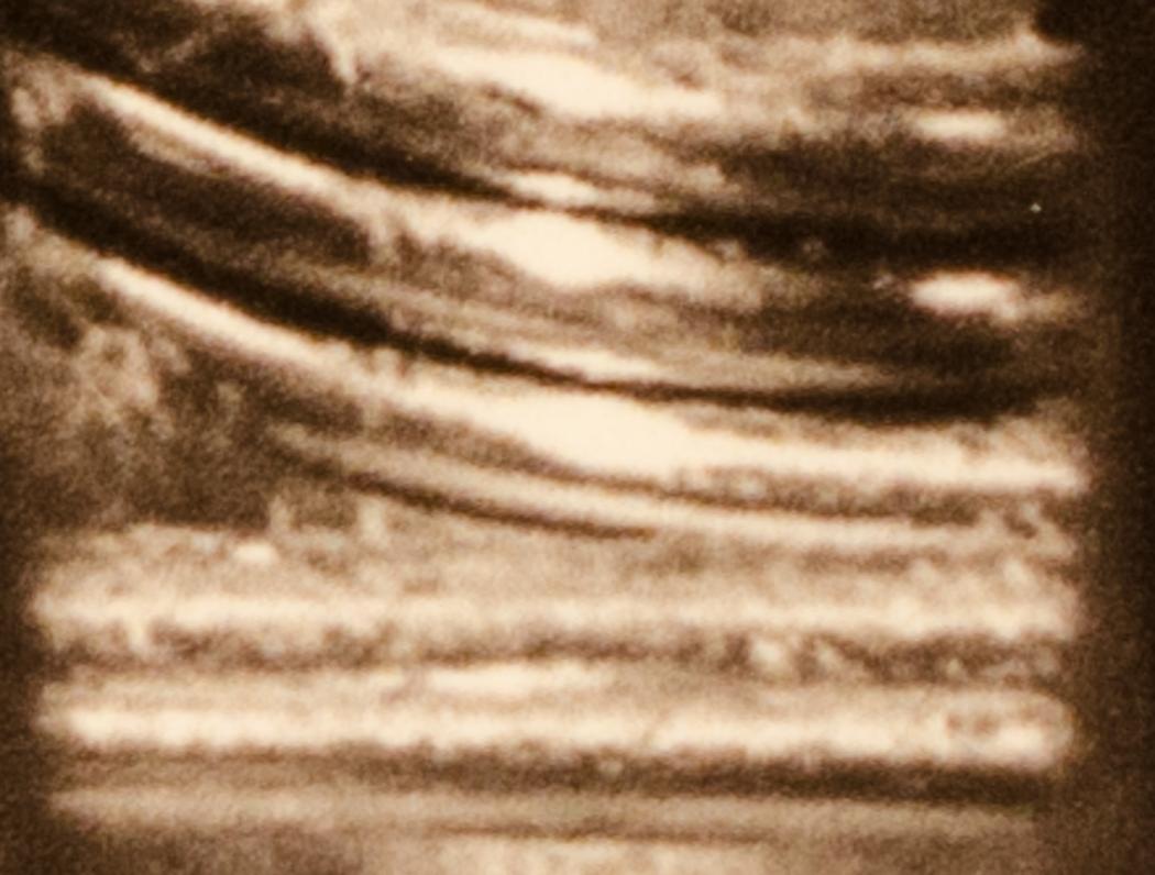
I looked up the one piezo print I had done, and the ABW print done on the same kind of paper. I took a macro picture using my Coolpix A and cropped a small section. Interesting results:
First the ABW print. It’s not unlike my ABW print. Sharp changes in contrast from darks to lights.
Here’s the Piezo print. The edges aren’t as smooth as the QTR K3 print. It’s definitely the most “real” looking image at this level of cropping.
I’ve never seen these differences before, even online, so I thought I’d share them here.
Larry
This is a very good example of the “virtual acuity” increase that you get from ABW even though the Piezography system has 3 times the resolution and can actually resolve much finer details. (And why I’ve spend so many years going nuts for piezo.)
Brian has spent a lot of time preparing his ABW version of my print to best match the piezography print. l look forwards to comparing them.
I now better understand why piezo works better for larger prints. It needs to be large enough to draw you from a distance, and as you get closer you become aware of more subtleties. l hope, for the sake of piezography, you’ll be able to crack the large format Surecolor printers. (There should be some kid in Russia that could do this for you?)
Larry.
Not that much time. Doing this by trial and error would be tedious. It’s not that hard to do with a spreadsheet that takes the linearisation result from QTR-Linearize-Data.exe and constructs a Photoshop curve that offsets any non-linearity. It may not be 100.00% exact, but by golly it’s close.
I wanted to add something about the comparisons of the three prints. I just put on my display the original TIFF (not colour managed, because LR won’t resolve images at that high magnification) at an equivalent magnification as the three crops I’ve posted. The only image that is TRUE to the image is the piezography print. What this means is that what editing you do really, truely shows up in the print.
Here’s what seems to be happening in ABW, and probably a result of deep shadow crunching and highlight blowing. Beside a deep shadow there may be a dark-mid-tone. The ABW prints it as a mid-tone. All the relative tones seem off, creating harsher edges that I would want. I did not sharpen the image this way, this is what the techs at Epson want. They are playing artist!
The QTR-K3 print is more interesting, and the effects may be more my fault than QTR. I thought the smooth edges were really there until I looked at the digital image again. However, when I produced this print, I was playing with tone blending. I used 75% cool ilford for highlights, 75% neutral for midtones, and 75% warm for deep shadows. I suspect my actions here caused the tones along the edges to be “averaged”, smoothing the edge lines.
EDIT:
I found my QTR neutral on Ilford paper. The ink and shading was much more similar to that of the piezography print. That is to be expected because both piezography uses QTR, but without curve blending. The edges were not smoothened out like they were in the other QTR print where 3 curves were blended. This may be a warning to those using QTR K3… If you blend curves, it seems to mess with the ink layout quite a bit!
What my camera does not pick up is the dithering and colour inks added in the QTR K3 print. Piezography obviously excells in this regard.
Bottom line is:
ABW seems to be the worst way to print. It just doesn’t print what you’ve worked so hard to produce.