One question I have regarding printing procedure which I can’t seem to find a clear answer on is when printing out of Photoshop (cs6) in OSX do I:
select “Printer manages color” in PS and then select “QTR” under the color management tab in the print driver? (This is what I’ve been doing, generally successfully, though the prints are rather heavy/dark, especially in the upper mids and highlights when compared to what I’m seeing on my panel)
or select "Photoshop manages color and turn off color management in the printer driver? (And if this is the case, do I use the softproofing profiles as the profiles, Perceputal conversion, black point on?)
I appreciate your thoughts, since this isn’t covered very clearly in the PDF manual.
Dana, okay, so I printed an image with the QTR tool, following the instructions. 2.2 gamma in, no color management, picked the right curve…pretty straight forward. The image looks good in the tool on the screen. But the print is really low contrast though, as in the blacks aren’t there: looks more like shade 3 then shade 2 or 1…
As a test I printed the same image out of photoshop like I was previously doing and it was much better, or much more in line with what I’m seeing on the screen.
Thoughts?
If the QTR tool is the right way to do it I’d prefer to figure it out.
Well, let’s rule out possible causes of your flat output:
First, let’s check your print settings- you can email me screen captures to review your settings in both the QTR Print Tool and QuadTone RIP windows.
If your settings are all correct, then I recommend printing the 21 step strip to check your output linearization. You can check your own linearization by printing a 21 step strip and following the instructions in our linearization checker, found here: http://shopping.netsuite.com/s.nl/c.362672/it.A/id.3682/.f?sc=15&category=-115#
If the image you’re printing doesn’t have true black in it, then deep black will not print. You can find several helpful resources, including our “Where is the Black?” document, here: http://www.piezography.com/PiezoPress/technical-support/
I hope this helps.
Please keep me posted if you have questions, or there’s anything else I can help you with- Dana
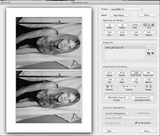
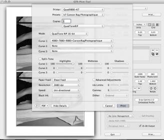
Just emailed you my print settings. Let me know what you think.
There is def a full black in the image. I don’t think it’s a linearization issue. Inks are fresh and have been shaken. I’m using Canson Rag Photographique as a paper, and using that profile. Out of photoshop it looks pretty darn good. And that’s by selecting printer manages color and “QTR” under color management.
Out of QTR the blacks are vanishing…it looks like a profiling issue or something there…
I attached the screen captures you emailed me, to keep everything together. These screen captures show all your settings are correct- so, we can rule that out and move onto the next thing: check your output linearization.
Do you have an EyeOne or other densitometer? If not, you can mail me a printed 21 step strip to measure and use to plot and check your linearization, as well as a printed InkSeparation image printed thru QTR’s Calibration Mode, which I will use to check your shade placement and individual ink density.
Please let me know, so we can move forward to resolve this and get you back to happily printing.
Best regards~ Dana
I don’t have a eye one spectrometer, but before I start mailing stuff around:
I printed two inkseperation.tif files using QTR calibration mode on standard copy paper. One was printed via photoshop (following the instructions), the other was printed via the QTR print tool. They look absolutely identical.
This suggests there’s something going on when using QTR tool in 16bit with the paper curve, or that QTR print tool’s approach is that much different than printing from PS. So to check again I printed two of the same files, one through PS, one through QTR tool.
They’re close, but again, the blacks are really different out of QTR. Were’s the thing, in a way the QTR file looks better, or smoother (so maybe I’m just used to Photoshop crunching the file?), but the problem is the photoshop print does more closely represent what’s on my screen (almost pure black). And I’m on a calibrated NEC panel.
I tried to upload scans, but couldn’t get it to work, so going to email them to you. The shirt in the scan is between 95-99% ink load depending where I eyedrop it. The PS print is close to this. The QTR print looks great, but realistically is a lot brighter.
Seeing these let me know if you’d still like me to print and mail you a step wedge. I’m happy to do it, but I’m just confused why Photoshop is more accurate and so different than the QTR tool.
In addition, looking at these prints, the QTR print is lower contrast all around. The whites are darker too. In a lot of ways it’s a better print. It looks like it’s utilizing the printers linear tonality better: it’s smoother.
It’s just problematic that it’s different from what I’m seeing on my screen softproofing, which is sort of necessary
I’d say I’d get a custom profile, but I plan on moving to either Warm Neutral or a custom mix when I order ink again…not sure if the profile will work after changing inks like that.
This is a small hiccup, the prints are looking great overall, but I’m still learning how to get the most out of this!
Without measuring a 21 step strip to plot your linearization, I believe you may be seeing is the intended linear output of Piezography, which gives it the ability to produce such a wide range of gray levels to achieve extreme highlight and shadow detail. I would like to check your linearization to continue troubleshooting and determine what’s causing the effects you’re seeing.
Please print the 21 step strip image from the QuadToneRIP> Curve Creation> Images folder, by using your normal printing workflow (same settings as in the screen captures you sent). If you’d like, print one this way, and another thru Photoshop as you had been printing (label each clearly with the settings used), then mail them to me for measurement/evaluation, and I will let you know the results.
My address is:
Inkjetmall
Attn: Dana/testing
17 Powder Spring Rd
Topsham VT 05076
Please let me know if you have any questions, otherwise I will be expecting your prints and let you know after I have checked them out.
Best regards~ Dana
I’ll print them both and send them to you! Would love to figure this out. The QTR prints look great, but it’d be nice to have a closer approximation with the soft proof.
Maybe I just have my monitor profiled to the wrong settings, too contrasty?
On my NEC 2690wuxi using spectraview I’m at
White point d65
gamma 2.2
intensity 85 cd/m2
Contrast ration: Monitor default
I know you guys suggest NEC panels. Are these the settings you prefer? d65 and gamma 2.2 are pretty standard, but maybe you guys have an experience with better contrast settings?
Reading that link you sent, it’s obvious what I’m seeing now is that QTR is, as you say, a more linear and correct representation of the file. Viewing and printing out of PS is adding contrast or crunching the file
In the link it suggests to try to assign a gamma 2.0 profile (which doesn’t exist as far as I know), and if I assign a gamma 1.8 or a dot gain of 20 it looks almost exactly like what QTR is printing.
So, the gamma photoshop is seeing in isn’t as linear as what QTR is printing in…?
The question then is, if I’m supposed to print using gamma 2.2, then instead of doing hack workarounds and guestimates, how do I get photoshop to look like QTR?
It seems like it should be so simple…not sure why they don’t line up more closely.
As per our manual, you should calibrate at D50/5000K for Piezography printing. Please refer to the Piezography manual, starting on page 60 it discussed proper viewing conditions and monitor calibration. You can find the manual here: http://www.inkjetmall.com/tech/content.php?130-The-NEW-Piezography-Manual
From Mac OS 10.5 and Photoshop CS5 on, color management is not handled correctly, and you can’t accurately print with “NO color management”- which is necessary, and therefore effects Piezography printing.
Let’s make this simple- please print thru QTR Print Tool for the most accurate/linear output, calibrate your monitor and use viewing conditions as described in our manual, along with a Piezography soft proof profile specific to the ink and paper you’re using, you should get very close match between your print output and on-screen preview.
-Well, unfortunately, calibrating to D50 is out of the question. I do a lot of prepress in color for my work that goes to full color offset for which d50 is way to warm, and can’t afford a second display just for piezo printing. Plus d50 vs d65 (color temp) has little to do with the large difference in contrast/gamma I’m seeing.
Calibrating spectraview…I use neither. I use a custom set up as I outlined in that previous post. I do that so I can set the intensity to 85.0 cs/m2.
For soft proofing I’m using the supplied softproofing profiles John emailed me, something like P2__880_CansonRagPhoto
I printed a step wedge out of QTR. It is lovely.
I then printed on out of Photoshop, using the suggested method on the website, it is also lovely, BUT it is contrastier. The separation is all there, but it appears to be at a higher gamma. It is still closer to what I’m seeing on my screen.
I’ll mail them to you after drying.
Overall the prints are all good, which is the important part, I just want to be able to better approximate what QTR print tool is going to output using photoshop. You asking about the softproof profile I’m using is smart, since it is a very good guess.
Well, we’ll just have to make your current setup work as best as possible for your needs.
I’ll let you know once I have received and measured your 21 step strips, and we’ll move forward from there. Please make sure to slip sheet the prints so they don’t get scuffed in shipping.
I received your prints today, and measured the two 21 step strips. Please clarify, when printing thru Photoshop, you select the same Canson Rag-x880 curve in the QTR window, correct? I ask because this was only written on the QTR print tool print, and I wanted to make sure both were printed with the same settings selected in the QTR print window.
After measuring your 21 step strips, I see the print made with Photoshop is overall too dark with several harsh transitions, and the QTR print Tool output is just about perfectly linear with smooth transitions, though has an ever-so-slight lightness bump in the 3/4 tones. As suspected, your output from QTR Print Tool is more linear and accurate, but now the choice has to be made as to which you prefer, and what is more important to you: matching the monitor, or accurate/linear output to take advantage of the full Piezography range.
Yes, printing out of photoshop was using that same curve. It’s strange how different it is isn’t it? Or maybe not.
Anyway, through the weekend I’ve had a chance to do 15 or 20 prints with QTR print tool and it is by all standards much better as far as print output. My initial trouble was just how different it was then what I had been doing previously, and it took awhile for me to adjust to the differences. Now that I have though, and I’ve learned to see the softproof in a way that corresponds to what will be outputted, it’s all making sense.
I’m extremely glad I asked though. Otherwise, I would have kept printing through photoshop. This was a step forward.
[QUOTE=Dana-IJM;1742]I received your prints today, and measured the two 21 step strips. Please clarify, when printing thru Photoshop, you select the same Canson Rag-x880 curve in the QTR window, correct? I ask because this was only written on the QTR print tool print, and I wanted to make sure both were printed with the same settings selected in the QTR print window.
After measuring your 21 step strips, I see the print made with Photoshop is overall too dark with several harsh transitions, and the QTR print Tool output is just about perfectly linear with smooth transitions, though has an ever-so-slight lightness bump in the 3/4 tones. As suspected, your output from QTR Print Tool is more linear and accurate, but now the choice has to be made as to which you prefer, and what is more important to you: matching the monitor, or accurate/linear output to take advantage of the full Piezography range.
From my experience testing various OS versions, Photoshop versions, and print settings, your results aren’t surprising to me, but likely a learning curve from what you have done in the past. I am happy to have clarified this for you, and that you feel the output from QTR Print Tool is superior. Have you read our “Where is the Black?” and “What it takes to make a fine Piezography print” tutorials? If not, I recommend you do, and you may find them helpful in getting the most out of your Piezography system. Both documents are available in the techsupport section of our Piezography.com site.