HI,
I’m just setting up Pro inks after migrating from K7. I 'm sending through a series of patches that determine tonal distinction from DMax to paper white. I have no concern about colour, only maximizing microtones. My 100% warm, 100% neutral and 100% cool produced the same results. I like 100% warm. My question is, if I print 100% of one curve, am I shutting down 3 of the available 8 channels, and if so would that result in fewer tonal distinctions? Would that be ostensibly a K4 process?
thanks
Paul
Yes technically it would, if you want 100% warm or 100% cool… but not if you wanted 100% Neutral. However just adding back some neutral would gain you…
best,
Jon
Ok thanks!
So then my 100% warm, neutral and cool patches could not have been the same.
Guess my eyes aren’t what they used to be.
Regards
Paul
What exactly do you mean by the same? Their measurements or their color?
Send pics…
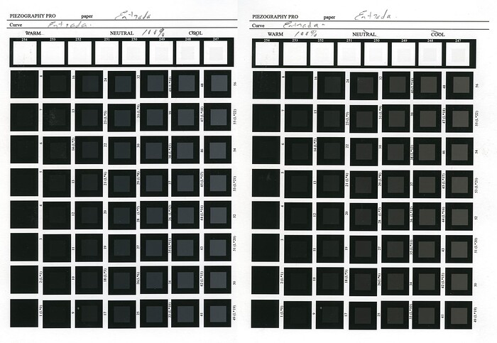
I mean colour, and principally in the toe and shoulder of the curve. I used to measure, especially in colour managed workflows, But in K7, tonal distinctions are decimal L* and I never found theses readings reliable and consistent. I just use a ring lit magnifying glass to examine the patches. Here are the scans of the neutral and warm toe & shoulder patches, but I don’t think you can see the nuances of the original. The targets are Same as Source, I send the 256 control signals in increments of 1 from Adobe 1998, the toe section patches are set against 0, the shoulder paper white. If I need to check to see if opening the shadows was at the expense of compressed areas higher along the curve I send patches nested in their neighbours (ie.128 in 129, 129 in 130 etc). I’m sure its not the most precise system but I like its simplicity and I like using my eyes. Its really just to find the best paper/ curve match.
My eye sees the black threshold emerging at level 3-4 and the white threshold at 254 for both of these.
Yes, definitely not the same. Your sensitivity to luminance is spot on! Could use yourself as a densitometer.
But, the difference in colour is evident in this photo. If you can not see the difference in colour then it’s just blue-yellow sensitivity loss and welcome to aging. I’ve always thought that “Neutral” is overrated and wasted on the youth.
Entrada is not a dMax champion. If you really want to get more out of the bottom end:
Arches88 and Bamboo papers are to die for…
Ok yes, sorry, I’m using “colour” in a larger sense, (HSL). When you wrote “Their measurements or their color?” I thought you were asking me if I had read the values or if I’d perceived them with my eye. Yes I do see a chromatic difference, (so still some blue-yellow sensitivity left) but I couldn’t see a difference in tonal distinctions given, as you said, the neutral option should produce more micro-tones.
Thanks for the paper tip!
