This observation surprises me, for two reasons.
(i) It appears to be at variance with things that Jon has said here before. While Jon has never compared ABW and Piezo sharpness directly that I can recall, he has consistently warned against over-sharpening when printing with Piezography, e.g. here and here. I’m sure that there’s another post somewhere here where he says to be wary of over-sharpening because of the resolving power of Piezography. The impression that Jon has created through his various posts on resampling, resizing and sharpening have not implied that Piezography has lower acutance, rather if anything he has implied the opposite - that its resolving power means it needs less if any.
(ii) It’s not consistent with my own experience. Occasionally I print carefully matched ABW, QTR-K3 and Piezography versions of an image for comparison purposes. (The QTR and Piezo prints are matched by the two curves being linear. The ABW print is matched using a soft-proof from an ICC and a Photoshop curve.) Admittedly only in A4 size, but try as I might I can’t see any acutance advantage to any of the the ABW prints.
As Larry alluded to above, he and I have been having a separate conversation on this. From the other side of the planet, I’ve been trying to understand what difference it is that he is seeing between these prints. I think it’s that the ABW print probably exhibits more contrast, which makes the print look crisper.
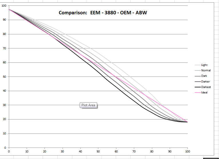
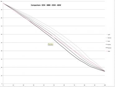
I say this because my measurements suggest that ABW prints with a contrast boost compared to Piezo. I measured the linearity of the five ABW modes on an 3880 and this is what I found;

Assuming that Bob had a Piezography curve that was dead linear, that he printed the same exact same image via ABW and Piezo without any edits, and that he used the ABW “Dark” setting which is what most ABW users would do, then ABW will print with completely differently tonality to Piezography. That plot shows a pretty sizeable contrast boost. You’d expect that the prints that Bob did for Larry would look very different.
There is another question here, and that is: which is the fairer comparison? Printing the image both ways exactly as-is, or using ICCs to do preserve numbers soft-proofs and edit the images so that their tonality matches? As-is will show the limitations of ABW without any compensating edits, but not its potential.
[Readers who know a thing or two will realise that if you print ABW from Photoshop on Windows, and use Printer Manages Colour as you probably would, then for images not already in sRGB, Photoshop does a silent conversion to sRGB en route to the Epson driver. Rest assured that I am aware of this and avoided this little trap in my testing.]


