Very excited about the split tone ink jet, I’m a current K7 user and plan to convert! However, simple question on the curves to install for QTR. When I look in the folder for 7890 Pro (in your document file) I don’t see the array of curves I see for say, the 4880 Pro set. Am I missing something?
Secondly, if I’m planning a project I’d like to print warm/neutral. Do I have to experiment with the split tome or will there be some basic presets for the 7890 curves.
Warm regards,
Raphael
Dear Raphael. Currently we do not have all papers profiled for K4 x890. The masters are their and they are very good and in most/many cases will not need linearization. I believe you have PPE yes? You can linearize.
See screenshot for master curve locations.
The alternative (I know this might sound weird) is to use the 3880 Pro curves (drag and drop them into the 9890 folder). We have not validated this internally, but others have said that the 38xx curves that we linearized for that printer architecture actually work on the x890 printers and are linear!
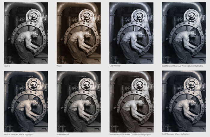
Thank you Walter. That all makes sense. I’m several weeks away from converting to the new system, but one question as I start to form ideas. I much prefer to focus on photography, not ink science and charts! I love this simple chart from you guys, once I get the new inks will someone be able to quickly guide me to these basic choices? I won’t be worrying about mega custom and niche choices. But I am interested in the basic combinations I see here!
Also Walter - Regarding the new Pro ink set, in QTR, does it matter how I order the curves? For example, am I correct in saying that say for the gloss curves, I enter the cool, neutral and warm, but it doesnt matter what order they appear in on the QTR menu? Regards, Raphael
Check out this page for recipes on blending.
https://cone-editions.com/piezography/#hues
We don’t have soft-proofs done yet, but when we do we’ll get that out for the general public too.
The images on there are done with matte paper so the toning (warm and cool) is not as strong as gloss paper.
Thank you Walter! I’m sold on the beauty of the tones but are there instructions on how to set up them up in QTR?
Look at the page again. The warm/neutral/cool curve percentages are shown.
I’m sorry, I see, but don’t understand. Do I have to use 3 curves or just adjust one master curve?
I got it Walter! Sorry it took me a bit! Thanks!
Last question! On the AVAILABLE BLENDS (PIEZOGRAPHY PRO INK), there are just two percentages. So say for the warm-neutral, is there just a curve to download for that? Thank you.
There is not, however, if you have PPE, you can combine two curves into a single curve at any percentage.
As we made thousands of curves, we did not want to make thousands more intermediates like WN. That is left to the slider/toners. Pro ink is not meant to replicate k7 ink per-se, however it does a good job at Warm Neutral. In fact, I specifically built this ink to blend and match the OLD PiezoTone (K4) warm neutral ink which was my favorite ink as a professional printer in the early 2000s.
best regards,
Walker
Walker,
Thanks for the link to CEP B&W Piezography page (btw the new site looks great!). What are the QTR settings / .quads used for the three K7 legacy inks shown; e.g. on Type 2… as a starting point 
thanks!
Michael
Walker, to clairify, I should add that I am looking to emulate the K7 inksets using Pro.
Pro is a different carbon so it has a different underlying color (what painters call a “base tone”).
Because of these underlying differences it will not have the same spectral response as K7 ink nor did I build it to have that, however it will get close.
Rules of thumb:
100% warm will not replicate K7 carbon but will get close. It’s less rosy and I made this ink to replicate a 100% Palladium Warm Oxalate print on Type 2 paper.
50% Warm 50% Cool will get you a decent Warm-Neutral on Type 2. Slide between the warms and cool or warm and neutral curves to your desire. The warm neutrals in Pro are very close to the old PiezoTone WN.
23%Warm 77% Cool will give you a neutral (more neutral than our K7 neutral which is built to replicate old F-type “Euro-neutral”)
Full warm shadows into cool highlights will give you a Special Edition. Adjust to your desire as this split is dependent on the image tones.
50% neutral and 50% cool in Mid/Shadows and then 50% Neutral and 25% Warm in highlights will give you a decent selenium. On some images (darker images) the selenium quality becomes even more evident. This ink will not give you magenta mid-highlights like K7 selenium ink but in my opinion is just a "different’ type of selenium.
best,
Walker
Perfect! Thank you Walker for these starting points!
best.
Michael
