I’m having trouble with Linearization Checker.xls. I have downloaded it to two different computers. One has Win7 and Excel 2010, the other Win7 and Excel 2013. Upon opening the file I receive the error message: File error: data may have been lost. I receive this message on both computers. I click OK and proceed. I’m entering Density data into the input column of the Density Tab and getting some pretty wild looking graphs. I even tried entering the “ideal data” (listed in the right hand column) into the left hand column figuring the black line should align EXACTLY with the pink line. No such luck. The black line is well below the pink line. I’m stumped. Any suggestions? My only thought would be to re-issue Linearization Checker with an updated version of Excel.
As an fyi, I used Linearization Checker back in January with the Win7 Excel 2010 computer and had no issues. My best guess is Microsoft changed something in an update.
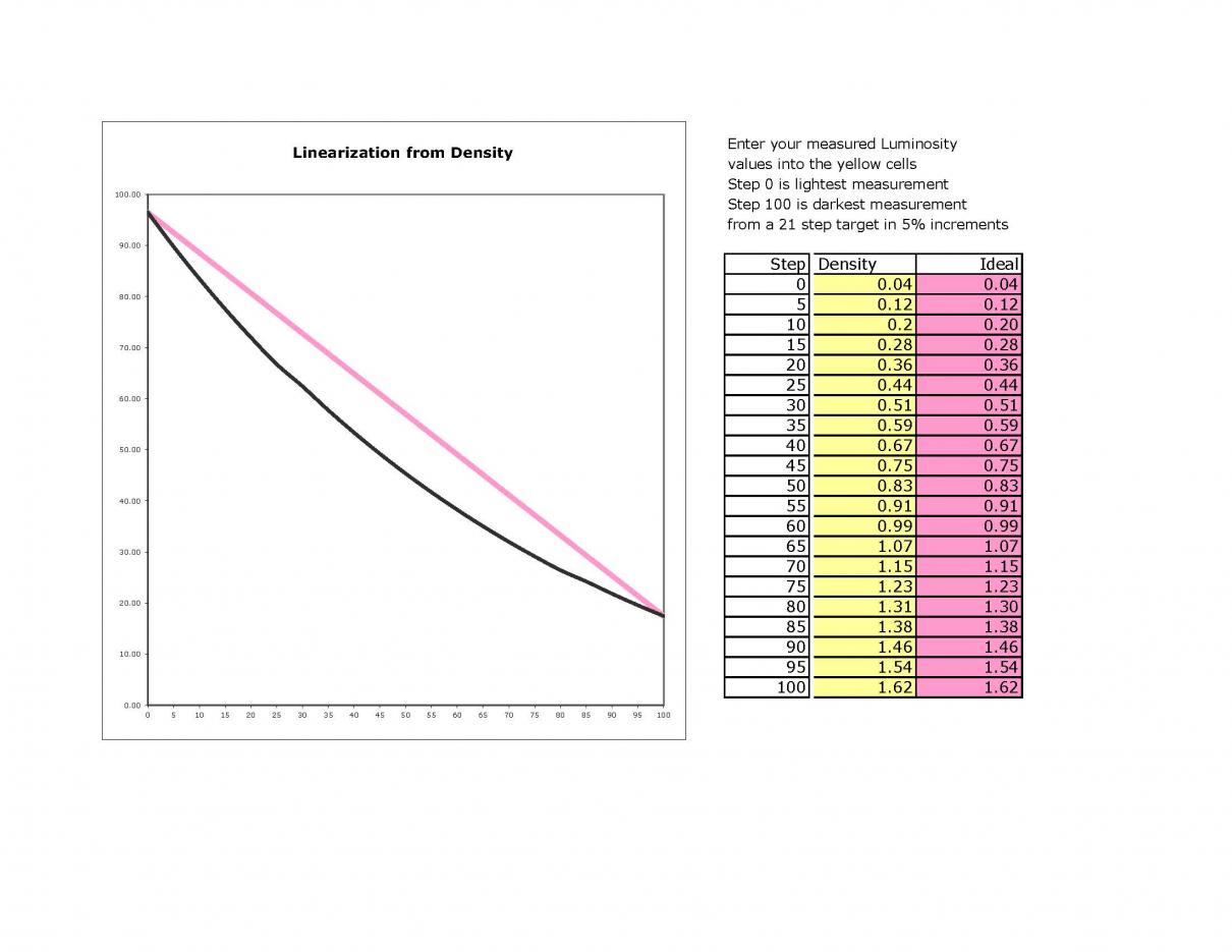
[QUOTE=jgbowen;9814]This is the resulting graph from “ideal data”
The black line should lie perfectly on top of the pink line…[/QUOTE]
If you’re going to do this, you’re better to do it in the luminosity tab of the spreadsheet. Piezography is linear in luminosity, not density. Then you’ll get the black line and pink lines coinciding. All this chart does is demonstrate that Piezo is not linear in density, which it’s not supposed to be.
[To explain a little more, the density tab of the linearisation checker spreadsheet is not what it appears to be. It’s not actually plotting density. In some hidden columns, it converts the actual density numbers to luminosity and plots those. So the graph in the density tab is actually the same graph as the one in the luminosity tab, but gets there by converting the density numbers to luminosity first. I.e. the graph is not a plot of the actual vs ideal density numbers that you see in that tab. In that sense, it’s a little misleading, because the ideal density numbers you see are not really “ideal”. They should be the ideal luminosity numbers converted back to density, and then plotted, but this is a curved line, not a straight line.]