I am calibrating my digital negatives using PDN for kallitype printing.
I have used the software to arrive at a curve that is very close to linear.
However i notice that the negatives are now less dense, especially compared to my negatives for platinum, The highlights seemed blown out before I linearized, now they seem too dark despite the curve suggesting everything is good.
So my question is, what luminance values as density on paper should match which K value in photoshop?
Like what would the ideal luminance value on the page be for 90% k in photoshop for example.
Just trying to get my head around it so I know what the goal is.
Ideally the image in photoshop should have similar tones when printed in different processes right?
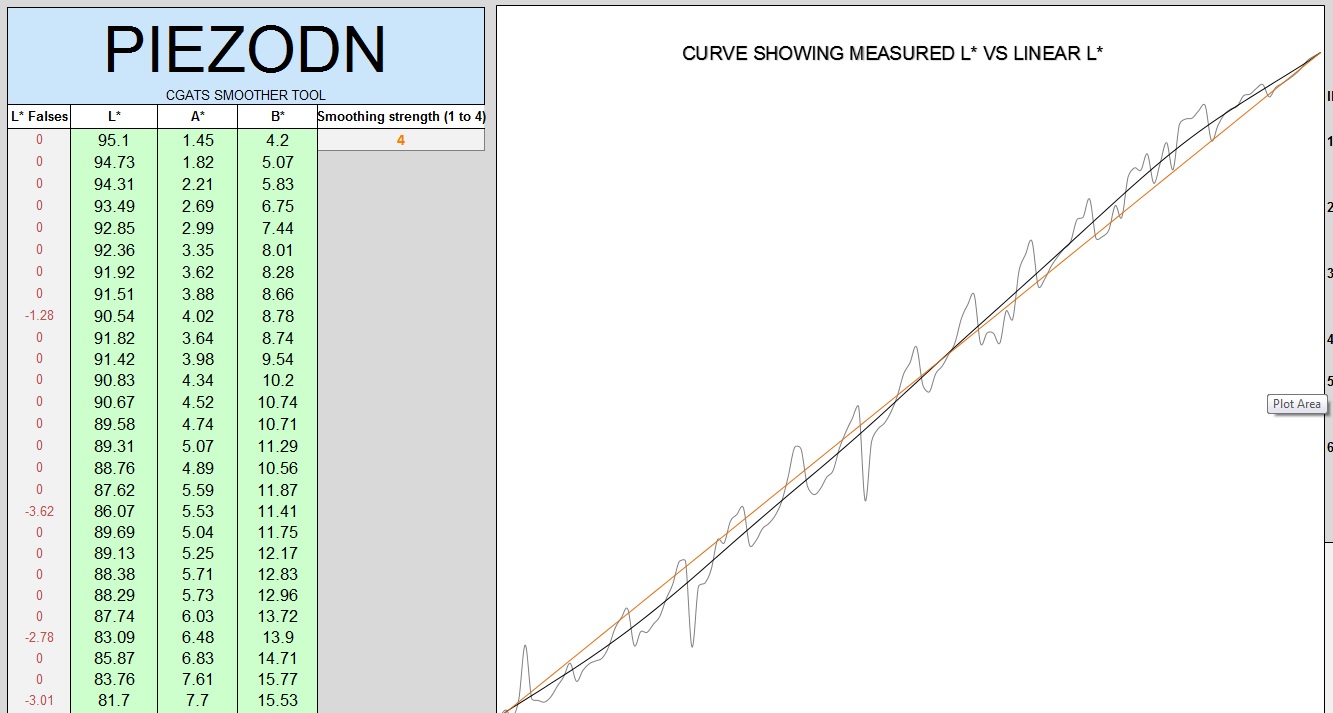
Are you only looking at the negatives? Because Platinum is a different process and requires different Highlight densities it’s logical that the neg would be less dense for Kallitype. The printed measurement on the screenshot look just fine.
That a complicated answer with lots of twists and turns . . . long story short they are related but with lots of different variables that effect that relationship
-Walker