Also, QTR-Create-ICC profiles used for output will only work in Perceptual mode. RelCol does not print correctly.
This is a post-reply to the thread offshoot started here: Low density and contrast with piezo pro - #3 by Brian_S
A QTR-Create-ICC (icc) does not produce a true perceptual rendering as do all other ICC programs. I’ve tested many ICC programs and they all act about the same. For matte papers, a normal ICC will lighten the highlights a bit and toe the shadows a minimal amount to make the over-all mid-shadow-to-mid-highlight contrast equal to a normal monitor.
What the QTR-Create-ICC does is create a transform table (so from Grayscale/RGB to xyz/lab to output) that essentially just puts a photoshop curve into the file on output.
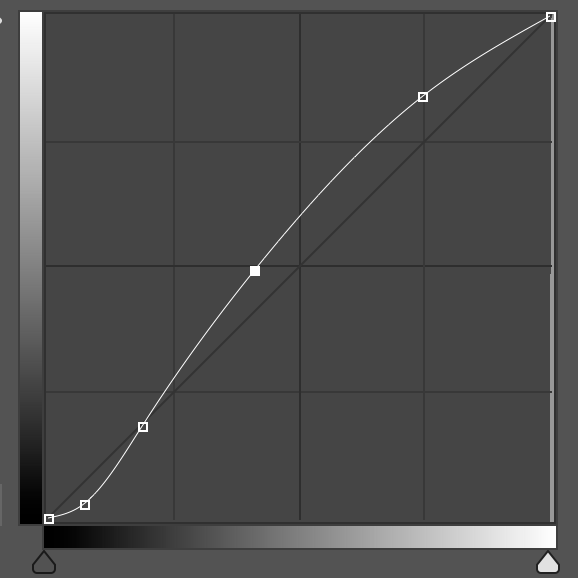
Here’s the (photoshop curve) example of what a normal industry standard RGB ICC does for an image when printing on matte paper:
And here’s the (photoshop curve) example of what a QTR-Create-ICC does:
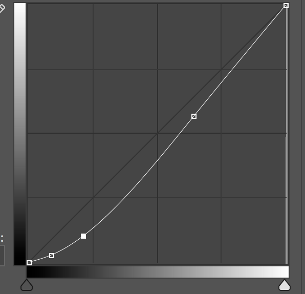
Both profiles create a contrast that is steeper on the tones that count (mid to dark) but the QTR one generally darkens the image over-all compared to what you see on screen where-as the normal ICC (created by i1Profiler or similar) will attempt to keep the over-all tonal values equal to the monitor.
Looking closer at the code of QTR-Create-ICC you can see some “shifts” that are programed into the profiler that create this curve based on the dMax and dMin of the measured values (ink black and paper white). The smaller the difference between these two values, the steeper and bigger is the curve.
i1Profiler (and similar) ICCs do something slightly similar (a bigger S for matte papers) but their curve is shaped differently and has more points that are effected. The over-all result is a better more consistent match and the way they do it is some complex 3d math that is simply not present in the same way in QTR-Create-ICC. (xyz transforms are present in QTR-Create-ICC but not the same sort or level of calculations that go into a true 3d profile).
best,
Walker
1 Like
Thanks. Much appreciated. I’ll digest this. Expect more questions.
It’s taken me a while to get back to this, as I wanted to repeat my previous tests.
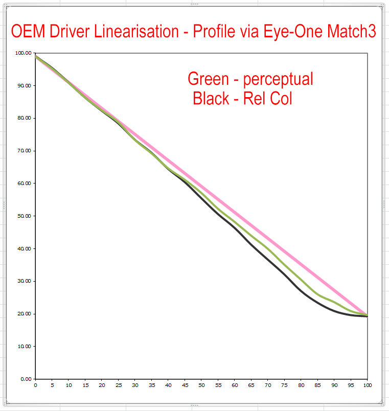
What I did before and what I have repeated just now is to take the 21x4, assign it to Grey Gamma 2.2, then convert it to AdobeRGB (same thing really, so not really necessary), then print it from Photoshop on Canson Rag using a custom (colour) ICC I created using my i1, and with the same driver settings as I’d print a colour image. I tried both perceptual and relative colometric rendering intents. The graph below shows the linearisation measurements.
[I’m a bit puzzled about the difference between Perceptual and Rel Col, especially in a greyscale image, but I make no claims to be a CM expert. Far from it.]
These plots were behind my earlier statement that the sort of linearisations that QTR-Create-ICC produces seemed similar to what commercial profiling software produces. That had been my experience.
Is the difference the fact that I’m using the much older Match3 software (which still works on Windows - if it ain’t broke don’t spend lots of money to fix it), rather than i1Profilter? I’ve had i1Profiler generated ICCs and not noticed the sorts of differences that you portray compared to my own.
Nonetheless, I may get JeffG to try to replicate this on i1Profiler, assuming that I’ve understood the methodology correctly.
So you see, I’m a long way from understanding your alternative approach to generating perceptual ICCs for QTR and what it’s based on.
Upload your original measurement data you used to build the ICC and I’ll build you a “different” icc (posted here) that you can print with and validate using the same method.
-Walker
That’s a very generous offer, and it would be churlish to say no. I might upload several sets of measurements if that’s alright. But before I do that I’d like to get a better understanding of all this and ask a few more questions based on my latest experiments.
1. Match3 vs i1Profiler
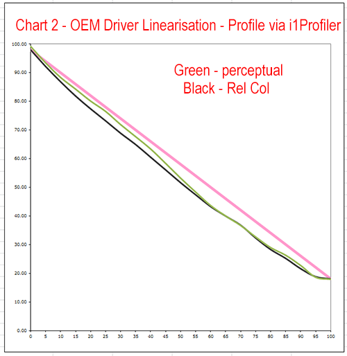
JeffG kindly repeated the measurements in my chart 1 above using his printer (same model), the same paper (CRP) and i1Profiler. Here is the equivalent chart 2. It’s different, although not radically so. It would appear that the rendering intents have been made darker in the highlights, at least on matte paper.
2. Does PK Make a Difference? - QTR
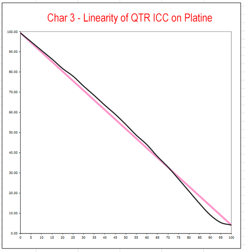
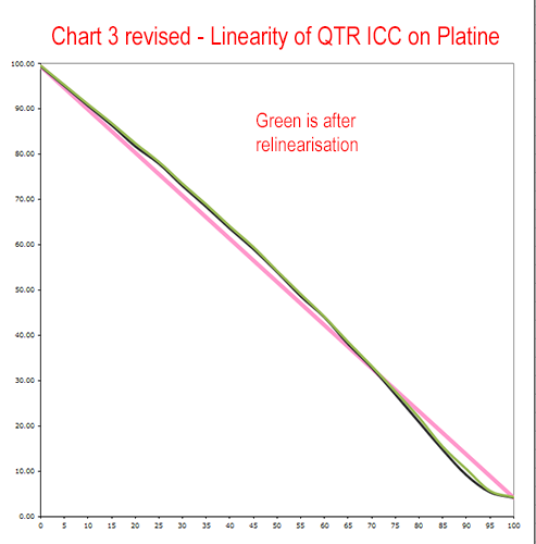
Something I’ve never bothered to do is to plot the linearity inherent in an ICC created using QTR-Create-ICC for a PK paper. So I did this for Platine and here is the chart 3. TBH, I was floored when I saw this. I had no idea that QTR-Create-ICC did something so different for MK and PK papers. After all, it’s not like you’re telling the droplet what kind of paper & K ink is in use, but I supposed it can work it out from the dMax.
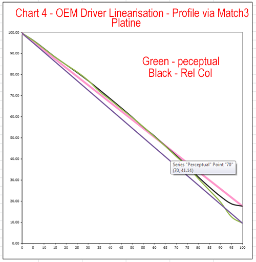
3. Does PK Make a difference? - Colour ICCs
Next I repeated my measurements in my previous post this time on Platine (previous was CRP), and the chart 4 is below. Like QTR they’re quite different to that for an MK paper. In broad shape they’re not that different to QTR. The Rel Col one is similar to QTR. The Perceptual one is similar to your custom ICC. I’ve a bit puzzled about the lower dMax for Rel Col.
4. What does it all mean?
I have to say that what Roy programmed into QTR-Create-ICC still doesn’t seem to me to be all that different to the behaviour of the colour profiling software available to me on either MK or PK papers.
The behaviour of QTR-Create-ICC doesn’t seem too radical for PK papers and I can’t see the harm of it. It’s similar to the curve you plotted for your custom ICCs, but less dramatic, and it’s similar to the shape of Match3’s Rel Col rendering.
Although I don’t know how, I guess you can embed any tone curve into a ICC. What I’m a little confused about is which is the best one and why? You say that yours is, but I don’t understand where it came from and therefore why.
I don’t think char 3 is entirely accurate to what the icc is trying to do. (it looks like it has not dried down or has not been printed with a linearized environment or something along those lines)
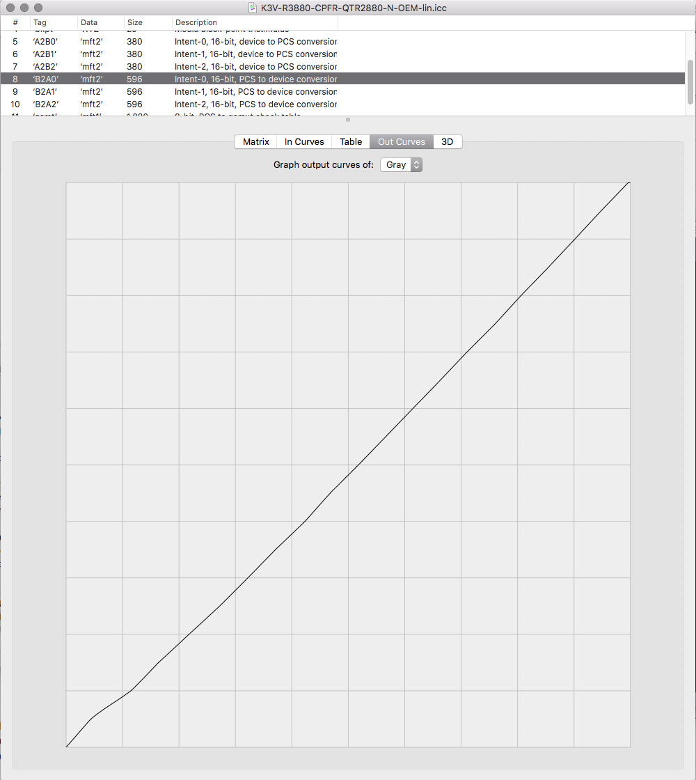
If you open the ICC in ColorSync on a mac you can see the actual curve that it’s adding to the print by going to the B2A0 section and clicking Out Curves.
QTR-Create-ICC never lightens the HLs if it is being created from a linearized target.
-Walker
Given your comment that “I don’t think char 3 is entirely accurate to what the icc is trying to do” I went back to taws and examined the curves to see if I had made any errors or if something had changed.
There had been a little drift in the curve but not a lot, but even so I relinearised it, reprinted, remeasured, and recreated the ICC. I did so using the 21x4 chart and the QTR-Linearize-Quad droplet. I left a lot of time for drying at all stages, and also used a hair-dyer to be doubly sure. The resulting curve was pretty darn linear, with the limits of these tools.
So again I assigned the 21x4 to Grey Gamma 2.2, converted to the ICC in Photoshop using the perceptual rendering intent, printed and measured. Here is the result - the previous attempt is black and the new one is green:
Nothing had changed. My result is confirmed. I get much the same result as you for doing exactly this on matte, but it seems that I get quite a different result on platine.
I tried examining the ICC in colorsync on a mac, but I don’t see this curve. I only see the curve from linearisation. I’ve attached the ICC and you can see for yourself, if you wish to check. I suspect you may have meant in Colorbyte, but I don’t have access to this software.
K3V-R3880-CPFR-QTR2880-N-OEM-lin.zip (2.7 KB)
Regarding your offer “Upload your original measurement data you used to build the ICC and I’ll build you a “different” icc”, here is a zip with a few sets of measurement data, if that offer still holds. Thanks.
Brian Measurement Data V2.zip (10.5 KB)
p.s. I’ve managed to get a plot of the ICC from Colorthink, and it doesn’t suggest highlight brightening, yet that is how that ICC is behaving when I use it. Convert to profile in PS with Adobe (ACE) engine and perceptual intent and BPC - what’s wrong with that?
I think the conversion in PS may be making this profile shift. Very interesting!
Printing out of Print-Tool applies the profile as it’s rendered in it’s B2A0 table (see screenshot).
best,
Walker
This is why I loathe and detest CM, even though it’s a necessary evil. It’s such a poorly defined, inconsistently applied, inexact science. I engage with the theory of it only when I have to.
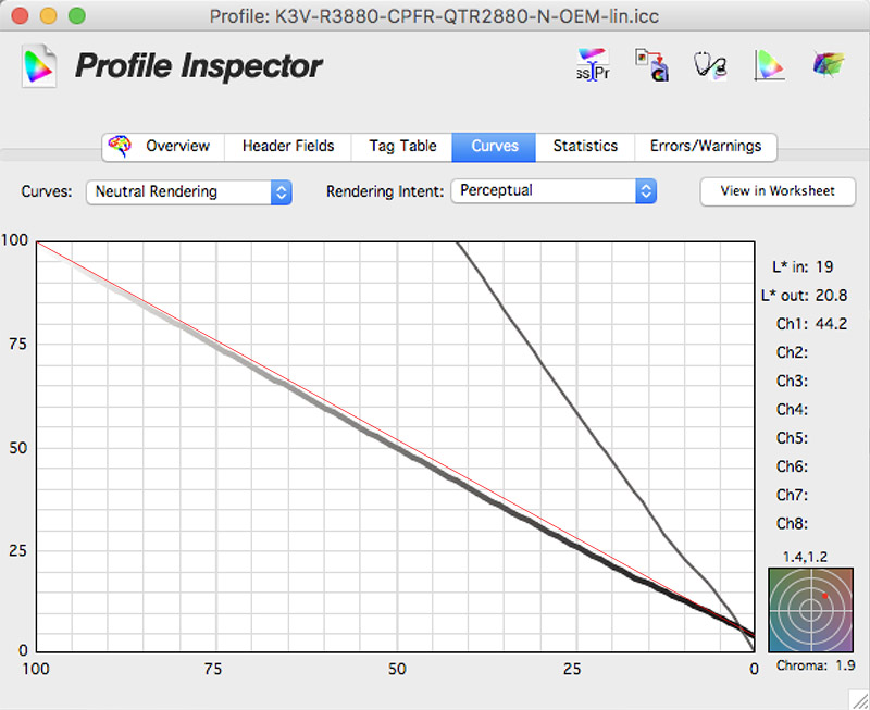
Yes, I saw that graph in Colorsync, but didn’t know what to make of it. It doesn’t seem to correspond to anything that I recognise. Yes, there’s no highlight brightening, but what’s that wiggle in the bottom? Where did that come from? There’s no sign of any shadow-crushing in that curve. I have been given a plot from Colorthink Profile inspector (I added the straight line in red) which is at the bottom of this post, and it’s different again.
What is really puzzling me is the difference between any of these characterisations of this Platine curve with a shadow-crushing curve created for a matte paper like CRP? How is it that QTR-Create-ICC is behaving so differently? Or is that just the PS CM engine having a mind of its own again? I guess I’ll have to try the alternative Print Tool behaviour to satisfy my curiosity.
There are a couple of aspects of this that puzzle me and about which I’ll write to you separately.
The PS conversion is more desirable . . . which is something that the other RGB profile process I use forces all apps to do (PS, LR, and PT).
-W
I’m pursuing this slowly as time permits. I haven’t used your custom ICC yet. Soon.
I wanted to compare Print Tool’s use of the QTR ICC compared to Photoshop’s. So I migrated everything across to a Mac and printed the 21x4. First without the ICC to reconfirm linearity of the curve, and then with the ICC and Perceptual intent. Here is the linearity plot:
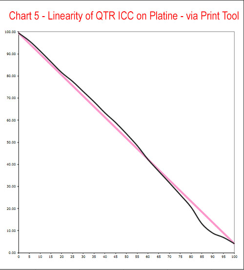
The results still appear to be at variance with your statement: “QTR-Create-ICC never lightens the HLs if it is being created from a linearized target”, at least for Platine. You may doubt my workflow, but I was very careful at each step of the way. For the record, this had over 36 hours drying in late summer temperatures.
I have to say that I much prefer the smoother Photoshop interpretation of the ICC, in chart 3 above, compared to the Print Tool interpretation.
3d RGB icc from your linear measurement. – Most likely a more intense HL and Shadow curve but I haven’t validated anything . . .
This stuff is all part of the beta testers group (open for PPE and PiezoDN customers to apply for) so much of that discussion happens elsewhere . . .
K3V-R3880-CPFR-QTR2880-N-OEM-lin-W.icc.zip (95.8 KB)
(Built for printing RelCol with BPC).
best,
Walker
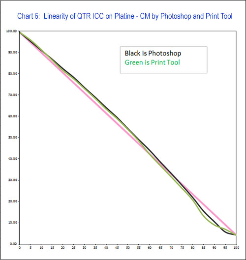
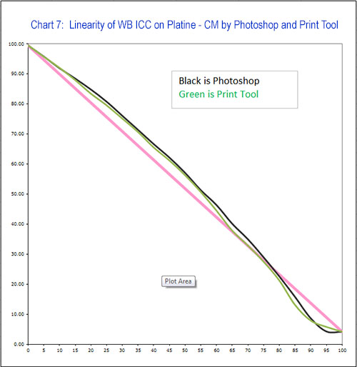
I suspect that I’m just talking to myself at this point. I’ve taken some measurements that compare the QTR ICC’s linearity with your special profile, and I’ve also compared printing each via Photoshop and Print Tool. I could paste yet more charts, but anyone who is still listening may just think I’ve become totally retentive about all this.
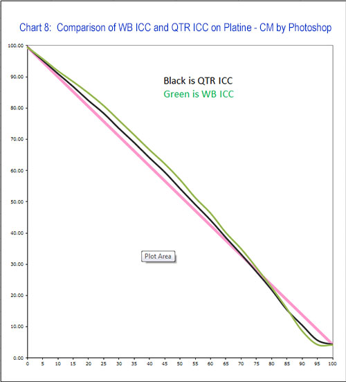
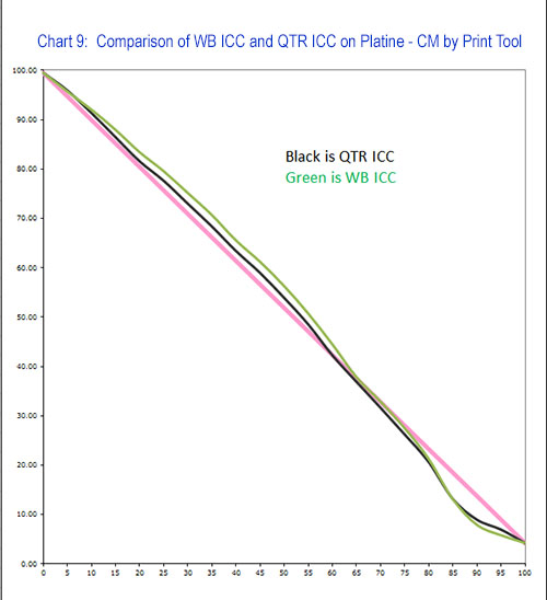
What I have found on Platine and my printer is:
(i) There isn’t a great deal of difference between your special ICC and the QTR ICC. Yours brightens the highlights a bit more and darkens the shadows bit more, but the difference is relatively minor one of degree.
(ii) I prefer how Photoshop handles the conversion to the ICC to how Print Tool does it, in that it results in much smoother linearity plot, and the effect in the shadows is less dramatic, i.e. less shadow crushing. Of course you probably developed your ICC in PT, and so you may well have intended the more dramatic effect.
And still find QTR ICCs broadly consistent with the linearity of Match3 colour ICCs.
The irony in all this is that I only put so much effort into analysing linearity on Platine because you caused me to doubt the accuracy of my measurements. In practice Platine hasn’t been a problem. I haven’t had screen-to-print matching problems, and I haven’t found the QTR ICCs to crush shadows all that much, at least when Photoshop handles the CM. Certainly less that your special ICC.
My problem with shadow crushing ICCs has been on matte. Clearly you’re not keen to hand out too many of these special ICCs to non-Pro customers, but I’m not about to sign up to the Pro Toolset just to try out a few ICCs. If you’re prepared to supply one more ICC, I’d be interested to repeat these measurements on matte.
p.s. The differences between how Print Tool and Photoshop handle the ICCs makes me a little wary about simply examining the internals of an ICC to understand precisely what it will do.
All interesting posts.
I will respond when I have time to test again myself.
Please note, this is my job. I try not to post on the weekends (Fri,Sat,Sun) to save sanity so me not posting replies right away does not mean you are talking only to yourself.
best regards,
Walker
I understand. I wasn’t expecting posts over Easter. I was only referring to whether this had gone as far as it could. I have four charts I can post to illustrate the points I was making if they’re of interest.
Ok, if you’re going to go to any effort to recheck anything, I thought that I should post my charts while I can still find them. I just didn’t want to make this thread any denser than it already is.
Charts 6 & 7 compare how Photoshop and Print Tool interpret each of the ICCs. So they’re a comparison of CM engines, and illustrate my point (ii) - that I prefer the smoother PS interpretation.
Charts 8 and 9 switch this around and compare the two ICCs, first in Photoshop and then in Print Tool, and illustrate my point (i). They’re not radically different. Yours has more of an S-curve and darkens the shadows a little more, except in the very deep shadows when PS handles the CM: