just set up my 4880 with the MPS selenium inks and it is working well, however i would prefer to get more neutral black tones. am printing gloss only, not matte. have tried Cone type 5, ilford gold fiber silk, epson exhibition fiber, but all are too sepia for me.
any ideas about papers? should i get some different inks?
Hi jm~ You are getting “sepia” prints with Selenium inks??? Are you printing the Gloss Overprint layer over the Selenium ink print? If not, then you will have some bronzing, which may be what you’re referring to as “sepia”.
Please let me know so I can help sort this out for you- Dana
I think you’re referring to the warmth of the B&W image, much of which is imparted by the underlying media selected. Aside from switching inksets, a “cooler” paper or one with a brighter white base may give you more neutral black tones. Hahn Photo Rag Baryta is pretty white… Not sure of others available for K7 Piezography with available curves. I tend to stay away from those with OBAs. Dana/Jon probably have more paper recommendations…
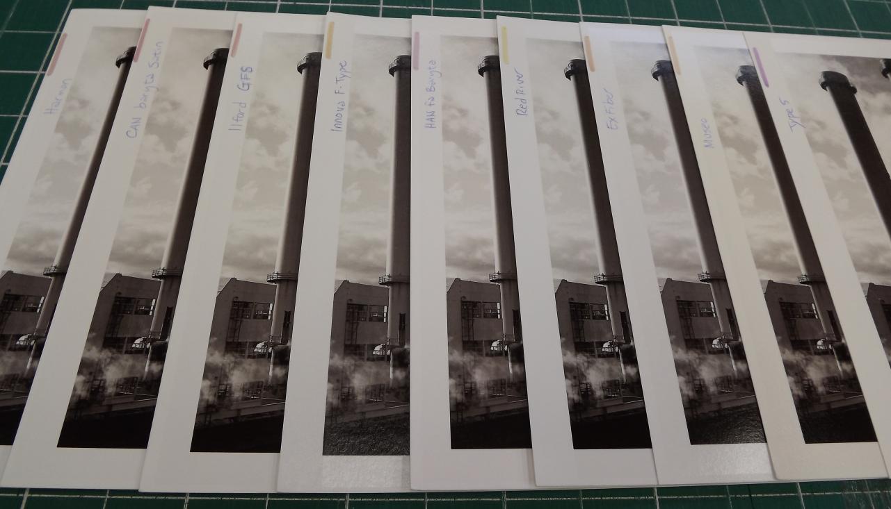
i did some rather extensive testing. all printed from the same image, K7 selenium MPS inkset, glossy only, epson 4880.
all of these were in the sepia-like tonal range with the most neutral so far ranked first: first two were rogues, however.
GO on all of them
paper/profile:
canson platine, canson baryta satin (a matte paper, but came out cool, but not a contender, otherwise, as i am using glossy inks)
canson paltine, ex fiber even cooler, same problems
glossy or satin papers: first three a toss up, but not a good neutral yet
museo silver rag, harmon GFW
museo silver rag, ex fiber
ex fiber, ex fiber profile
the rest were all warmer:
red river ultrapro satin: ex fib, canson Baryta, harmon gfw type 5
ilford GFS: ex fib
harmon GFW, harmon gfw
hannemuhle FA baryta, han rag baryta MPS
canson rag phootgraphique, canson baryta satin
canson baryta, canso baryta satin
innova Fgloss; ex fib
type 5, type 5 (warmest of all)
I just received your package of prints, thank you- they are very helpful to review. After examining all the prints you sent, I believe you are experiencing slight yellow staining, which is appearing in the highlights of your images and making them appear “warm”. This is not related to the Gloss Overprint, paper or curve used, but is caused by some stubborn yellow color ink clinging to the inside of your damper, which is slowly seeping out and causing the highlight areas of your grayscale prints to be slightly yellow tinted/warm. To eliminate color staining, you can do a power clean cycle, few regular cleaning cycles, or print a few yellow purge pages thru QTR calibration mode (as per our instructions in the Articles> Product Instructions and manuals section of this forum). To prevent color staining, color ink can be flushed from the printer’s internal ink system by using PiezoFlush before installing Piezography inks, or the dampers can also be replaced (it seems to be more of an issue with older dampers, that are due to be replaced anyway, which should be done every 1-3 years).
Attached are two photos I took showing a range of glossy sample prints you sent. I labeled the side with the paper name and marked each sheet with our pH pen to give you info on the acidity of the papers you’re testing (purple is neutral/archival, yellow is acidic/not archival). I realize it’s not as easy to see in a photo as it is in person when examining prints, so I will also explain what I see when viewing and comparing the actual prints. I am a little confused that you referenced Type 5 as the warmest, but Museo as one of the most neutral, as I am seeing more warm/yellow tinted highlights in the Museo print than Type 5. I think the prints on the Exhibition Fiber and Red River papers are the least warm, and I prefer Exhibition Fiber due to the acidity of this Red River paper (though I like the way this paper looks otherwise).
I am in the process of compiling a binder with printed samples on a range of papers from different manufacturers. I carefully evaluate each paper for both color and Piezography printing, and rate them on a range of qualities including surface, pH, marring, bronzing, glossiness, flaking, dMax, etc… Tomorrow I can review my paper evaluations and give you some feedback regarding papers I think you may like to try that will give you cooler results that you’re aiming for.
Please let me know if you have questions/feedback, or if there’s anything else I can help you with.
Best regards~ Dana
You are very welcome! I would happily share my paper evaluations, but would have to brainstorm exactly how I could do that since some is straight fact (paper weight, material, surface, pH, etc), but some traits need to be seen/felt, and can be personal preference- so I could only report the facts of my findings and describe the papers as best as I can without having my personal perspective influence the report (though I expect I will have a comments section, where I will say that I LOVE certain papers, and that other just don’t work so well).
Would you like me to return the stack of prints you sent? I marked them up for my evaluations, but they may be helpful for your documenting and comparing various papers?
Please keep me posted and let me know if you have questions or if there’s anything else I can help you with.
Best regards and happy printing~ Dana
please do return, and can you include some sort of sample print showing what you think i am after, something that shows very neutral blacks and over all tone?
i did a power clean,and ink separation print before and after and re=printed the same shot i sent to you, a bit of difference, but still not there.
evidence of any yellow tinging in the ink separation prints is extremely subtle.
tried to follow the yellow purge instructions, but couldn’t figure out what to do with the magenta color once i had eye-droppered it in PS. (am am a PS dummy)
dug in a bit deeper today and cleaned the capping station and wiper (followed a few Vicky you tube vids). did a minor clean after the cap station work, followed by a nozzle check, made a pageful and then it looked good. tried to make a separate test print/nozzle check, but it is of no use…a few of the patterns are too faint to read at all. then printed the imseparation file, it looked fine.
made a 16 x 20 print, was quite happy with the detail and range, but i’m still not getting “coal” black, more like coal brown
read something that said you need to let the printer sit for a while to get reliable nozzle check prints, so tried again today, (test print/nozzle check off the printer LCD)
1,2,3 are printing complete, 4 is totally invisible, 5 is very faint 6 and 7 are a bit darker; about what i expected, yet i thought #4 would be faintly visible
The 4880 nozzle check prints color positions in the following order from left to right: K, C, M, Y, LK, LC, LM + LLK (Piezography ink shades: 1, 2, 4, 7, 6, 3, 5 + GO/PiezoFlush).
Shade 7 (yellow channel/position 4 on your nozzle check), is SO light that it can be difficult to see due to the small amount printed on the nozzle check, especially when using plain/typing paper (it’s easier to see when printed on some sort of coated paper). We recommend people print the ink separation image thru QTR’s Calibration Mode as a way to 1. make sure all positions are printing fully/well (smooth, without banding or other defects), and 2. all ink shades are printing in the correct order (as per the Piezography ink shade placement chart specific to the printer model you’re using, which is included in each refillable cartridge instruction, as well as on the Piezography support page).
I hope this helps clarify what you’re seeing.
Please let me know if you have questions or there’s anything further I can help you with.
Best regards and happy printing~ Dana
as i noted pos 4 is so light as to be invisible and the ink sep image prints perfectly, with each channel showing a similar gradient from light to dark. i don’t see any sign of yellow staining. printed on coated paper
order on the ink sep image, top to bottom: ink 1,Black; ink2,Cyan; ink3,magenta; ink4,Yellow; ink5,Light Cyan; ink6,Light Magenta; ink7,Light black
order in my printer, L to R is: #1, #2, #4, #7#6, #3, #5, GO
so i assume my cleaning worked well and all nozzles are clear.
and am back where we started, i would like to get a more neutral black. Dana, can you send me a sample print of the most neutral black you have been able to achieve, using one of the gloss papers you have profiles for, like Canson Baryta or Type 5?
Piezography Selenium under the best of circumstances looks like a Selenium toned silver print with its characteristic purply gray seductive toning. We used to sell a lot of PiezoTone Selenium inks to Roland who used it in their original D’Vinci system for printing neutral on Concorde Rag paper. But that paper is unique and no longer available. For some reason, the combination was very near neutral. Concorde Rag was discontinued because it discolored like crazy!
Piezography Neutral inks on the other hand, are neutral (achromatic to human vision) when printed on Hahnemuhle Photo Rag and viewed under a 5000k light source. 5000k is also achromatic to human vision. So neutrality is designed with Neutral inks in this lighting condition on this paper because Hahnemuhle Photo Rag (at one time) was the most popular paper we sold. The lighting condition is critical because its the only lighting condition under which humans should judge color comparisons. Under a warm light the inks will look warmer as will the paper. Pretty normal human perception qualities. The Neutral inks will take on the cast (of course they will!) of warmer and cooler papers than Photo Rag. For example if you print them on a very warm brownish paper - the results will be warm brownish. If you had a pink inkjet paper - the results would be pinkish. All the Piezography inks will take on the cast of paper. This gives a wide range of toning capabilities to all the ink sets.
You are favoring very warm white papers. Canson barta is a unique coating, but type 5 is warm. However, you are wanting a neutral look. I think that you should use Piezography Neutral inks on Hahnemuhle Photo Rag and Photo Rag Baryta for neutral looking prints.
But, I’m curious as to why you did not select Piezography Neutral inks if you wanted Neutral prints? Is there something we wrote about Selenium that made you choose it for a neutral look?
i used to selenium tone my silver prints for that cooler look, so assumed the same would apply, similar reasoning as your first sentence. I am also using gloss paper, not matte; aren’t the rag papers matte? I did try several papers.
worst case, I’ll buy a new set of inks, but need the guidance and maybe a sample print
for analysis, i view my prints in an Imagepro 5000 illuminated stand, and in diffuse daylight
Selenium inks were made to replicate a short bath Selenium tone print on Ilford Fiber Base paper that was made for the purpose by Arnold Gassan (who was my teacher.) So, that is what we intended to replicate with the Selenium inks. We formulated them to match this color by measuring them using Hahnemuhle Photo Rag as the base. Neutral was formulated on Photo Rag. All of the inks have been.
So that is the base color of the inks.
The samples we provide however, are on Type 2 and Type 5 which are both non-OBA papers and therefore warmer than HPR. We do not sell Hahnemuhle products. But, given the fact that Neutral inks are designed to be Neutral and Selenium was designed to be a cold purply tone away from Neutral - it should follow that you need Neutral inks.
What you can do on your own is download some ICC profiles for soft proofing and preview your image in both the Neutral and the Selenium inks. I think that you will appreciate how many papers we took the time to profile with the five ink sets. Take a look and see if Neutral is more to your liking or you just need to shift the paper under your current Selenium inks.
The ICCs are here. I just put them up for you, and wrote a short article on how to use them and what to expect to see and what the best practice is to use them.
Have not been able to locate the folder where PS finds profiles (Mac)
your recommendation “User/Library/ColorSync/Profiles” can’t be found
started on my data drive: so i created this path: “username”/Library/colorysnch/profiles and copied the new .icc profiles there, started PS they still don’t show up in the profile list when trying to soft proof
then went to my applications drive, found the “library” folder, created the same path, re-started PS, no good.
plenty of profiles show up when soft proofing, so PS finds the ones i have somewhere, i just can’t.
tried searching for various existing .icc files, but that did not lead anywhere…
tnx
With some operating systems, I believe the directory you want is just Library/ColorSync/Profiles. You can not make your own directory and have the profiles recognized by PS, they must be in your computer’s profile folder as listed above.
If you are still stumped, you can always do a search online for something along the lines of “install color ICC profiles” with your specific operating system version.