Epson 3800 P2 Setup - Apparent Linearization Issue

I’ve been working on setting up an Epson 3800 printer to print with Piezography inks. A Magenta clog forced me to switch to a P2 setup. With a lot of help on a previous thread I figured out how to do this and how to convert a profile to work with the remapped nozzles. Thanks Brian_S!

Here’s the previous thread: http://www.inkjetmall.com/tech/showthread.php?2208-Epson-3800-Magenta-Clog-not-Yielding-to-PiezoFlush

I’ve made my first prints but my perception is that I am loosing rather than gaining details in the shadow areas (relative to prints made on my Epson 3880 with the normal Epson inks). Here are the specs for what I am doing:

  1. Remapped Shade 7 to MK (which effectively means mapping it to null since I’m just printing on glossy paper)
  2. Remapped Shade 4 to the Yellow.
  3. Paper is Hahnemuhle Photo Rag Baryta.
  4. The closest profile I could find to remap was P2-X800-X880-SEL-HANptoRag.quad

Was that the right profile to use? Is there something else I might be doing wrong? I’ve been carefully following the directions in the “New Piezography Manual” but of course my remapped setup means that I’m not following standard procedure right from the start. I don’t have a way to make density measurements to check linearization.

Thanks!

The mapping looks right. The P2 curves expect PK in the Y slot so you map it to the K slot, and select the PK cart for the K channel. Then you map M to Y. This is what you’ve done. You could always attach the remapped curve so that we can check it.

I’d be inclined to put flush carts in the M position. You never know, M may come back (unlikely). If you’re really not using MK I’d do the same for it, as the 38x0 printers have been known to have problems with the MK/PK selector, and having flush in there may prevent those problems. But there’s nothing to stop you printing P2 on matte, so long as you remap the relevant curve and (very importantly) do the MK/PK switch every couple of weeks and print at least a decent purge pattern, to keep the ink in the lines flowing and the pigment in sedimentation.

The profile doesn’t look right. The curve I think you want is P2-X800-X880-SEL-HANptoRagBaryta.quad - do you have this one? I suspect that this is the main source of your problems, as you’re using a curve for a matte paper for a glossy baryta paper. If remapping and using the correct curve doesn’t help, then here are a few more suggestions (I wrote them before realising that you probably had the wrong curve).

You’ll have noticed that P2 has inkset-specific sets of curves, whereas K7 has generic curves for all five inksets. The official IJM line is that P2 needs it whereas K7 doesn’t. I find this surprising, but that’s the official line. Given that, there’s the potential for some difference between a P2 and K7 print, particularly if one curve is more linear than the other on your particular printer, but you have no way of checking that. I’ve compared P2 and K7 prints from the same printer and I couldn’t spot the difference, but that was with curves that had been relinearised with the droplet. So differences in linearity is a distinct possibility if using the correct curve doesn’t deal with the lost shadow detail.

The only other possibility that occurs to me is that the remapped inks haven’t make it to the print head. How did you get the remapped through to the head? Power cleans? How many? Although if you had some shade 7 still coming through the Y channel mixed in with shade 4, then that’s going to lighten the print rather than darken, so this seems unlikely to be causing the current issue. It may become an issue when using the correct curve. Density measurements would help diagnose any issue with the inks. Failing those, you could post a decent quality scan of an ink sep page in calibration mode.

That’s a curve for HPR matte, not baryta. The P2 curves are here: http://www.inkjetmall.com/tech/content.php?165-Piezography-2-Matte-and-Gloss-for-K3-printer-models

Thanks again Brian.

I just ran a new print using the correct (remapped) profile (P2-X800-X880-SEL-HANptoRagBaryta.quad). Unfortunately the dark areas are still quite dark. Here’s the remapped curve graph.


To close a few loops and open at least one more:

  1. Before installed these inks the printer was very well-flushed with Piezoflush due to my attempts to clear up the Magenta channel. So, there’s no question of contamination from old ink.
  2. For now I’ve left the Piezoflush cartridges in the MK and M slots, as you suggested. If I decide at some point to make matte prints I can make the changes then.
  3. It does seem possible that it’s at least in part a question of needing a custom profile.
  4. I do also wonder what differences I should expect between my 3880 printing in “Advanced B&W Mode” with Epson inks and the 3800 printing using the Piezography inks. It’s possible that some of what I’m dealing with is just the difference between what I’m used to and what’s normal with the Piezography inks. And, of course, I’ve “calibrated” my images to print as I want them to on the 3880 with Epson inks since that’s what I’ve been using up until now.

Here’s a scan of a calibration page.


Thanks!

I can’t answer to the more technical questions. Brian, Walker, et al. have far more experience than I. I’m just getting into piezography.

However, I did have a couple of piezography users graciously print off one of my images using piezography, and I compared them to ABW, and also QTR-K3. Initially I found the ABW to look crisper (or as Walker put it, greater acquity to avoid the term sharper). The reason I’m avoiding the term “sharpness” here is photo editors increase sharpness by increasing the contrast along edges. I do not believe this is the reason my ABW print looked sharper. As ABW goes from medium light to very light, it has to choose what ink to use. In some cases, along lighter areas, it goes to no ink at all, or maybe a little colour for various reasons. The piezography print had smoother edges. QTR-K3 seemed like the best alternative in the absence of piezography because it seemed to produce smoother transitions.

What totally turned me off ABW was the lack of control. The image was “sharp” on paper, but not on screen, meaning the user is not in control of sharpening. QTR-K3 gives you full control, but you are limited to 3 black inks plus the colours.

Larry

The mapping looks right and as fas as I can tell, the densities in the scan are probably right. You can open the scan in PS and read the 60% patches and compare the shades. If you do this you will see that the jumps between shades aren’t even. Your percentage jumps are different to mine, but I only did this at 720dpi on plain paper, so that probably means that they’re not directly comparable. If you continue to have concerns, then I could try and print on similar paper and remeasure. This will at least provide some guidance about whether or not your issues are ink related.

However the main issue now is definitely the ABW one. I am often guilty of not reading carefully enough, and missed the fact that you were coming from ABW because of a clog, rather than converting a K7 printer into a K6 one for that reason. ABW prints quite differently at default that does P2/K6 or K7. Piezo is “linear”, or at least will be if the curve you’re using suits your printer. In what follows I assume that you understand this concept.

ABW on the other hand is not at all linear, and the nature of the non-linearity varies with the paper type.

We’ve discussed this before here, but not for glossy paper. ABW has five settings - light, normal, dark, darker, darkest. The usual advice is to use the middle “dark” setting. In that link I posted a plot of the linearity of each of the five ABW settings on EEM. The dark setting has an s-curve boosting contrast compared to how a Piezo curve will print, so the highlights will be brighter and the shadows darker. My assumption is that this contrast boost panders to the common preference for more “pop” in prints.

However the story for gloss is quite different. I’ve only checked the linearity of Ilford Smooth Gloss using ABW-Dark, and here is the plot:


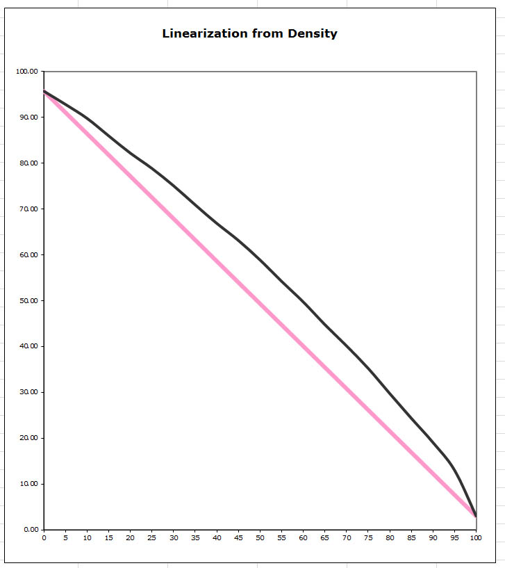
The paper type was probably specified as Epson Semi-gloss. As you can see, it’s a lot brighter than linear. It’s less clear to me why ABW was designed to print like this on gloss.

So if your workflow was based around printing on a glossy paper with ABW with a linearity like this, and you switch to a linear system like Piezo, then your prints are definitely going to be a lot darker. At some stage you must have adapted your workflow to ABW. You’ll need to adapt your workflow to P2 & QTR. You don’t have a measurement device, but I think IJM can supply ICCs that you can use to do a preserve numbers soft-proof in PS that will help you adapt your workflow.

Re Larry’s comment about crispness, or whatever term you use, I haven’t found that to be the case myself when I have bothered to do comparisons. The contrast boost you get from ABW on matte may seem to some as crisper, and edge transitions are harder from ABW if you look at them very closely, but when I’ve done three-way comparisons of Piezo, ABW and QTR-K3, with the ABW made linear by a little trick of mine, I didn’t regard ABW as noticeably crisper. But these things are in the eye of the beholder, and YMMV.

Thanks again, Brian. That’s very enlightening.

First a point of clarification. Since I also print in color regularly, when I decided to set up to make Piezography prints I went to eBay and picked up a used Epson 3800 to use alongside my Epson 3880, which will remain a color printer. I’d intended to set up the 3800 to print using the K7 inks but the magenta clog forced me to shift to P2. But practically speaking, for the purposes of this discussion, none of this really matters because you are correct that my workflow so far as been printing in ABW using the standard Epson inks and Photoshop and Epson’s standard printing tools.

And I suspect that the “problem” I’m dealing with regarding the darkness of the images is simply the result of the non-linearity of the ABW system. Your plot of the output from ABW on glossy paper is very helpful as it gives me a better idea of what I need to do to adjust from ABW to Piezography. So far, based on my very initial testing, I’m finding that each image needs something a little different to be just right but all need to be lightened, especially at the dark end.

Interestingly, as I look at my adjusted test images on-screen and compare them with the Piezography prints, I’m feeling like they actually match quite well. I think I’m just used to the way the 3880 in ABW prints so without even fully being aware of it I’ve adjusted my photographs to suit the way the printer prints.

Thanks again for your help.

I think if you can learn Brian’s “little trick” for ABW, you will probably be much happier. If you just lighten the image to get your shadow detail, I think you’re going to start losing highlight detail. Personally, I’d look into the QTR-K3. It’s a tiny bit more work to set up, but not very difficult. I think the B&W looks much better done this way. And you’ve got lots of help here available. I know because I’ve probably asked more than my fair share of questions and I haven’t been told to go to the moon yet.

Something else I noticed was that any K3 printing, whether ABW or QTR-K3 (I like QTR-K3 the best) is very sensitive to the colour spectrum of the viewing light. Because both ABW and QTR-K3 must use some colour to neutralize the blacks, there is some colour printed. If you’re viewing an ABW or QTR-K3 print under a light source that contains a lot of blue, such as LED or fluorescent, blues will get reflected proportionally more than the reds, giving the print a cooler look. If you view the same print under incandescent or halogen light sources, these contain proportionally less blue than reds, and give the print a warmer look. Because piezography doesn’t use any colour inks, this effect is negligible.

Larry

Thanks Larry. I should clarify that I would never just lighten the image overall. Instead I use a curve to lighten just what I want to lighten. So, in this case what I’m typically doing is lightening the darker end of the range but leaving the lighter end alone to get a result I like from my Piezography printer. And I don’t lighten the very darkest end because I want the areas that are supposed to be fully black (no detail) to be really black.

At this point, with Piezography working for me I doubt I’ll use ABW since I like Piezography better. But there will be a place for some experimenting when it comes to printing in color. For now what I’m focusing on is adding a curve layer to my key B&W images to adjust them for Piezography printing.

I do need to think about my viewing lighting. Right now that realm is not pretty in my work space. On a cloudy-bright day I have pretty good outside light. Otherwise I’ve got an ugly fluorescent or bright, direct sunlight.

Sorry for jumping into this late, although Larry and Brian handled everything really.

Piezography and ABW handle images very differently (as described above). ABW non-linearity is not consistent between paper families (matte/luster/gloss). One image printed with ABW Normal on one paper has to be printed with ABW dark on another, etc, etc.

Piezography is more consistent in its rendering of tonals because currently Piezography is built with a straight linear tonal line. But by no means does it have to be, we just find that that works the best for consistency.

So, because of this linear effect, contrast is decreased below most monitors/expectations that are built for other BW processes, and soft-proofing is required when doing fine-tunes of the image to simulate the contrast of the linear piezography system.

Those profiles can be found at Piezography.com (do a google search for Piezography soft-proof profiles) and also in our upcoming Piezography installer.

regards,
Walker

Soft proof ICCs here: http://www.piezography.com/PiezoPress/blog/calibration/piezography-soft-proofing/

They may assist you adapt your workflow to Piezography. Note that they’re used a little differently to colour soft-proofing. See here: The Piezography Heretic: To Convert Or Not To Convert? – CyberHalides

p.s. The ICCs implicitly assume that you’re printing with a curve that is linear on your printer for that paper type. Without a measurement device, you don’t know that. So there may be discrepancies between the print and the soft-proof, even when proofing is performed correctly. Printers tend to drift as they age, so that becomes more likely over time, although this is supposed to be less so on the Pro printers like the 38x0 models and larger, compared to the desktop printers.

Following on from a discussion on another forum, I should also acknowledge that the recommendation to soft-proof, including with preserve numbers enabled as per that blog post, is less critical for glossy papers than for matte, but personally I still find it useful. Of course this assumes that you have a quality, hardware-calibrated monitor which is configured to proof for print, which requires at least a screen profiling device.

Thanks Brian. I do have a decent monitor and I have profiled it with an Eye-One. So in theory my monitor should be a good match to the printer, and when it comes to accurate re-production of colors I have found it to be an accurate match. I think where I may need to tweak things is the overall brightness of the monitor, because that’s the key place I find myself adjusting the on-screen version to get the results I want from the printer. This shows up most in the mid-range tones.

I may also need to pay a bit more attention to just how I’m using profiles. I’m used to keeping everything in Adobe RGB, turning off the printer’s color management, and letting Photoshop convert the image to the profile for the paper I’m printing on as it sends the image to the printer (I essentially stuck to this system when using ABW, which is a bit quirky since it means two profiles are getting used, but it seemed to work). To my perception, the standard Piezography workflow is not that different since I leave the image in Gray Gamma 2.2 and select the “curve” (profile) for the paper in QuadToneRIP. If I read that blog post correctly there’s no real difference between Adobe RGB and Gray Gamma 2.2.

So what confuses me about the blog post is the talk of converting to the ICC profile before printing. I’ve never converted or re-assigned the profile before printing. Is that something most people do or am I misunderstanding the blog post? One of the basic rules I was taught long ago was to keep the original image files in Adobe RGB/Gray Gamma 2.2 to preserve the maximum range of color/tone so I’ve always edited in Adobe RGB or Gray Gamma 2.2.

Re the monitor, sounds like you’re in a good position. The ideal is to have a monitor that you can set brightness and contrast on, such as an Eizo. An Eye-One is also good especially if it’s an Eye-One Photo that enables you to create printer profiles as well as profile the screen. I hesitate to recommend these things, as they’re expensive and you can certainly do Piezography without them, but there’s a whole lot more predictability and control and flexibility possible with them.

The blog post is generic, and how best to describe the workflow will depend on where you’re coming from. If you’re printing colour from Photoshop, you wouldn’t normally convert to a printer profile by selecting 'Edit | Convert to Profile …". Rather you’d call up the print dialog, choose “Photoshop manages colours” and then select a printer profile. This is still converting to the printer profile - it’s just doing it on the fly en route to the printer rather than converting the open file. You’re doing the conversion, whether you realise it or not. (If instead you’re using “Printer manages colours” (as C’tein notoriously now recommends), then you won’t get this option to select a printer profile.)

[The ABW workflow doesn’t really fit this model. You have to select “Printer manages colours” in PS, and there are issues in doing this on both Win and OS X, because both OS have some hidden profile conversions that can happen in such circumstances. I can sent you some comments on this by an Adobe engineer, but since you’re no longer using ABW this is a bit academic.]

This is not the Piezography workflow. It’s not clear whether you’re on Win or OS X and the workflow is slightly different. On Win you can’t print direct to QTR. You have to save a file and open it in QTRGui. So if you were to convert from either AdobeRGB or GG22 to an ICC for printing you can’t do it on the fly - you have to save a converted copy. On OS X you can print directly to QTR but you shouldn’t. The reason why is well documented. Instead you print the file from Print Tool, and PT will allow you to convert to the ICC on the fly, in much the same manner as you do when printing colour from PS, if that’s what you want to do.

So when the blog talks about converting to an ICC, it isn’t specific about how the conversion is done - on the fly (OS X) or via a saved copy (Win). I’m on Win, and that may perhaps come through in the way that I wrote it. Rather the blog post is about whether and in what circumstances you should convert.

Thanks Brian. I can set contrast and brightness on my monitor, and I can adjust the “level” of each color channel (RGB), which is good when profiling it with the Eye-One. I did notice that I can’t set the brightness to be as bright as Eye-One wants it to be, and I’m guessing this is because of the age of the monitor, but I’m not that worried by this as my prints are still coming out a bit darker on the printer than they are on the monitor. I’m not sure why that is. That’s a piece that would be nice to figure out.

Unfortunately my Eye-One is just for monitors so I can’t take readings from prints.

Thanks for the explanation of the blog post. Now it’s all making sense. I am on Windows so I have to save my image as TIFF and then open it in QTR. This can feel like a hassle compared to just hitting control+p but I do like the potential repeat-ability of having a TIFF that’s truly ready to just open and print, but still also having a Photoshop file that’s got all my layers and so and that hasn’t been resized or sharpened.

I have a consumer grade Samsung monitor that isn’t the best for the best work. In fact when I had trouble matching shadow detail between my screen and prints, Jon blamed my monitor. He wasn’t wrong to blame my monitor because consumer grade monitors truely aren’t best for viewing shadow detail. It turned out, though, that I had an even bigger problem and that was my profile.

So, even though my monitor won’t be the best for shadow detail in Piezography, I did find that if I worked in a dimly lit room, calibrated my monitor and set the brightness down to 10%, I could see down to # 4 or 5 on the scale here:
http://www.piezography.com/PiezoPress/blog/calibration/calibration-do-i-need-it/ My point is that I had to calibrate my monitor and brightness for a very dimly lit room.

Larry

It’s also important to calibrate your eyes for said room.

Put a light behind the monitor pointed at the wall so the monitor is not the brightest thing.

best,
Walker

I should have been more specific. Most desktop monitors allow you to set brightness and contrast. I meant that you can set the brightness to a specific level, say 85cd/m². A monitor that allows you to directly calibrate its hardware enables this to be set. In a similar vein you set the black level to something like 0.3 cd/m². The combination of these two give you a contrast ratio of 283:1. People argue over these precise numbers, but you get the idea. Settings like this are intended to match the characteristics of the typical inkjet page, and are termed calibration for print.

Thanks All. Where I’m having the most trouble is not with seeing the shadow detail but getting the right sense of the mid-tones: they always seem to look brighter on my monitor than they do on the print. The suggestions around managing the room like are interesting, and I do have a somewhat challenging room since it gets a fair amount of sunlight at certain times of day.

And thanks, Brian, for the more detailed explanation of the settings. I can set the target brightness when I calibrate the monitor but you are correct that I can’t set the specific level via the monitor’s controls.