I just converted my 2400 over to K7 inks. I’ve printed on both Epson matte heavyweight and Epson enhanced matte and both have a few ripples after printing and drying. Seems to be from too much ink being laid down? Is this typical? Or are there some adjustments that I need to make?
I followed the latest version of the Piezography manual: The NEW Piezography Manual (version 8-28-2013) Covers Mac OS X, Windows, Piezography Glossy and Digital Negative
I tried some additional tests today and seems like the prints are worse today. The paper (matte heavyweight) curled as it came off the printer, and the photo looks very flat and muddy, no detail at all. I must be doing something wrong. I ran the calibration profile, looks like a match in terms of ink positions. The lines don’t appear as sharp as I would expect. Seems like the ink is spreading farther than it should (dot gain?).
I’m running a Mac Yosemite with latest QTR and Print Tool install.
Could you please attach a photo or scan (300ppi min, and “large” attachment so I can see detail) of your printed Ink Separation image, along with a print of your image that looks dark/flat/muddy?
Instructions for attaching images to this forum can be found here: http://www.inkjetmall.com/tech/content.php?152-How-to-attach-images-to-this-forum
Matte Heavyweight and Enhanced Matte are pretty thin papers, but we use them a lot for testing, so know they provide crisp detail with good open tonal range with Piezography.
I haven’t personally used Mac 10.10, but a few customers have reported upgrading and seem to be working fine using QTR Print Tool and QuadTone RIP.
To confirm, you’re using version 1.1.0 of Print Tool and 2.7.5 of QuadTone RIP- correct?
Please let me know so I can help you sort this out and get set up happily printing.
Best regards~ Dana
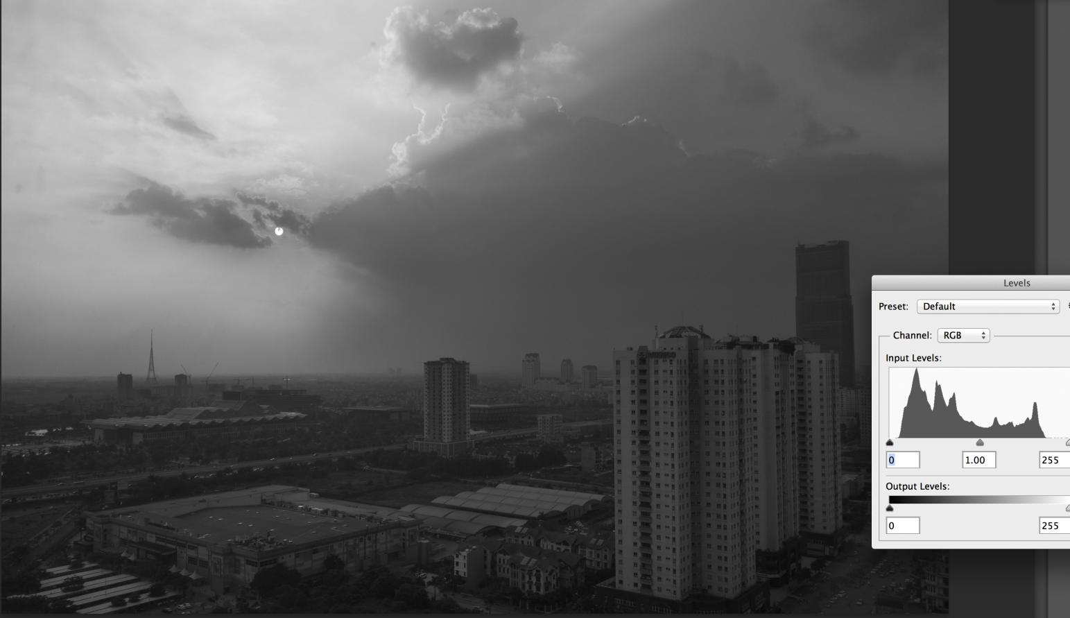
Ok, here are the attachments. I am attaching the ink separation and then scans of two separate prints. The first print is Hanoi, which is the one that I’m concerned about. I really noticed the missing details from the buildings. The second print is KentTrail, this one came out great. Same paper used for both prints. I also am attaching a jpg of the Hanoi photo in case it helps analyze.
Last attachment will be a photo of the paper curl. They are horizontal to the way I’m holding the back of the print. Is this normal, do you see something similar?
And yes, I am using version 1.1.0 Print Tool and 2.7.5 Quadtone RIP.
Based on your printed Ink Separation image, it looks like your ink shades are in the correct order.
Yes, this waviness of the paper is normal when using thin papers such as matte.
I think your output is probably correct for Piezography, based on the histogram for this image. The right sky and buildings are very similar in density, and there is no black in the image- this will result in a flat looking Piezography print. I recommend reading “where is the black?”, here: http://www.piezography.com/PiezoPress/technical-support/ to add black, then make a contrast adjustment to separate the buildings and sky. Keep in mind that Piezography prints true image information, so 40% prints 40%, 60%, etc… though printing thru the Epson driver forces inaccurate contrast. There’s a little learning curve to properly adjust images for Piezography, but once you get the hang of it, you’ll be blown away!
I hesitate to intrude into this thread, but there is a very simple and embarrassing mistake that I once made, which had pretty much these symptoms. And that was to print on the wrong side of the paper. Are you sure that you’re not doing this?
With regard to the paper curling, I had this problem years ago when I was running piezo on an 2100/2200 on EEM and the old-style non-transparent cartidges. Nowadays you could probably get a custom profile made that hopefully would deal with this issue. What I did back in those days was to print at 1440 rather than 2880, and to make some compensating adjustments to the supplied curve. I had to do this in Excel and it involved some trial and error, but it worked fairly well. Jon thought I was a little crazy, as piezo is supposed to work out of the box, but what’s the alterntive, other than going to a heavier paper? If you’re interested, I can see if I can find the details of how I did this.
Thanks Dana. If everything looks to be in order, then I will do some experimenting with setting the black and then making the contrast adjustments. I am just starting out so I’m sure I have a few things to learn. I probablyalso need to look at getting my monitor calibrated for Piezography. I have a NEC Spectraview PA271W. Do you have some articles that discuss this?
Thanks for the comments and suggestions. I do check the paper coating side with moist finger and thumb, that seems to work. So based on what I’ve read that’s the sticky side and the side I print on.
I’ve also used the pre-packaged profiles that come with QTR installer, of which includes the EPSON heavyweight and enhanced matte (for R2400). Do you lose density if you don’t print at the 2880 setting? If I have to choose density or removing curls, I would stick with density. If density is not affected then I would like to try your method out.
With some papers it can be hard to tell which side is the correct side until you learn to see the coating. The issue I had was that if you’re used to printing on a textured paper and then get one that isn’t, at a quick glance the reverse can seems like the correct side because it has more texture. EEM is fairly easy to pick as the coated side is a lot whiter than the reverse. I haven’t used the wet finger test.
It’s not just a case of printing at 1440, there is also an adjustment I made to the included curve to minimise density loss. I felt that it was a reasonable compromise. I only half recall the precise details of how I did this. If you want to give it a try, I’ll dig out the spreadsheet I used, but it sounds not.
It’s worth trying 1440dpi. The density should be the same, but less ink being laid down (so, less crisp details, but also less ink on the paper, which may help with your wavy paper issue).
I hope adjusting the contrast of your image as per our user manual gives you the desired results.
Please let me know if you have further questions, or there’s anything else I can help you with.
Best regards~ Dana