I’m doing a little research ahead of possibly buying some more inks, pehaps SEL. In getting test prints made by others, and examining curves etc, I was struck by what seems to be the effect of HDPK on print toning. The SEL effect seems more muted with HDPK (testing on Platine).
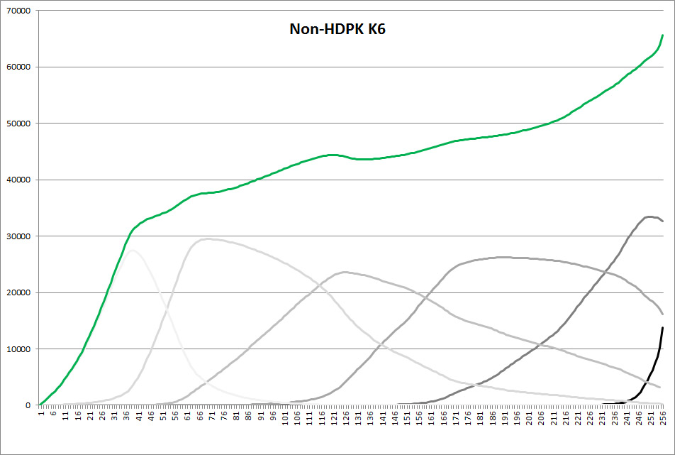
The P2 curve with regular PK looks like this:
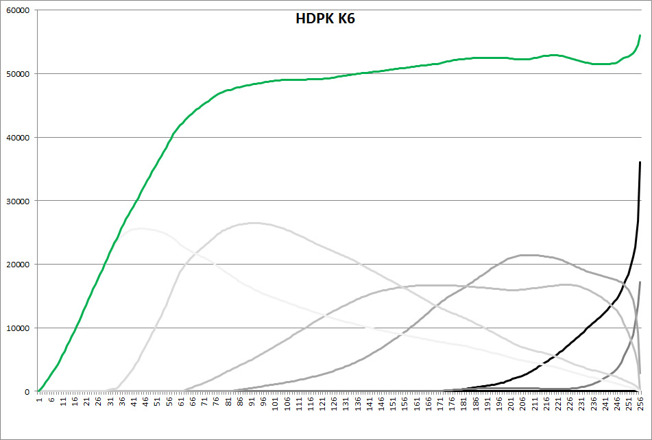
Whereas the HDPK P2 curve looks like this:
I was surprised by how much HD shade 1 is being used and how little shade 2 compared to traditional curves. Since Shade 1 is neutral, I assume that this the cause of less toning in prints. If I’ve got that right, I’m a little surprised by this.
I’ve previously posted on this but can’t find where:
This curve structure difference is mainly due to minimizing gloss differential. Shade 2/3/4 sel are all much less glossy than HD-PK. If you use the original curves simply with HDPK in there, you will see the last few luminance tones become very glossy compared to the tones directly after. It’s also about maximizing dMax. You’ll notice that on the new curve structure there is significantly less underprinting of the last tonal value. We tested 1560 different combinations of underprinting (HDPK with other inks printed at the same time at different levels) and found this (curve #2 underprinting) to make the darkest black after GO is applied (between L* 1 and L* 3.2 paper dependent).
That being said the different curve structure in the shadows have very little effect on the actual SEL effect. The mid-tone and highlight-tone difference is actually causing the difference in color. These changes in curves structure also minimize gloss differential compared to the previous generation of curves. They also decrease the total amount of ink per channel a bit and overlap a bit more. All of this makes a curve that is easier to calibrate and is more “universal”: meaning it can print on a bunch of similar papers equally well.
It also allows for these curves to print onto baryta papers properly with 1 pass gloss optimization: something previous curves did not allow for very well.
Piezography Professional users can always blend between these two curves structures to get mid-tone and highlight colors back while maintaining the gloss differential abilities of the new curve in the shadows. This would limit some of the papers that are printable (aka, baryta papers) but could be valuable. A few have done this already to my knowledge.
I’m not sure I fully understand the impact of HD blacks in mid-tone and highlight toning, since both HD and non-HD curves are using the same shades 2-6. Looking at a few of the curves, it appears that in the HD curves there’s a greater reliance, i.e. higher aggregate ink load, on the lighter shades in these tonal values, and perhaps those lighter shades have less toning component.
Reading this, it sounds like the HD inks, or at least HDPK, are a case of on the one hand, on the other hand. There are clear dMax benefits, but in order to get them there’s a loss of toning. If you opt for Pro inks you may be able to work around that. But as I understand it, Pro is warm and cool and you can’t really simulate the SEL inkset in Pro. If you want SEL then you have to make the choice.
I’m waiting for sample prints to arrive to help make that choice. I’m hoping to make a quick decision so that Wells can ship inks to me to meet me in the US quite soon so that I can avoid the shipping cost, which has become more complex and expensive to this part of the world. I’m not sure Pro is a big advance for me over Special Edition, at least on matte, but it may be on gloss, as it would enable me to moderate the overly strong SE toning effect on gloss, apparently with the assistance of the HD curves. Decisions, decisions. And under time pressure.
HDPK isn’t in the mid-tone. If you read my statement, you’ll notice I talk about overlaps and total amount of ink in the mid-tones. The curves structure is different in the mid-tones. Nothing to do with HDPK ink being there re mid-tones: I updated the entire curve structure.
Goodness yes, of course I understand that. I did look at the curves. But I am guilty of careless expression. Let me try that again.
I’m not sure I fully understand the way in which the changed curve structure because of the HD blacks has led to reduced toning effect in the in mid-tones and highlights. Shades 2-6 SEL are still the same but are being combined in different ways. How does that reduce toning effect? It appears to me that the curves are using higher loads of the lighter tones to build up density, and I guess that leads to reduced toning effect, although I’m surprised that it does.
But my main point was that the HD inks sound like a mixed blessing, if maintaining the toning effect is important. This thread is the first that I’ve heard about this, and I read most of the material, at least in the public forums. Is it mentioned anywhere, publicly?
And it’s been causing some confusion in this part of the world. Jeff has put SEL in a 3880 that previously had colour. How can you be certain that the colour all been purged? There was the expectation that when the toning of a print of a reference image matched one previously printed with SEL non-HD.
Pro inks, and presumably Pro Tools, only offer a solution of sorts if the tonings possible with Pro are what you want.
a. It’s a minimal change. It’s still selenium toned!
b. Papers change this more from lot to lot.
c. Most people who change to HDPK are printing new work and changing up their workflow or buying Selenium for the first time (or using a new paper or paper lot).
d. The advantages (any paper, better inking, better dmax) outway the small shift in color IMO.
e. You can always have your cake and eat it too if you want to blend use the PPE tools: although this would still limit you to a smaller paper choice or double GO layers on some papers.