Epson Premium Presentation Paper Gloss is what we profiled. http://conecolor.com/icc/EpsonR3000.html
Is that different from Epson Premium Glossy Photo Paper?
Did they name change? Or do they have two different papers with such similar names…??
Epson Premium Presentation Paper Gloss is what we profiled. http://conecolor.com/icc/EpsonR3000.html
Is that different from Epson Premium Glossy Photo Paper?
Did they name change? Or do they have two different papers with such similar names…??
[QUOTE=jon;9754]Epson Premium Presentation Paper Gloss is what we profiled. http://conecolor.com/icc/EpsonR3000.html
Is that different from Epson Premium Glossy Photo Paper?
Did they name change? Or do they have two different papers with such similar names…??
[/QUOTE]
I don’t know the answers to those questions. I just know to choose a profile that matches the name of the paper. On the Epson site, presentation papers seem to be matte, whereas photo papers tend to be glossy. I’ll try the presentation paper glossy.
When I said “I don’t know why Jon is so negative about printing from LR”, I was responding to
rather than making a general PS vs LR workflow comment, since I use both, although I’m using C1 more than LR for processing at present. The internet is full of religious wars over workflow, and I don’t intend to add them. The point I was trying to make was just that I wasn’t aware of CM deficiencies in LR 5.x for printing purposes, based on what I’ve read.
Exactly. I can’t find any references to “Epson Premium Presentation Paper Glossy” either, if you Google on that exact phrase. HP have a paper with that name, but I can’t find an Epson one, so I share Larry’s confusion. At present, there’s “Ultra Premium Photo Paper Glossy”, “Premium Photo Paper Glossy” (was Premium Glossy Photo Paper} and “Photo Paper Glossy”, and for matte there’s “Ultra Premium Presentation Paper Matte” (was EEM/EAM), “Premium Presentation Paper Matte” (was Matte Paper Heavyweight), and “Presentation Paper Matte” (was Photo Quality Ink Jet Paper).
I’m interested in this, because I’ve been caught by Epson’s name changes and variations before, e.g. EAM -> EEM -> EUPPMP and EEF vs TPP. The problems with these name changes is knowing which profile or curve to use, which is exactly Larry’s problem at the moment, although I wonder if the the IJM CCP profile for “Epson Premium Presentation Paper Glossy” was accidentally misnamed, given that there’s no sign of this exact paper.
[QUOTE=Brian_S;9759]When I said “I don’t know why Jon is so negative about printing from LR”, I was responding to
“Adobe Photoshop arguably has better color management than LR5 - although Adobe is trying hard to equalize them in more recent versions of LR.”
[/QUOTE]
I don’t want to “beat a dead horse” here, but I’m not trying to point out or defend any points of view here. I can see that some may take exception to Jon’s statement, but as a LR user, I can easily see that if control over color workspace is important, LR color management is poor. However, because an output profile can be used, the comment is probably not relevant to my needs. I had seriously considered getting PS, but I was able to pick up LR with an educator’s discount which sealed the deal for me. Also, in general, I don’t need to do a lot of touching up of photos, so a simplified workflow in LR is an advantage for me.
As for profiles in general, if you dig around IJM, you will find they recommend making your own profiles, or using one of theirs. They do, in advertising, say that their inks are a direct replacement for Epson inks. This is probably true for general home printing. However, I am surprised to the amount of lost detail in shadows. I had a picture of a child with dark brown hair. You could hardly see how the hair would flow in the print although it was clear on the screen. I believed for a long time my screen was too bright (see earlier posts in this thread) so I tried for a long time to adjust my monitor, and thought I’d have to upgrade. The lost detail was that bad, IMO. Also, when I printed the image of a kid’s pink coat, my wife noted that the color seemed more accurate with the different profile.
The latest print, using one of Conecolor’s profiles (the Epson photo lustre) recovered A LOT of shadow detail. I didn’t figure this out until I got IJM’s test print and saw the detail in the shadows there. I then knew there was something wrong with how I was printing, not the monitor.
Should IJM recommend their profiles on the purchasing ink page? I’m not a business person, nor a professional photographic artist. I don’t have any right to answer that question. If they had recommended their profiles right on the purchasing ink page in an obvious location, would I have gone through all this? I think it may have solved a lot of issues.
Sorry about such a long post here. I have been struggling with dark prints for MONTHs! And the solution was really simple. I thought because IJM said their direct replacement inks that the Epson ICC’s should be so close, they’d be good enough and that the dark prints must have been something else. It seems that the ICC profiles was the issue. I’m sure that Jon and the team at IJM probably assumed that anyone with half an IQ probably knew to use dedicated ICC profiles. I’m going to suggest that there is more than one person out there like me with less than half an IQ!
I think it may be time for IJM to update the names on the Epson profiles to match current Epson papers, or at least match the current papers to the best available profile. That would have helped me a lot.
Anyway, I believe I’m on my way to happy printing again!
Larry
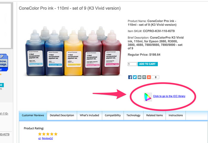
We have a new webstore launching in January and ICCs will be on the IJM site.
Right now we point you to them on the product pages which takes you to conecolor.com/icc
As I said in various posts and PMs, I didn’t expect that using IJM profiles for CCP would give such dramatically different results to using the Epson ones. I’m surprised that it did.
I’m no LR salesman on a commission, far from it, but I still don’t understand what you and Jon think is wrong with its CM.
p.s. although they’re not all that easy to find at present, the issue of the ICCs is not their location, but their naming. In a few instances, they don’t match the Epson paper names.
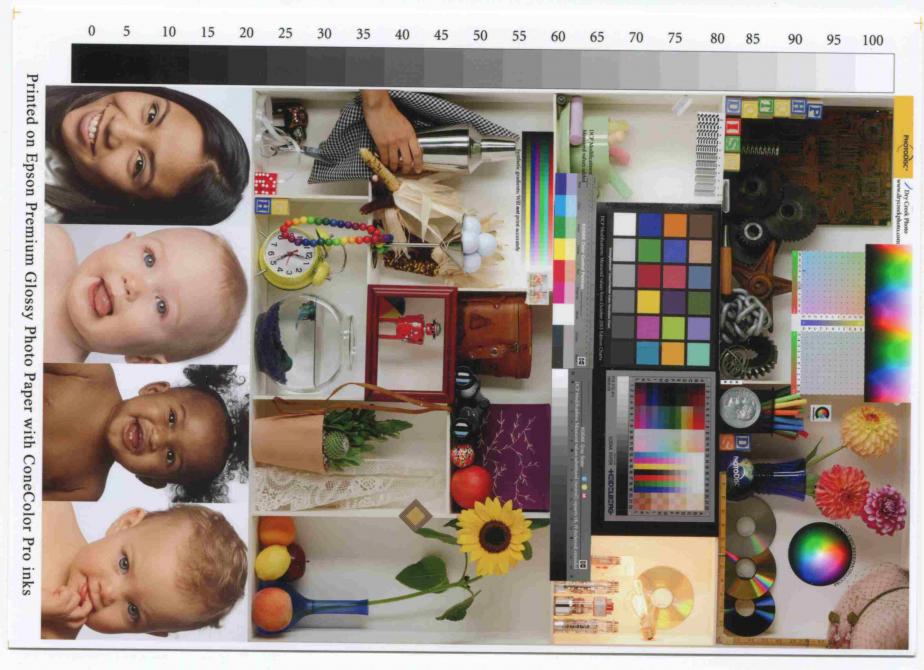
I thought I’d scan three prints so everyone can see what I’ve been talking about. All scans were scanned at 400n dpi, 24 bit colour. It’s probably more important to understand that all prints were scanned using the same parameters. They were then saved as jpg using the same compression factor. Because of jpeg compression, assessment of colour is not reliable. But you can sure see the difference in shadow detail in the top left (old circuit board? beside the toy alphabet blocks). My prints are on Epson Premium Photo Paper Glossy. IJM print was on Epson Professional Glossy.
1st picture is the IJM test image using whatever ICC profile IJM used. (Not identified, but I’m assuming it was the EpsPPPG for the R3000.
2nd picture is my print on the Epson R3000 using the EpsPPPG ICC for the R3000.
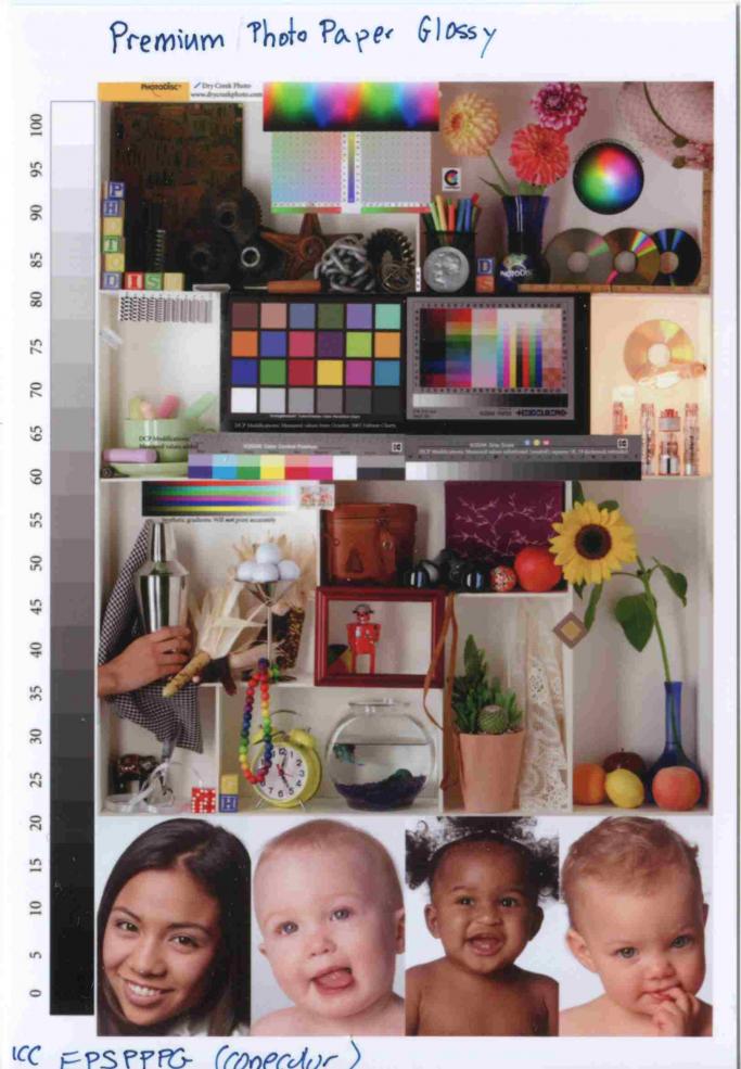
3rd picture is my print on the Epson R3000 using the Epson ICC SPR3000 Premium Glossy for the R3000

I would suggest that the Epson ICC is not appropriate, and either a custom or the IJM profile be used. If you’re switching over, order the IJM test print, run a test print and when the shadow detail begins to darken, switch to the Conecolor ICC.
[QUOTE=Dana-IJM;8662]Hi Larry~
Our inks are designed to work with the standard Epson driver + profiles. Have you tried making a print using one of the Epson profiles?
What printer model are you using? Are you printing from Mac or Windows? Have you printed a nozzle check to make sure all channels are fully printing, and printing in the correct position?
It may be that you need to make a profile specific to your exact printer/ink/paper/print settings to optimize your results with this media.
Best regards~ Dana[/QUOTE]
If this advice is good for most, my eyes are pickier than most. This was the information I was working with before, and one reason I didn’t try the IJM profiles. This was also the reason I thought my monitor or other aspects of my work flow were faulty. Perhaps Epson profiles have changed since, but in one of my latest replies on p. 5 one can see clearly that Epson profiles are not providing reasonable shadow detail.
I’m not trying to be critical here. I’m just pointing out what I’ve observed from my prints
Larry