Anyone else using Red River paper and Conecolor ink noticed prints having a yellow cast? It was more noticeable on Polar Pearl Metallic, less noticeable on Satin Pro 4.0.
I’ve calibrated my monitor, I’ve set the printer driver to not control colour, and I’m using the Red River profiles.
Also, I have noticed that, to get the brightness of my prints to come close to what I see on the calibrated monitor, I have to turn my brightness down to near zero. I thought monitor calibration (spyder 4) would have been better.
Our inks are designed to work with the standard Epson driver + profiles. Have you tried making a print using one of the Epson profiles?
What printer model are you using? Are you printing from Mac or Windows? Have you printed a nozzle check to make sure all channels are fully printing, and printing in the correct position?
It may be that you need to make a profile specific to your exact printer/ink/paper/print settings to optimize your results with this media.
I’ve done a reasonable amount of printing on RR Pecos gloss, but never used their profiles or IJM ones. I always created my own. I was careful to compare the print to a soft-proof on a monitor setup for printing, i.e. D5000 and dimmed to 80c, and given that I thought the match was good. If you don’t soft-proof and your monitor is too bright and at a different temperature then there is likely to be a discrepancy, but that’s the case for a fully OEM workflow as well.
Jeff and I did a comparison of CCP & OEM recently. It’s surprising what a good match CCP is, but it’s not perfect. The OEM gamut map is wider. How much of this you see in practice will vary from image to image. On a few test images I found it hard to see the difference, but on some you may, especially with an image in ProPhotoRGB that is pushing the boundaries of the OEM gamut.
Dana,
I’m printing to an R3000 using Windows 7 and LR5. My monitor is fairly basic, a Samsung LED with PLS technology. When using the Spyder the onscreen instructions tell me to set the colour temperature to 6000K. The menu on the monitor just has “cool 1”, “Cool 2” etc.
the nozzle check was good.
I’ll try using the closest Epson profile, and I’ll try some Epson paper too.
I suspect I am doing something wrong. The colour difference between the monitor and print shouldn’t be so far off that my untrained amateur eye can see a difference.
Brian,
forgive my ignorance, but you said soft proof on a monitor setup for printing, ie D5000 and dimmed to 80C. Are you referring to soft proofing on the Nikon D5000 monitor?!? This is new to me. I think I’m misunderstanding something.
I have dimmed my monitor to less than 50%, but that still seems to bright for shadows. Parts that were visible in the shadows were barely visible in the print. When I dimmed the monitor to nearly 0%, the shadows seemed to match, but then the bright areas of the print seemed too bright.
I’ve tried soft proofing in LR5, but never seen much difference.
Forgive me if I seem to be “thrashing” here. I figure Cone inks should be good. Pros use it. It could be the Red River paper. It’s not expensive paper. But it could be me too.
Again, I’ll try the Epson paper sometime. I’ve got my room torn apart while I’m re flooring for a few days.
My comments were in relation to the computer monitor, not the camera screen. I may be guilty of mixed terminology. I probably meant 5000K which I think is sometimes called D50.
Pages 10-11 of the New Piezography Manual has a section “Piezography Workflow Background” on calibrating for print. While it’s written in a piezo context, I regard it as applying to colour as well.
I wasn’t talking up or down one inkset over the other. I was only to point out that while they’re close substitutes, in my view they’re not 100% identical.
These Samsung LED with PLS technology displays are not designed for printing. The contrast ratio is simply too bright. The new ASUS are in the same boat. But the marketing of accurate color implies to print. These displays are better suited for video. Apple is guilty of the same marketing. For the cost of these displays one can get a refurbished NEC PA model that is actually designed for print. You want full specifications at a contrast ratio of about 250:1. At that level, the Samsung and ASUS will begin to fall apart. You can use a Spyder to calibrate your computer’s video card but not actually the display itself. The Spyder can only write a color lookup table that affects the video board and further cuts down the fidelity.
You want a brightness level of about 80-85L or candelas for printing. But measuring a brightness that low on the Samsung puts it at a disadvantage. You have to check the website frequently but I just purchased two 30" calibrator displays from NEC for $749 each.
Click on the PA displays as the filter and it brings up a 23" and a 24" at low cost. You may be able to use the Spyder instrument but you MUST use the NEC software to calibrate these. A USB cable goes to the actual display where the NEC software will tune the display while leaving your video board null. Eizo also makes this type of display but they are very expensive.
Spyder and Color Munki are not really professional solutions - and they work better with some displays than others when you use their software. The difference between a NEC PA and your Samsung - besides being that the NEC is designed for print professionals is that the NEC has a 14bit on board video controller that the calibration software can physically affect.
Having said all that - a yellow cast can be the result also of not having an ICC profile made for the combination or not using the ICC profile that you have been supplied with correctly. The settings that were provided to you for use with the Epson print window must exactly match the settings used when the ICC was made. Also run your nozzle check.
Well, this is a little disappointing. I knew when I bought my Samsung monitor, it wouldn’t be the best. But, I didn’t expect to see differences between the screen and print from my amateur eye. All I can say is that no one else will likely see the difference unless they place the image beside my monitor. I guess a NEC is now on my wish list, but not for this year. Jon, I gave you guys most of my photography budget for the remainder of the year when you had your sale.
In the next few days I’ll do another nozzle check, try an Epson profile on Epson paper.
Expectations and needs do not always follow behind a purchase. It’s best to seek the advise of those who print for a living when buying displays. Not that many people who sell displays actually print in a color managed environment. They tend to sell what they make bonus money on. The Samsungs are more expensive than refurbished and warrantied NEC Spectraview displays. So, it may be possible to sell it on eBay and get something that is designed for printing rather than for gaming and video. The Spyder 2 and 3 are compatible with the NEC Spectraview software - so no more investment needed there. You just would not use the Spyder software (defeats the purpose of the NEC Spectraview display).
Having said that - the issue may not be the calibration of the display but the actual color output being produced either by the ICC, or a mismatch in the settings required by the ICC, or the condition of the printer - or a combination thereof.
I would first look at this as a color management issue.
The least expensive thing to do is maintain the printer properly - as you can not print any other way but with a perfect nozzle check.
Then calibrate the display to the best you can. Ideal is a 250:1 contrast ratio or a brightness of 85L. The Gamma can be set to 1.80 for color work using the Epson RGB driver. The white point should be 5000k but you may not be using 5000k to view the prints in. The viewing light and the white point of the display are supposed to both be the same color - but its not useful to calibrate an LCD below 5000k.
Then you tackle the ICC which may cost you a custom. But, first make sure the settings required by the ICC are the exact same settings you are using in the Epson RGB driver. If you do not know the settings, you can not guess. The ICC is worthless at that point and you will need a custom ICC for which you also know the correct settings. The ICC profile is for the inks, media, printer model, and printer driver settings. Change one thing and you change the output. Hope this explains all.
On this point I agree. There’s also the question of whether Larry is soft-proofing at all. He’s printing from LR and the way that soft-proofing enabled is different in LR and PS. A custom ICC would enable him to simulate the Red River paper colour, which may be different to Epson paper, although he should be able to do that already with the Red River supplied profile.
The one question no one asked me was what lighting was I using when viewing the print. While assessing the print, I forgot that it works by absorbing colour. Fluorescent and LED lighting produces a little more blue light than does halogen, my desk lamp. I believe this explains the yellow cast on my print. There’s not enough blue light from my desk lamp, which results in less blue being reflected from the print. I took a photo of the screen, print under the halogen desk lamp, and the print under an LED bulb. The print when viewed under the LED bulb did seem closer to the computer screen when viewed in the camera screen. I’ll take a look in daylight tomorrow.
Regarding the issue of soft-proofing, I have tried it. The difference is quite small to my untrained eye. What I saw was a big difference in comparison, but I think I found at least one reason, my dark lamp.
I didn’t ask you what lighting you were using - but I did remind you that the lighting and the white point of the display had to be the same.
“The white point should be 5000k but you may not be using 5000k to view the prints in. The viewing light and the white point of the display are supposed to both be the same color - but its not useful to calibrate an LCD below 5000k.”
In any event, I am glad for you that this turned out to be a color management issue rather than a printer/technical issue.
I tried a print on Epson paper using an Epson profile and looked at it using natural daylight. The print was still slightly more yellow than the image on the monitor.
I’m going to shoot an image of something beside my computer, process, then print it. That way I’ll be able to determine what is causing the difference. Because I had the same colour balance on Epson paper, I’m suspecting it is the monitor as Jon suggested. I’d have to say that as long as the print is accurate, it won’t be worth upgrading my monitor at this stage.
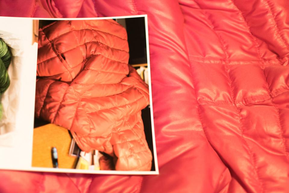
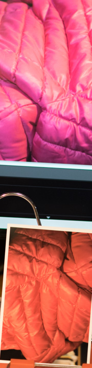
I finally got around to taking a picture of a print side by side with the original object, and the print side by side with the monitor. I did this for a print on Epson premium glossy and Red River Ultra Pro Satin 4.0. All shots were taken with no flash, 800 iso, using a G9 halogen bulb on my desk lamp. I realize this is not optimal for viewing, but at least my images should appear consistent with the actual item under similar lighting.
The first image shows a photo of a pink jacket along side with the print done on Red River Ultra Pro Satin 4.0. The jacket in the print appears quite orange compared to the digital image of the jacket. The digital image on my screen looks quite close to the actual jacket.
The second image shows the Red River paper print along side my monitor. The print looks noticeable orange compared to the monitor.
Then I remember Kelly saying that Cone inks are designed to be accurate on Epson papers, but they cannot guarantee them being accurate on other papers. So, I tried a print on some Epson premium glossy. Here is the print with the actual item on Epson premium glossy:
And here is the print along side my monitor:
I’ve noticed that the difficulty seems to be in the reds. I do not have Epson inks to try for comparison. Is this difference in the reds a common issue with pigment inks in general? Do I simply need to make my own profiles for my papers?
Brian, if your offer still stands, I’m now interested to try profiling. I wanted to see if the difference between my monitor and print was a monitor problem, or a profile/ink issue. While I can see a slight difference between the monitor and real objects, the difference between the real objects and the print is definitely greater.
The answer is yes. You’ve got my email address in a PM from 2 Sep. Best to handle this via email.
What you’re trying to do - get an exact screen to print match - requires some precision. There was some discussion above about the best equipment for a soft-proofing workflow. I agree with Jon that better gear delivers better results, as in highly accurate and repeatable, but I disagree that you need to spend up big in order to get acceptable-results-on-a-budget. You may not get an exact match, but we should be able to get you a lot closer than you currently are and into the range of acceptability.
There is also the question of your soft-proofing workflow. You’ve said that you’ve tried soft-proofing on and off and not seen much of a difference. That surprises me a little given that image. I’d have expected that turning on a soft-proof would change the reds quite a bit. There may be out-of-gamut colours there as well, which would need to be handled. We can run through all this once you’ve got a proper profile.
You raised the question of viewing conditions for soft-proofing. That’s also an issue. I’ve had cause to double the accuracy of some of my colour profiles, but after some experimentation I came to the dramatic realisation (duh!) that in image with deep shadow detail, you need good lighting to see it in the print as you do on the screen. For colour matching, you need some sort of D50 light source. Very few of us can justify a D50 viewing booth. An Ottlite is pretty inexpensive.
p.s. Are any of the comparisons above of a print with the actual jacket? It’s not entirely clear to me, but I suspect so. If so, real-world colour matching raises a whole additional set of issues, related to camera profiling etc. All we are aiming for with printer and screen profiling is a screen-to-print match.
The 1st and 3rd images compare the real jacket with the print.
When I click the soft proof I do see a difference, but fairly small. I do notice that image of the jacket on the screen is the most pink compared to the print. The actual jacket colour is not quite so pink, but definitely not orange like the print. The 2nd and 4th images were comparing the print to what’s on the monitor. I had the soft proofing box checked while taking this shot. I should also note that the actual image in front of me doesn’t look as orange as the image I see on my computer screen on this website.
I know about the light source problem. I figure that if I take the picture using the same light source as I view it, it should be a reasonable comparison. I don’t see a discrepancy between the prints and the screen and real objects for the blues, greens, and yellows.
I don’t think I need to be getting a new monitor over this. To look at the print of the jacket in front of me, it’s not offensively off colour. The print you see in the images above are more orange than the prints in front of me. But I figure I should be able to get a print to look closer to the original object under the same lighting a little easier.
Anyway, I’d want to correct any issues I have with workflow before I do anything with profiles.
I’m starting to wonder if I have an issue with white balance. I shoot raw with the white balance set to auto, then often use “as shot” for white balance in LR.
Actually, I’m more concerned about getting a closer real-world to print match! However, my untrained eye seems to see the screen as fairly close to the real world object.
However, I just noticed something: When I compared the images of the real world jacket to the computer screen, using “as shot” for white balance in LR, the photograph of my computer screen came up much more pink than the real world picture of the jacket.
I’m going to read up some more of Martin Evening’s book on white balance tonight.
The paper modeller’s thread is about out-of-gamut colours, which I mentioned in passing in my last post. As they said, there are colours that you simply can’t print on your printer. You can check for these in soft-proofing and decide how to deal with them, or at least you can in PS, I’m not so familiar with printing from LR. As I said, there’s a good chance that there are out-of-gamut colours in that image.
Even for colours which are in-gamut, getting an exact real-world match is a non-trivial exercise and requires a carefully colour-managed workflow from image capture to print. For example, take a look at this Lula thread on fine art reproduction.
Accurate WB comes from measuring the colour of the ambient light at the time the shot was taken. A second best solution is to take a shot with a grey card or colour checker and use that to set the white balance. Auto works sometimes, but mostly it’s not accurate, and the only question is how far it’s off. It’s only making a guess on based on the colours in the image.
Attempting to master colour management is a known cause of insanity. I’ll leave it to you and Martin.