A few months ago I ordered 2 Piezography Pro sample prints of an image file I provided, warm-neutral toned, one on Hahnemule Photo Rag, the other on Canson Platine. The image file contained a 50-step wedge and some photos that had a lot of tones at the low and high ends of the scale.
The Canson Platine sample print has a lovely deep warm tone and beautiful finish - but the low values are depressed compared to the Hahnemule. The 2 prints are a match at the high end, but the lower 1/3 of the scale on the Platine sample is overly dark with less separation: a lower, less linear quality than I’ve grown accustomed to with Piezography on matte papers.
Lately I’ve gotten around to printing with Platine on my Epson 3880, using a mixture of the Warm and Neutral profiles in the Community Edition. I’ve noticed that I always need to apply a Photoshop “gamma” correction to lift the lower 1/3 of the tonal scale. At this point it’s hit-or-miss which is an unacceptable approach in the long-run.
Was your Canson Platine profile off ? Is there a newer profile available for that paper ? Do I need a custom profile made for my printer ? Is it best for me to make my own profile ?
I have a Datacolor Spyder spectrophotometer, which I don’t believe is one of your supported spectros. Do you recommend higher-end spectros because they are more accurate or consistent ? Because they provide automation features which make it easier to measure targets with more patches ? Or why please ?
Thanks for your help as always !
If you print linear there will be a marked contrast difference betweeen matt and gloss papers because the tones are printing linear in relation to the paper contrast. This means you have to alter your image based on the paper contrast. ICC profiles minimize this difference between paper types but also destabilize your shadows.
tldr: your contrast adjustment for switching from matte to gloss paper is totally normal when working with a linear workflow.
Best,
Walker
I don’t understand what you mean by a linear workflow.
I am simply using the Community Edition profiles for Canson Platine, just as I have done previously with Community Edition profiles for matte paper. Have I overlooked something ?
Do you mean you are selecting the ICC Profiles for Matte paper? This would certainly print very dark if used on a gloss paper . . .
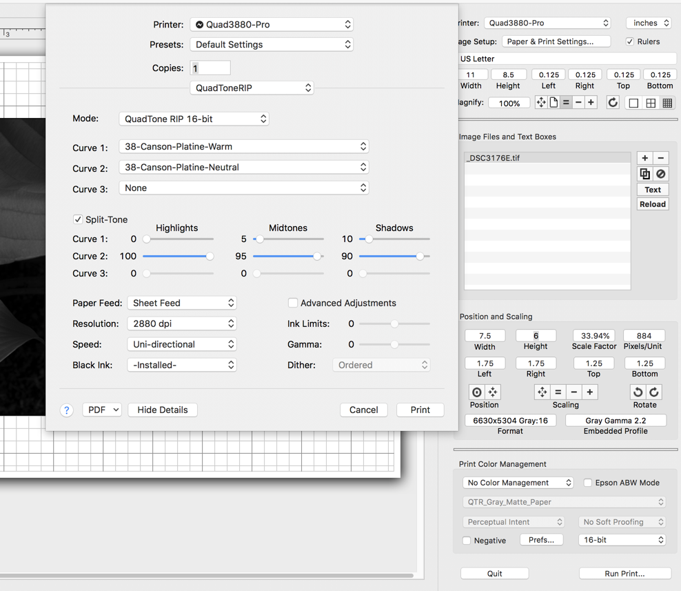
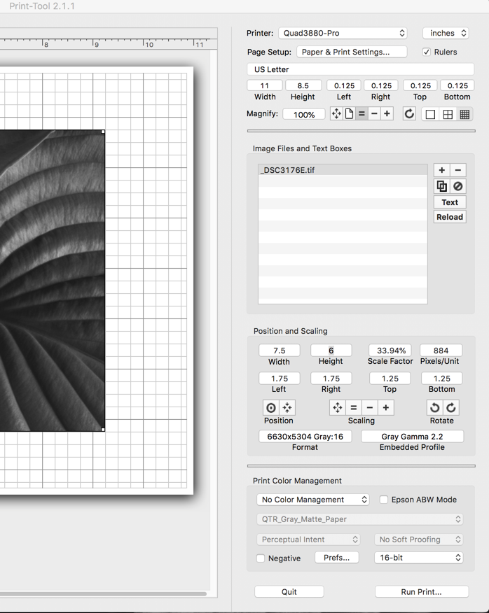
If you are printing with a PC you are printing linear by default (no icc option). If you are printing with a Mac, the normal workflow is to print “Without Color Management” and this is also linear. If you are choosing “Print Tool Manages Color” and selecting the an ICC to print with, then you need to select Perceptual rendering intent and the correct profile (QTR-Matte is a good default for matte paper, and QTR-Gloss is a good default for gloss paper) and then the correct QuadtoneRIP Piezography CURVE inside of the QuadTone options of the driver itself.
Please confirm your settings with screenshots so we can debug your workflow.
best,
Walker
I will send screen shots when I get back to my computer (Mac). I am following the usual methods for QTR and Piezo Pro.
I apologize if I asked too many questions, prompting your tldr , but I also asked about Spectrophotometers:
I have a Datacolor Spyder spectrophotometer, which I don’t believe is one of your supported spectros. Do you recommend higher-end spectros because they are more accurate or consistent ? Because they provide automation features which make it easier to measure targets with more patches ? Or why please ?
Here are the settings I use.
Note that my results are consistent with the sample images you sent me: your Platine sample image had deeper low values than your Hahnemule sample image.
Thank you for your help !
Yep. Everything is A ok. You just need to adjust your image to hit the correct linear slope of the more contrasty (glossy) paper.
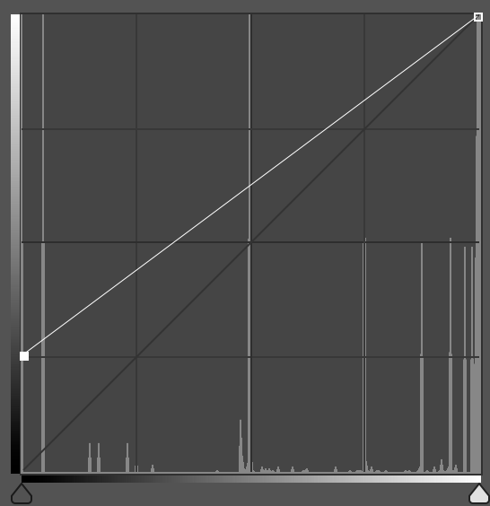
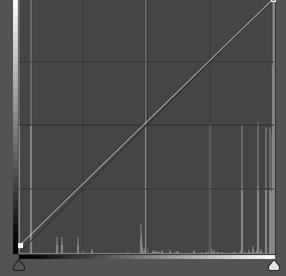
Here’s a over-emphasized graphic of what linear prints do between papers:
Matte paper:
Glossy paper:
-
We try to use the word “piezography curve” instead of “profile” because profile usually really means “ICC Profile” which is a totally different thing that piezography curve and I also talk about ICCs later in this email.
-
Up until now you have been printing on matte paper and tuning your images for that contrast ratio (about 1:167 in monitor lingo).
-
Piezography curves are linear so they will faithfully reproduce your image tones linearily to the contrast of the paper. So if you print your image on matte paper with a linear matte curve your shadow, midtones, and highlights will all be printing at the same contrast slope/angle at a ration of around 1:167.
-
If you suddenly change the contrast of your paper to glossy (1:230 or so) and use the same image that you have been printing with matte paper, you will not just get darker shadows but ALL the tones will faithfully print at that new contrast ration (1:230) with this system. In short, you will see a dark print if you do not edit your image.
Piezography is a “printer linear” system and is not industry standard color management. Instead of attempting to faithfully reproduce the contrast one sees on screen using ICC profiles (this de-stabalizes shadow detail) Piezography simply faithfully prints the tones in linear fashion at whatever contrast the paper is at. This enables better shadow control and allows for the legendary tonal fidelity that the ink is capable of producing.
There are two ways of going about working between gloss and matte papers.
-
The traditional way is to edit for a matte paper and gloss paper separately (your image will have a different final contrast curve built to visualize for the difference in contrast of the papers)
-
The “industry standard” way is to use ICC profiles. These ICC profiles (gloss and matte)essentially add different automated adjustment curves that negate the difference between the two papers so you can print the same image on both papers without adjusting specifically for each paper in photoshop. ICCs tow down the shadows and two-up the midtnone highlights a bit so you would need to not edit in soft-proof (Preserve RGB numbers) mode in Photoshop when printing with ICCs.
I’ve included two icc profiles. You can print in Perceptual or Relative Colorimetric w/BPC mode and experiment. Use the Matte ICC for printing matte and the Gloss ICC for printing glossy. Once you get a contrast good on one paper, you should be able to only switch ICCs and get a decent contrast on the other paper with this workflow. A big caveat with this is that you will have slightly de-stabilized shadow detail with this workflow.
Archive.zip (3.3 MB)
Ps: All of this we teach in our workshops and have touched on this in several public places online.
Best,
Walker
Thank you for continued patience Walker 
I am not printing with ICC profiles: I am only using Piezography curves and QTR as my screen shots show.
When printing on matte paper with matte ink, I use the specific Piezography curve for that matte paper. When printing on glossy paper with glossy ink, I use the Piezography curve for that glossy paper.
Are you suggesting that the Piezography curves which you provide for for glossy papers are designed to accommodate the contrast range of matte papers - and thus require an additional adjustment ? If so, why not linearize (or otherwise tune) the glossy curves for glossy papers ? Isn’t that the whole point of having specific curves for specific papers ?
I apologize if I am still missing something.
Your question here is a bit miss-directed. Piezography curves are simply calibrated for their paper to produce linear (equidistant tonal values from dark to light) prints. There is no compensation for differences in contrast between a matte paper and gloss.
The word linearize means to make tonal values equidistant from dark to light. Each paper is different and we have decided that the most valid and consistent calibration point should be a straight line. ICC profiles will do your “tuning” but at the expense of shadow detail as moving anything from the linear line to a curve will delete some tonal information.
Producing “pre-tuned” non-linear curves would be making contrast choices for our customers. Instead we let them do it. Think of the Piezography system as a stick-shift Subaru Legacy wagon.
regards,
Walker
Thank you again for your patience.
I now see that a linear result means that the steps are equidistant. Contrast refers slope or steepness of the curve, as your previous screen shots illustrated.
The QTR GUI allows us to specify Ink Limits and Gamma, while Photoshop or other editing tools allow us to apply contrast adjustments to the image itself… but what is the best way you recommend to adjust the contrast or slope to suit the paper, without losing image quality ?
Do it the slow and manual way in Photoshop. It takes more time, more proofs, etc. But over time you will settle on the exact translation (from Matte to Glossy) curve that works for you 99% of the time.
best,
Walker
1 Like