I’m new to the forum and this was the only area I could post a question. I bought a refill pack of Cone inks in November 2019 and fitted them to my Epson 3880. I have been printing fine with them, but today I tried a print and the colors were very muted and dull - almost like an image with a wide color gamut looks on an sRGB screen if it hasn’t been converted to that color space. I agitated the cartridges, but it made no difference. I tried all the settings in the printer driver (from Photoshop) including letting the printer do the color management - no difference.
I then downloaded a trial version of Printfab and was able to get pretty reasonable prints using their print driver for the 3880. Not perfect, but then I haven’t done a calibration print that they offer if you license the software.
So does this suggest that my epson printer is not really allowing the correct use of their print and paper profiles because it is recognizing the use of non-Epson inks?
Steve
Did you run any nozzle checks to verify that they were printing correctly?
Yes, I did. Had a few blocked nozzles, but I did the power clean and that improved that. What I’m currently struggling with is that I downloaded the Photodisc color test chart and printed that both with the Epson drivers and then the PrintFab driver. Both looked pretty close to each other and also pretty good in terms of colors and shades. But the image I’m trying to print from Photoshop (which looks OK with the proof view) continues to print in a muted rather dark look. So back to the drawing board… I’ve attached the problem image

So I’m not sure what is actually going on!
Steve
On a 3880, agitating the carts isn’t going to have any immediate effect on its own, as there’s a lot of ink in the lines between the carts and the print head. So you’ll be printing with the existing ink in the lines for some time. A couple of power cleans would flush the lines, but that’s a lot of ink to dump into the maintenance tank, and not something that you’d do on a whim.
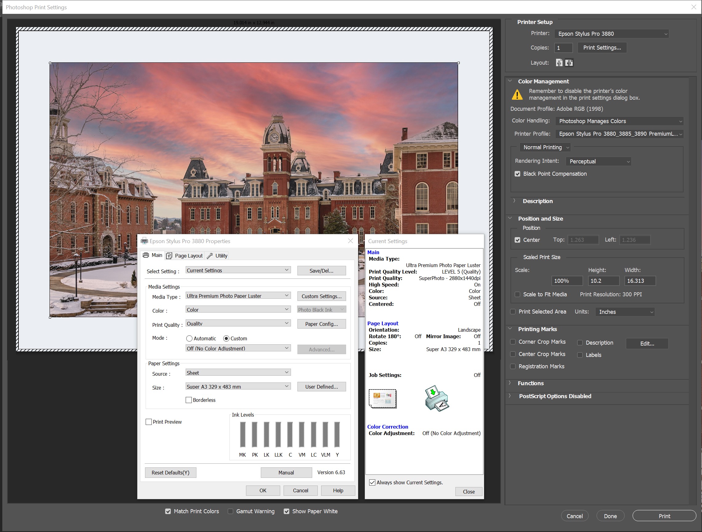
Your description of your problem sounds like a problem with your printing settings. Are you on Mac or Win? What ICC is the image you’re trying to print in? You may care to post screenshots of your Photoshop print dialog settings, assuming that’s how you’re printing, and the Epson driver dialog. Maybe someone can spot something. Otherwise we’re just guessing.
Good point about shaking the ink! I’m thinking that was, in fact, the issue, because my most recent tests have shown hardly any difference between the Printfab and Epson drivers in terms of the output and is pretty close to what I expect from a print. I use Windows, and the file was converted in Photoshop to the Adobe RGB space from ProPhoto using the Convert to Profile command.
From there, I apply output sharpening and then the following print settings:
So, unless anyone can see an issue with my print settings, I think I will put it down to stale ink needing some agitation!
Steve
I can’t see any issue with your print settings, although I can’t see the full name of the ICC you’re printing with. I assume you’ve triple checked it. Is this an ICC you’ve downloaded, or once you’ve created yourself?
Your earlier statement: “What I’m currently struggling with is that I downloaded the Photodisc color test chart and printed that both with the Epson drivers and then the PrintFab driver. Both looked pretty close to each other and also pretty good in terms of colors and shades. But the image I’m trying to print from Photoshop (which looks OK with the proof view) continues to print in a muted rather dark look.” strongly suggests to me that it’s a workflow issue somewhere. I don’t see how it can be ink sedimentation if the test chart and Printfab both produce acceptable results.
I assume you did convert to AbobeRGB, and not simply assign it? Have you tried leaving the image in ProphotoRGB for printing? In the absence of anything else, I’d be suspicious of the ICC. But as I said at the outset, I’m now just guessing.
Thanks Brian
The profile was the official Epson one for Premium luster paper - the specific one I was using. I think my issues were probably due to stale ink as now the images I print from either the Epson driver or the PrintFab one look almost identical. I am going to get a profile made for the paper/ink combination. That will probably help get a bit more consistency.
I did print from ProPhoto via the Epson driver and then converted to Adobe RGB and printed using PrintFab and those looked pretty identical as well. I do convert not just assign.
Steve
You need to print in Relative Colorimetric with BPC turned on (not perceptual).
That said, it may be time for a nozzle check and a custom ICC. I can build you one freebie if you print the targets at the correct size and send my way.
all the best
Walker
Wow - I wish I had seen this earlier. I have just sent off the two color prints this afternoon to Profiles by Rick. I also did the auto version of the nozzle check on my printer before printing the test pages, and it did do some cleaning before finally printing out a complete set of blocks with no missing elements.
But thanks for the offer!
Steve
Why is this Walker? My experience is that the best rendering intent is image-dependent. Are you saying that rel col should always be used? Steve’s original problem “I tried a print and the colors were very muted and dull” didn’t sound like an issue with rendering intent.
Most likely it’s not this but he’s double BPC with Percep + BPC and Percep brings all out of gamut colors down proportionally not just the outer-bounder colors.
I still have no idea what his tolerances are vis a vis what he considers low gamut print because I have seen no photos of the result so can’t help other than to spit-ball here. Percep + BPC can do that. But most likely not the problem.
-Walker